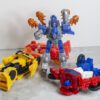
You know, I bought Siege Springer back in 2020, and in the four years between then, and selling him at TFCon this summer, I never once wrote a review of him. I think that’s because there was something bizarrely forgettable about the figure, something that made his existence just vanish from your brain the second you stopped looking at him.
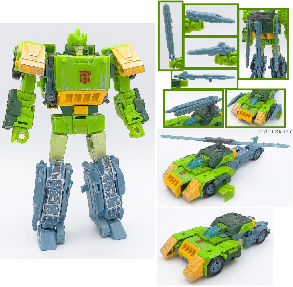
Try to remember this picture of him the second you stop looking at it.
Which is odd, considering that Springer’s whole character is supposed to be Mr. Charisma. When he was introduced in the 1986 Animated movie, he was transparently written as a wry Han Solo stand-in, and pretty much every subsequent appearance over the years has depicted him as a brash, two-fisted hero-adventurer, who’s often in charge of leading the Wreckers, the Autobot’s black ops squadron.
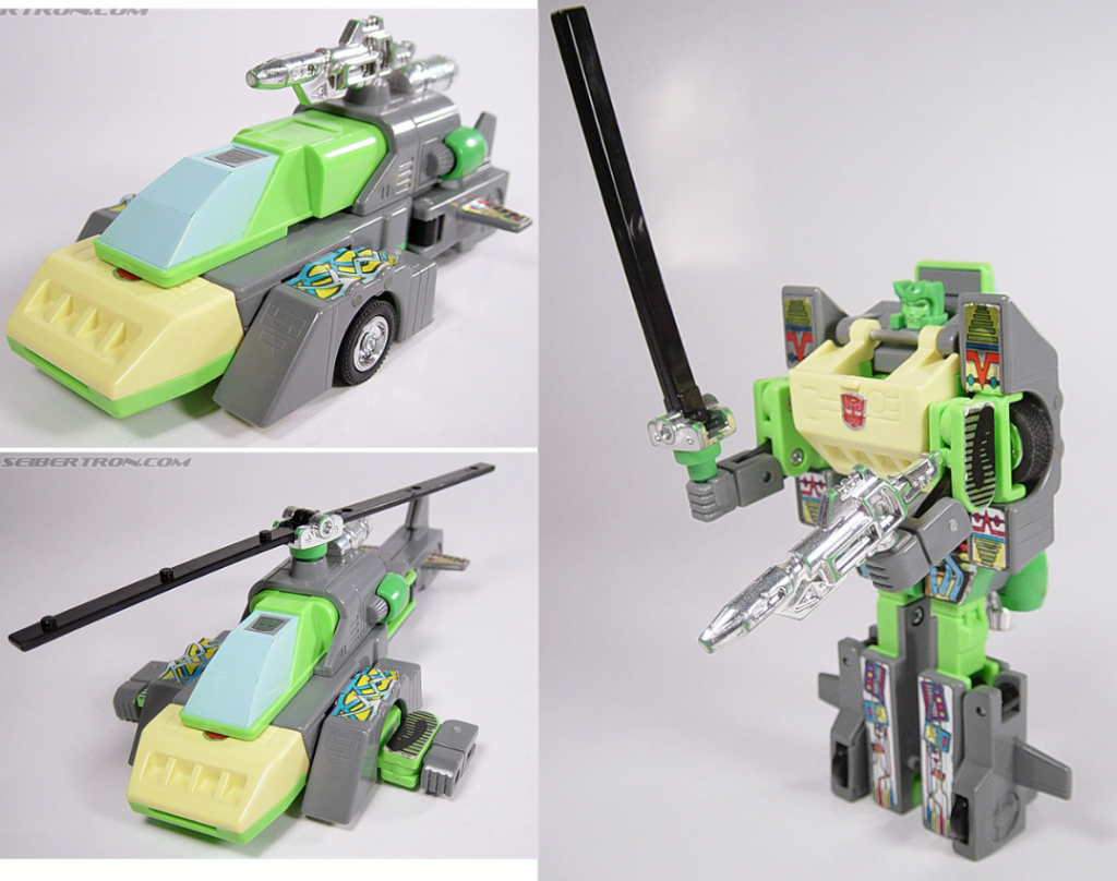
The original G1 figure was janky, but at least memorable.
He’s had more than a few figures over the years, but it took a long while before they managed to make a new one that was a proper car/helicopter/robot triple-changer, like the G1 original. And that one (2014’s Thrilling 30 Voyager) has been called one of the best Transformers of all time, though it was based on his appearance in IDW’s comics.
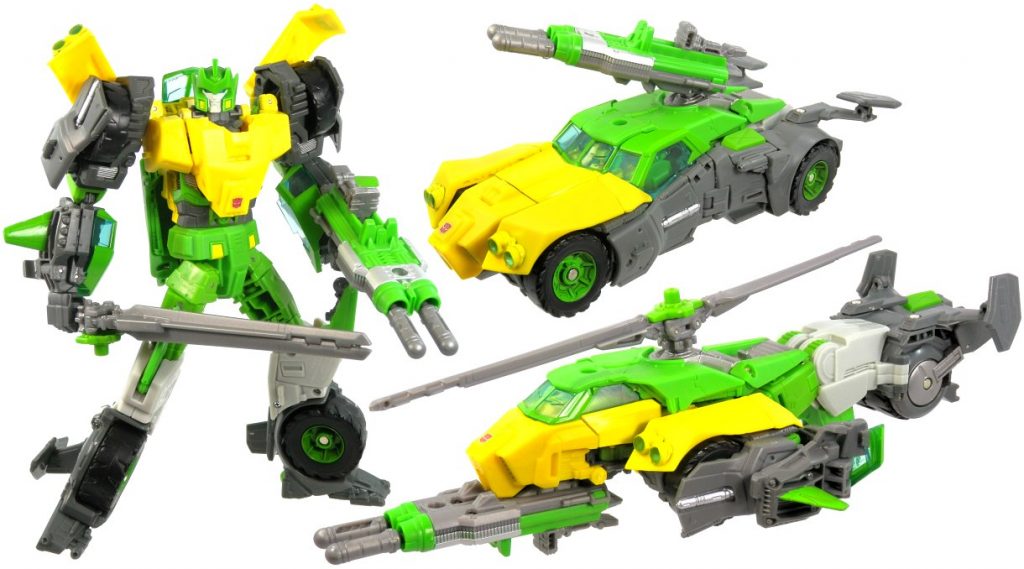
The GOAT, according to some.
So there was certainly room for an animation-accurate version, which is what the Siege one was supposed to be, until it came out, and everyone immediately memory-holed it. This Studio Series 86 one feels like a mulligan, an attempt to inject some charisma into a figure that was strangely forgettable. And I mean inject pretty literally, since it’s actually an extensive retooling of the Siege Voyager, with extra engineering and accessories, sold as a Leader-Class figure, so he has that whole need to justify the inflated price tag, too, on top of trying to be, like, good. So, let’s have a look, and I’ll be treating him like a new figure, since the old one’s already sold, and I’ve forgotten so much about it already (I don’t understand how it does that!).
Robot Mode
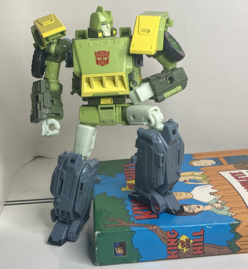
He just sort of naturally settles into poses like this.
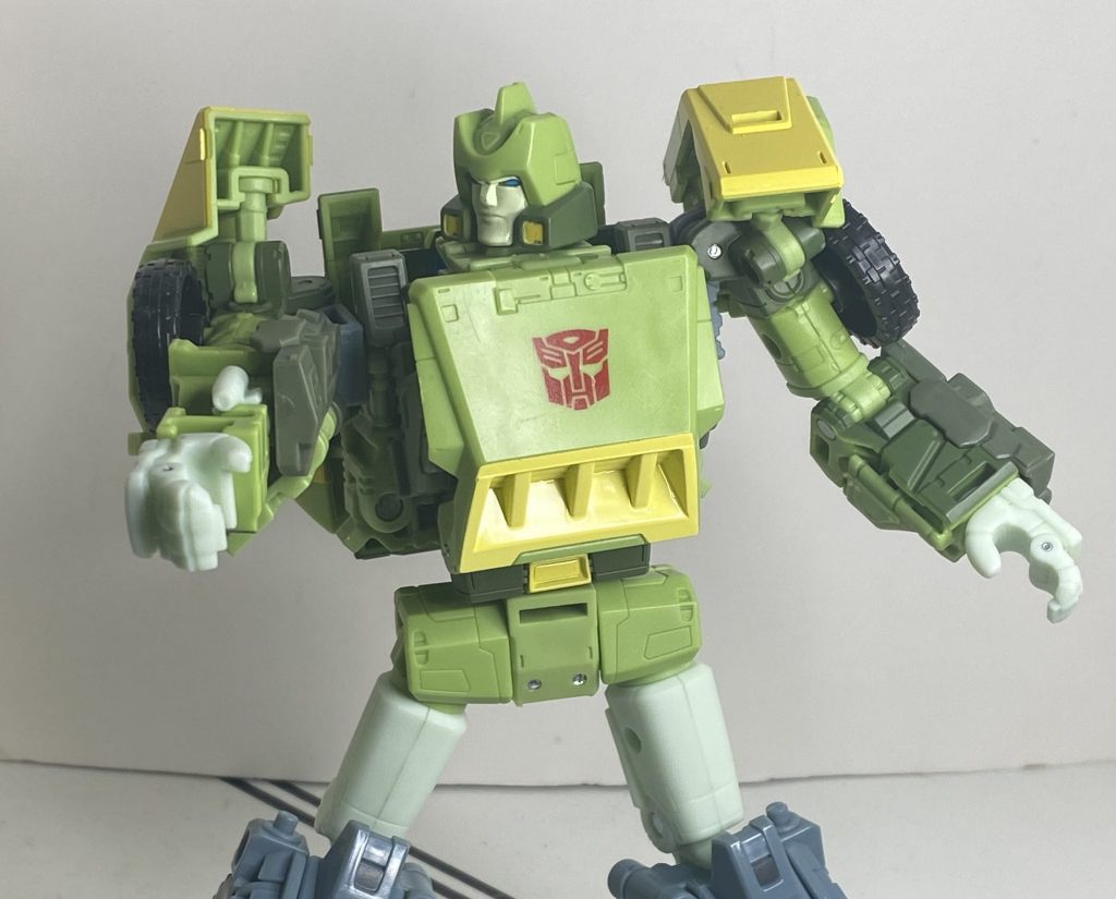
The foremost question on my mind, and presumably yours, upon this Springer’s reveal was his size, so let’s get that out of the way: He’s definitely still a Voyager, but he’s got some substance to him, but not as much substance as some other short Leader-class figures. He’s about a head shorter than Legacy Jhiaxus, who was famously large for a modern Voyager, but you pick both of them up, and Springer definitely has more heft to him, to say nothing about more obvious complexity.
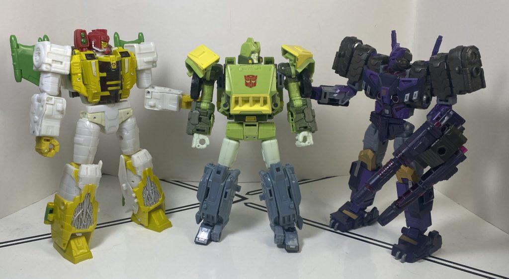
They’re gonna get him, because they’re bigger than him.
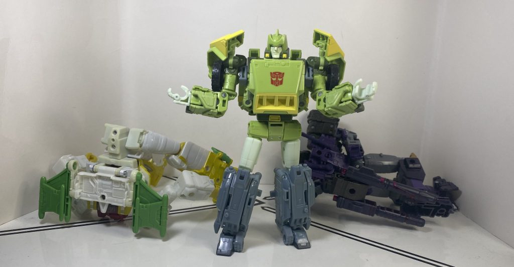
Or so they thought!
On the other hand, he’s a head and a half shorter than Kingdom Leader Galvatron, and obviously much slimmer and lighter. So, he’s not quite a Voyager, and not quite a leader. One thing he is is really heavily retooled from the Siege version. His whole upper torso’s basically new, save for a few bits and bobs, and the only thing on him that I can immediately peg as being from the Siege version is his lower legs. This feels like a new guy.
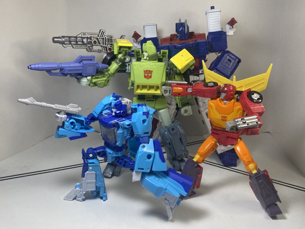
My 86 movie guys are a motely crew of updates from several different lines.
In terms of animation-accuracy (the whole reason for this exercise), he’s not quite the Perfect Cartoon Replica you’d expect from Studio Series. Specifically, his animation model’s got proportions make him into this rounded, bulbous thing, with a thick, barrel-chested torso, whereas this version is proportioned more like a standard humanoid, slimmer and boxier.
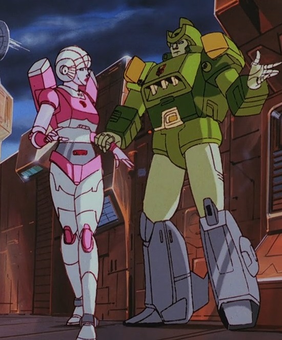
On the screen…
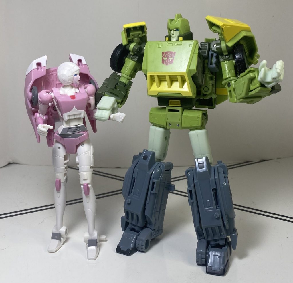
…And in the plastic.
I can’t say I mind, I really think his animation model would be kind of ugly in 3D space, and this is better, it’s just amusing that he kind of doesn’t fulfill that brief (he’d probably have to be 100 percent new, but would be worse off for it). The one thing that does bug me, visually, are his new shoulder pads. They’re supposed to be flared diagonally outwards, in an attempt to imitate smaller ones on his animation model, but I find that they look awkward,, and moving his shoulders around puts them in odd locations, exposing a lot of his inner articulation joints.
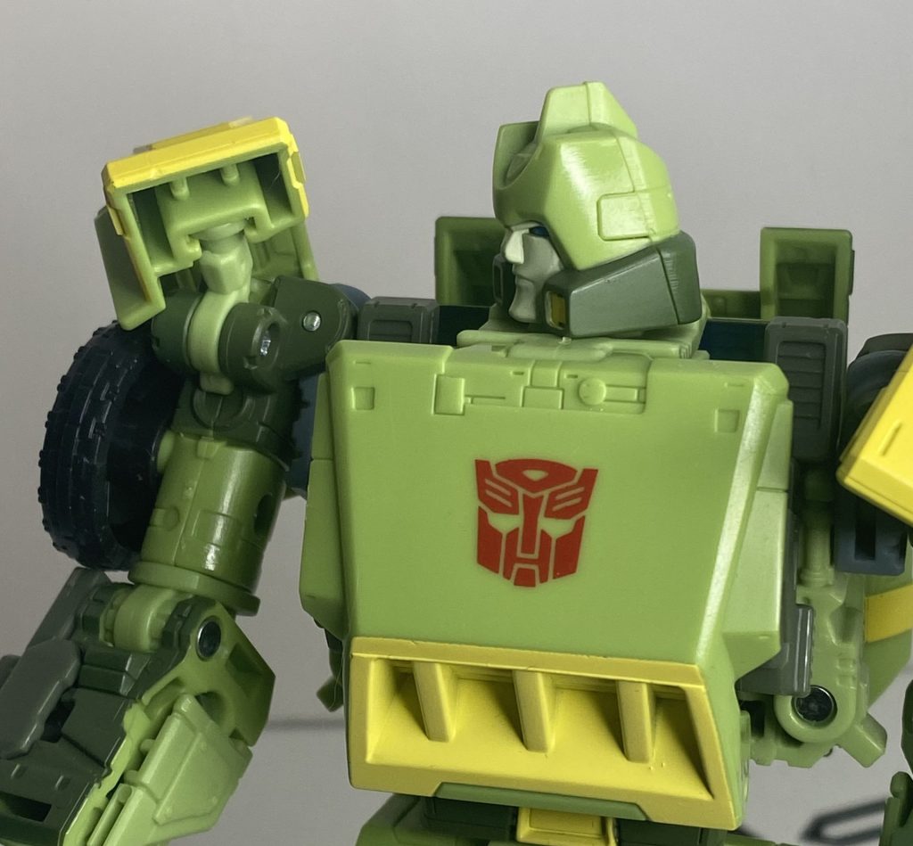
This type of thing happens a lot.
It doesn’t help that it’s unclear just how far out they’re supposed to go, with the animated ones being almost entirely horizontal. I leave them a bit more vertical most of the time, and it’s even possible to just put them where the Siege toy’s pads were, perfectly straight.
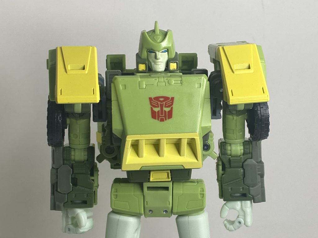
A perfectly serviceable alternate configuration.
One thing that does work is his new headscupt, which does accurately translate his Floro Dery-designed mug into 3D space in a way I find really pleasant. He’s got an expression that looks like he’s trying to be a tough guy, and it fits his personality.
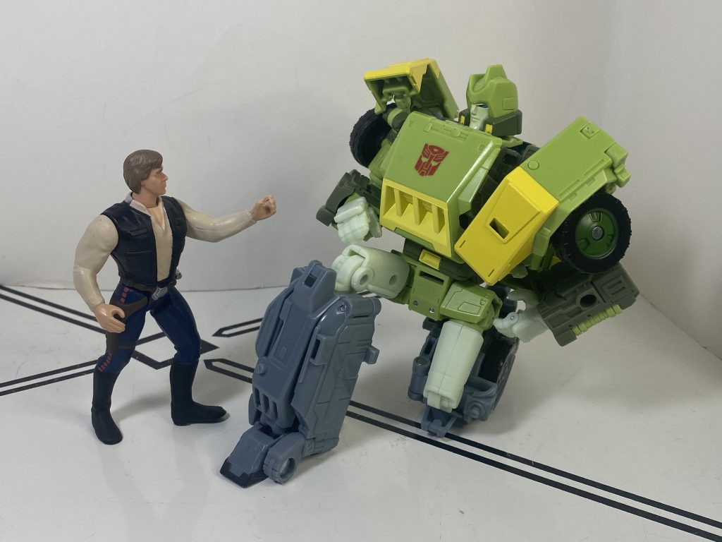
He had to get it from somewhere!
For colors, it is….it is green.
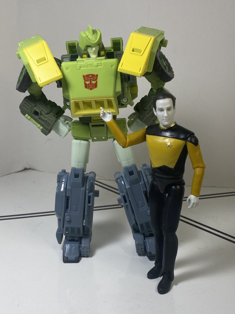
“Yes, thank you, Mr. Data.”
Okay, he’s got plenty of color on him. Light green, dark green, a kind of milky green-white, some yellow, and some dark gray, plus a red Autobrand and blue eyes. It’s all very complete-looking, and pretty lush. I do find it funny, again, that in the “we must be like the toon” line, they added way more yellow to the grill on his chest than he’s supposed to have, but again, I think it looks better via adding more color variety. Speaking of color variety, he had enough budget that they could sprue out most of his deco as plastic, instead of paint, with most of the painted-on color being the yellow accents, and some dark green on his backpack and head. (I always view less need for paint as a good thing, less chance of scrapes, chips, and qc issues).
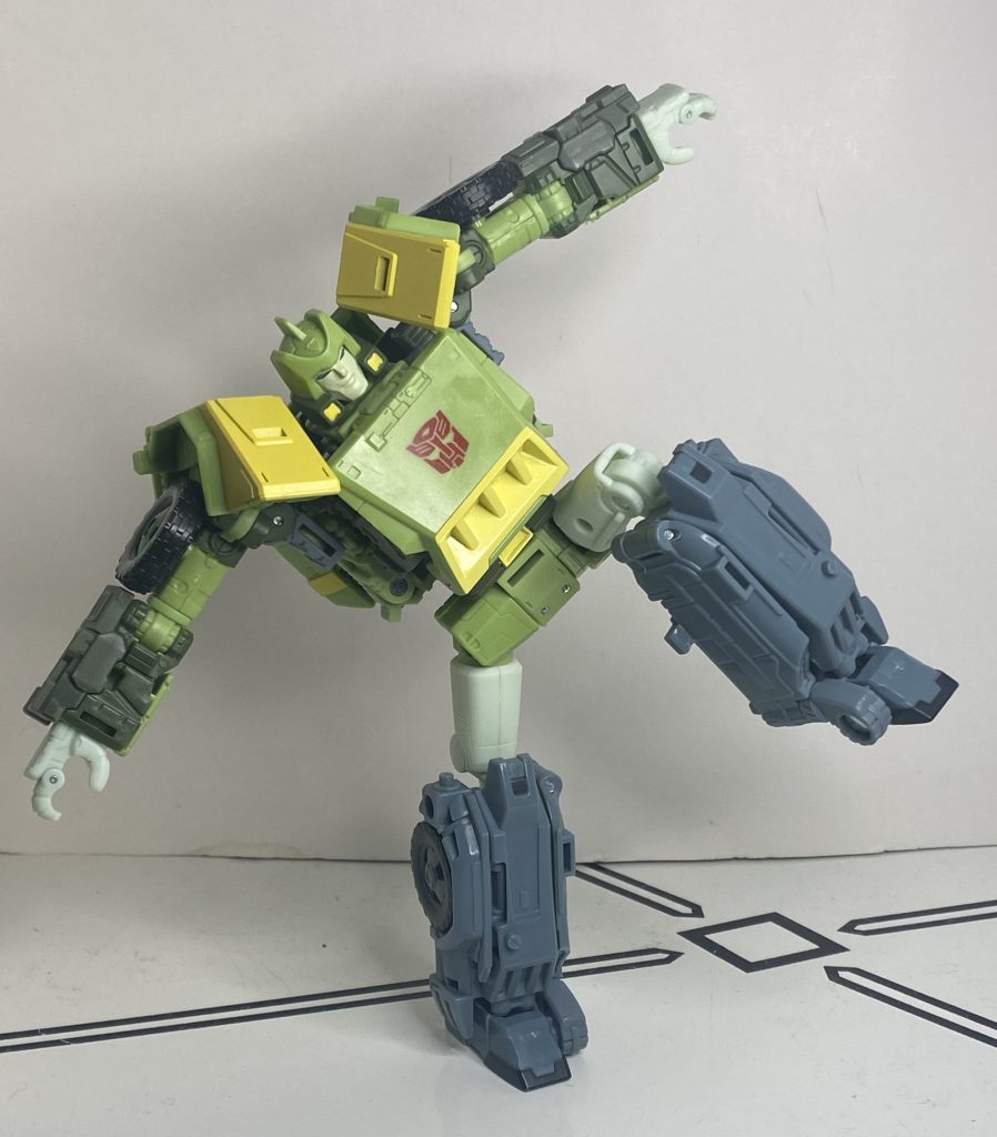
Stand back, he’s about to spring!
Build quality is definitely one area where we’ve got a massive improvement over the Siege one. I remember that his lower legs really had problems staying together, and would come apart when you posed him. I don’t know how they fixed it, but it’s no longer an issue here, they keep together. His feet are also a bit smaller and looser than I’d like, but I can still stand him on one leg. There is one very large, disappointing build quality problem with his forearms, but it’s not really visible until we get into his features/alternate mode, so more on that later. When he’s Just a Guy, he holds together well.
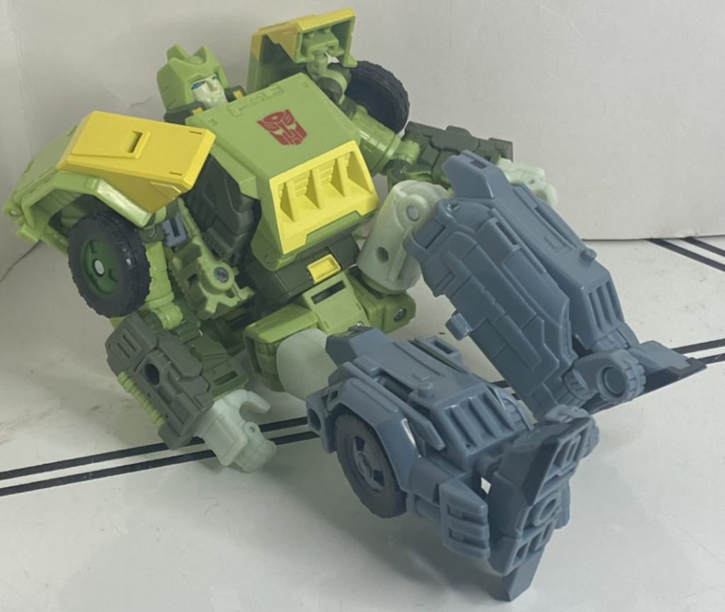
The nonchalant attitude is integral to his image.
One advantage of these kinds of size-class-cheating guys is that they have potential for generous articulation, and that’s…sort of on display here? Firstly, he’s got all the good joints you’d expect from a modern mainline Transformer. And when it comes to bonuses, he’s got hands that can open and close mitten-style (on top of his swiveling wrists), and feet that don’t just have ankle tilts, but forward-and-backwards rockers. While his elbows and knees aren’t double-joints, they made sure they have a broad range of motion. And, much as I groused about how his shoulder pads look, I appreciate that they went out of their way to make sure his shoulder articulation is both unimpeded and generous. I think the only issue I have is that his head can only rotate, and can barely look up or down. He’s tall, he’s got a lot of people he needs to look down at!
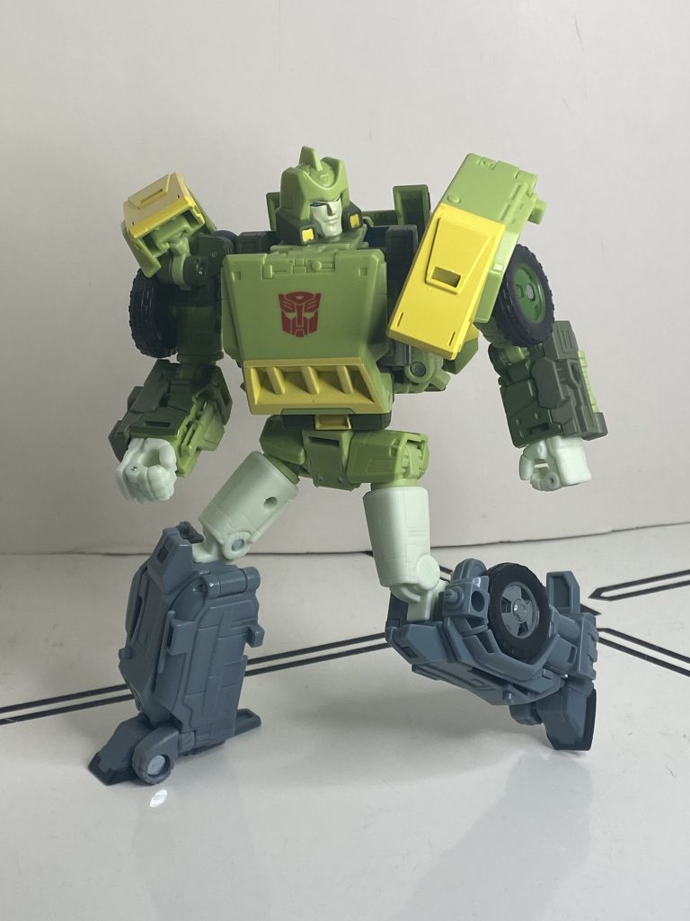
He has so many options that are better than running.
Okay, features and accessories. This is where the money is, quite literally, and there’s a lot of it. So, firstly, he’s got two entire swords, a bigger green one, and a smaller silver one, with a blue hilt.
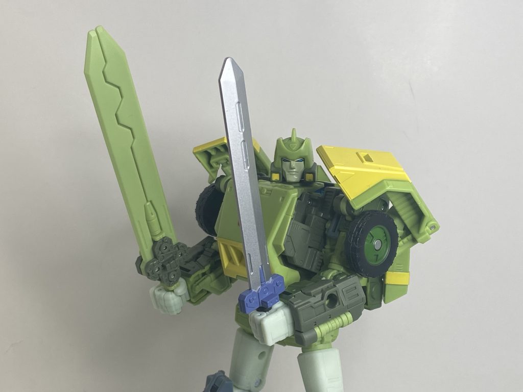
“I gotta tell ya, this is pretty terrific!”
This is some crazy toon accuracy: The smaller one resembles the sword he uses in animation, while the bigger one changes into his copter mode’s rotors.
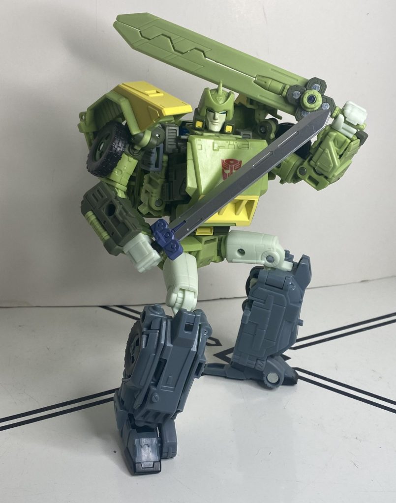
He poses really well with them.
They seemingly just gave him two, because they couldn’t make the former change into the latter. Me, I like having him dual-wield them.
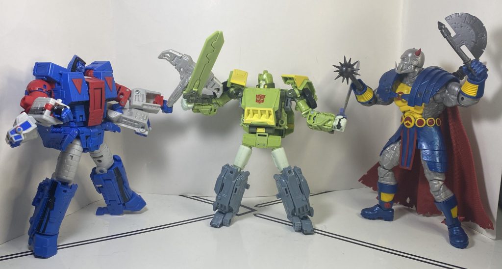
Statistically, most of you haven’t read Marvel UK, so you can’t tell me, who did, that this didn’t happen.
Next up, he’s got guns! Specifically, two little laser pistols that he’s kept from the Siege version.
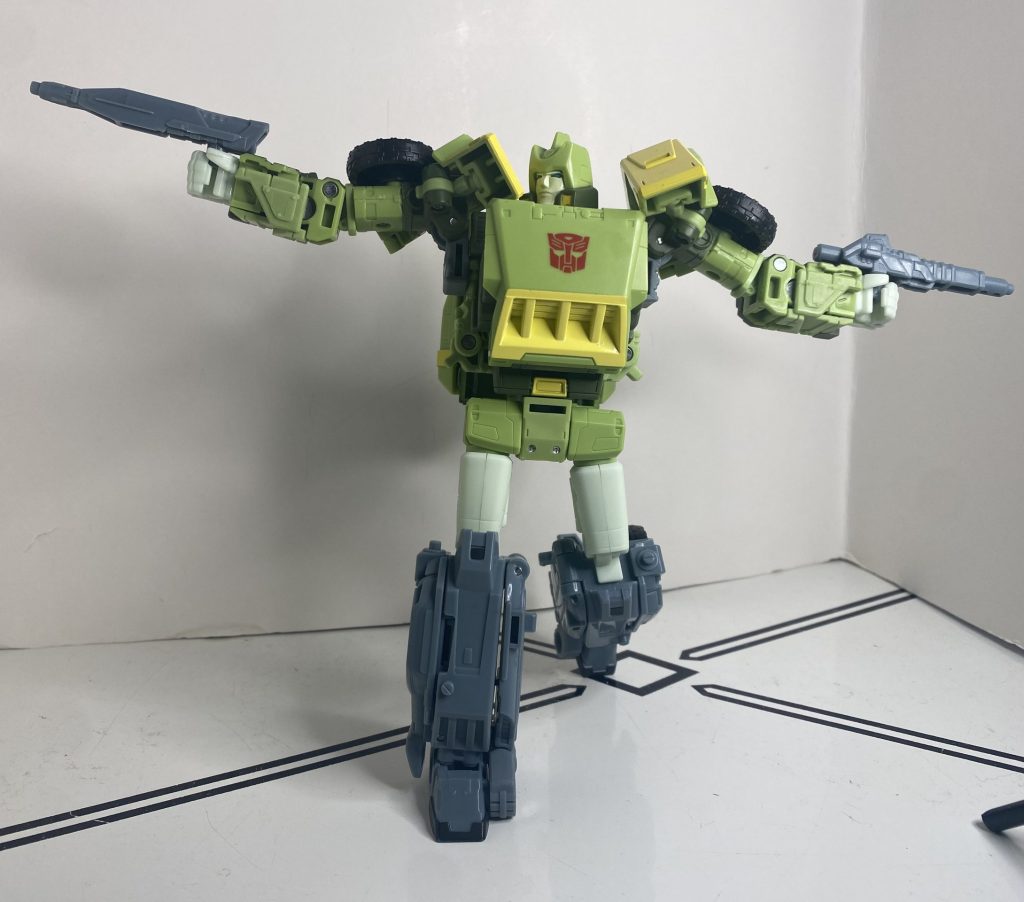
They fit nicely in his hands, and host blast effects well.
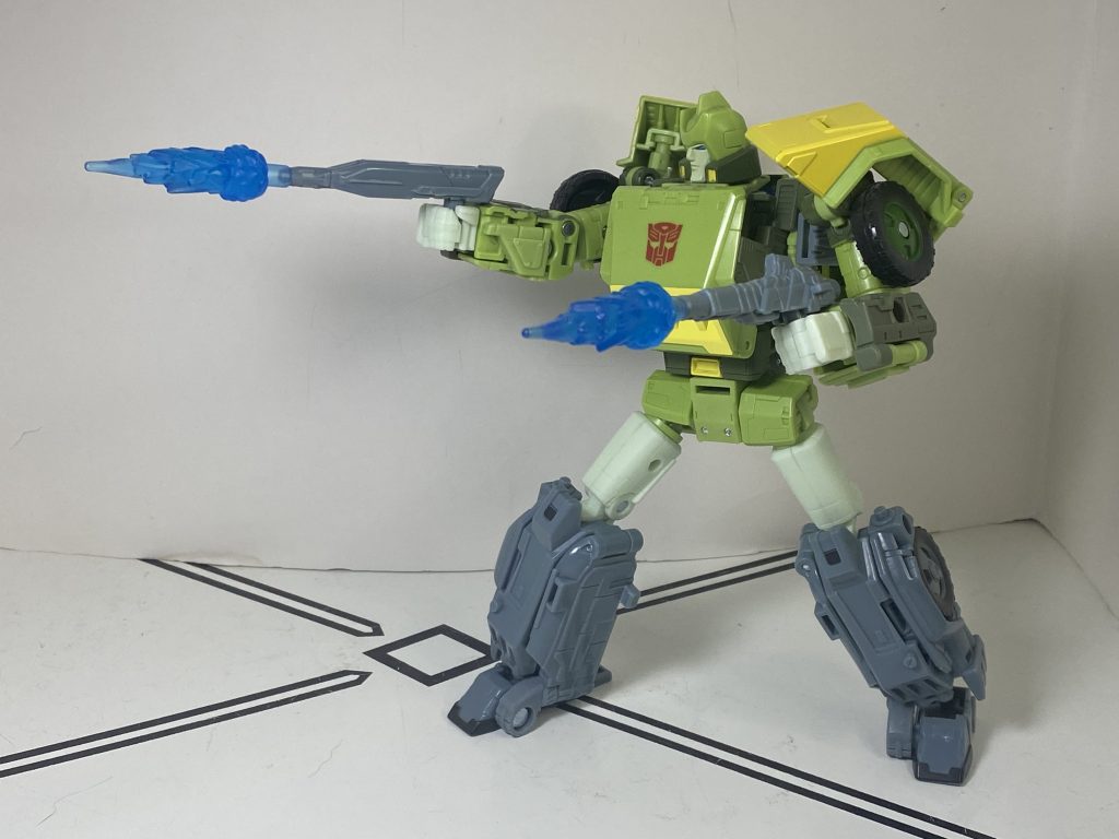
Excellent pews.
You can also combine them into a singular, very long rifle, like Rodimus Prime’s.
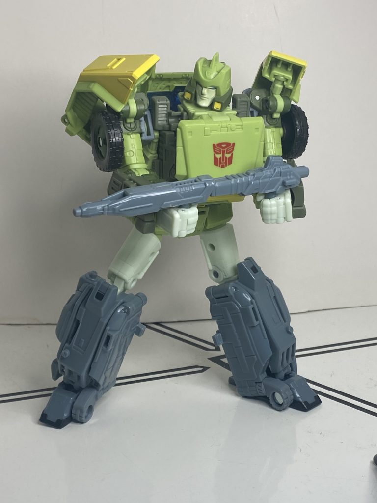
It’s no less awkward to use, either.
Next up, he’s got a larger laser rifle, painted in bluish purple. It’s impressively detailed, and feels a little oversized for him. Or perfectly sized, if you’re a Wrecker leader.
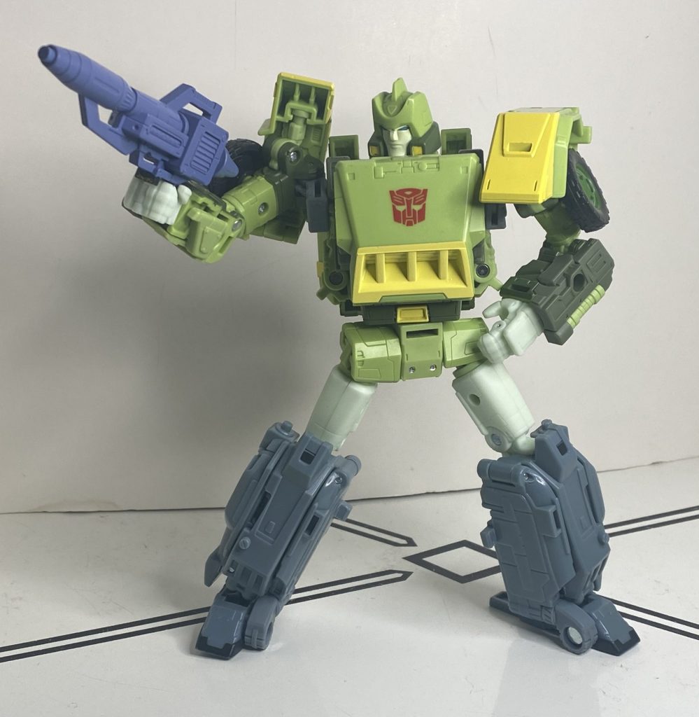
His shots miss a lot because he’s too busy posing.
Speaking of that, the weirdest thing he comes with is his “iconic Wreckers hammer” (according to product copy), a little mallet he’s never used before in anything.
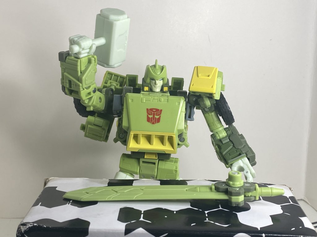
No media has ever covered his blacksmithing hobby, I guess.
It’s unpainted milky light green, has a groove in it for a Wreckers faction symbol that isn’t there, and really feels like they said “we have a little more money, let’s give him one more thing.”
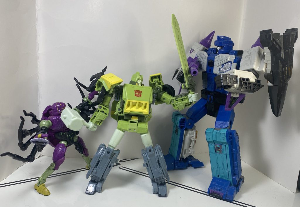
It’s helping him work through his daddy issues, at least.
The second-weirdest thing he’s got, though, is a big purple mortar shell, which is somehow the largest singular accessory he has. It’s specifically supposed to be the one he was loading up when he said “I’ve got better things to do tonight than die,” and it’s a funny one, because there’s like, no clips or anything to help him hold it, you’ve just gotta cradle it in his arms (I’m having Origin Bumblebee flashbacks).
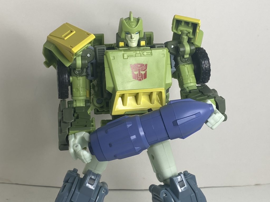
“Nothing says courage like going into battle with unsecured live ammunition that I can barely carry!”
On the other hand, it’s got a good port at the back for blast effects, and you can always mount it on his back to make him into some form of Rocket Man.
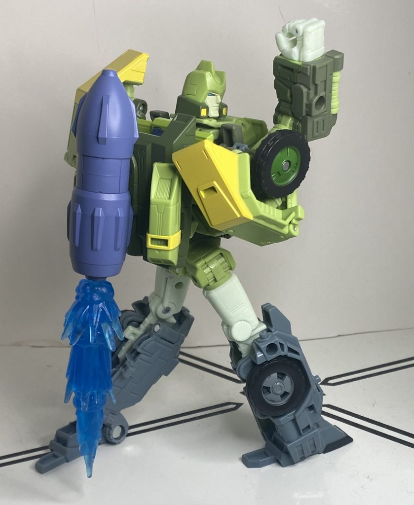
Dude, you have an altmode that can fly!
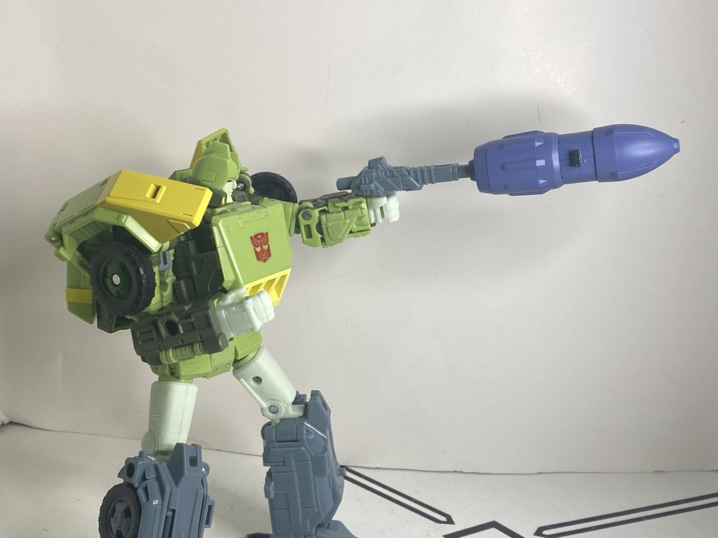
On second thought, go back to the Rocket Man thing.
Speaking of accessory storage, he’s, impressively, got a lot of it. A number of his accessories (the swords, the hammer, the mortar, the big gun) have these rectangular tabs on them, and he’s got bespoke mounting points in three places on his backpack for them.
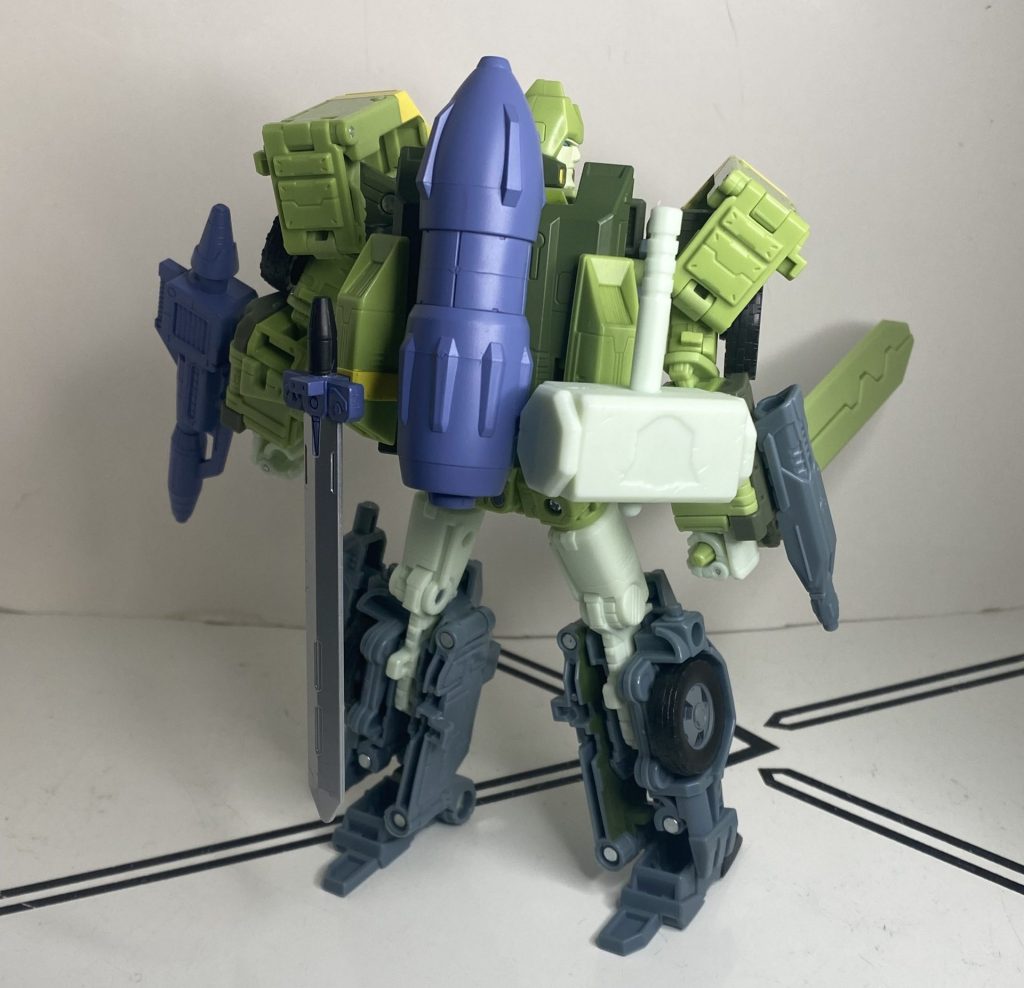
It’s a heavy burden.
He’s also got five millimeter tabs across his body, seven in total, for additional storage. I haven’t quite managed to finagle a configuration where every accessory is stored on him, he always needs to be holding something, but it’s still very impressive, and covering him with his gear really emphasizes how so much of his budget went into giving him all this stuff.
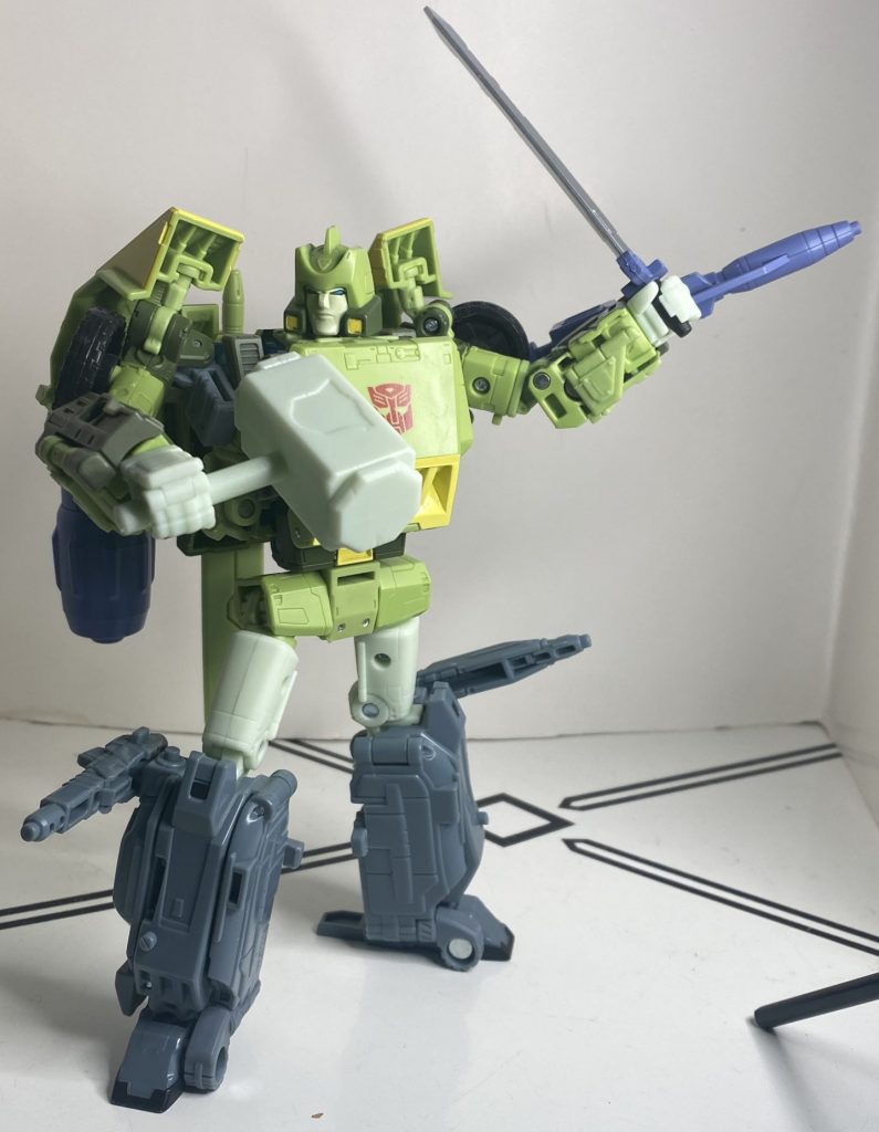
I wouldn’t want to fight a guy with this much live ordinance strapped to him.
Honestly, accessories often feel like a smokescreen to increase perceived value on figures like this, where the complicated engineering is less visibly taking up the budget, but this is one time where the pile of extra stuff feels like a legit use of the money.
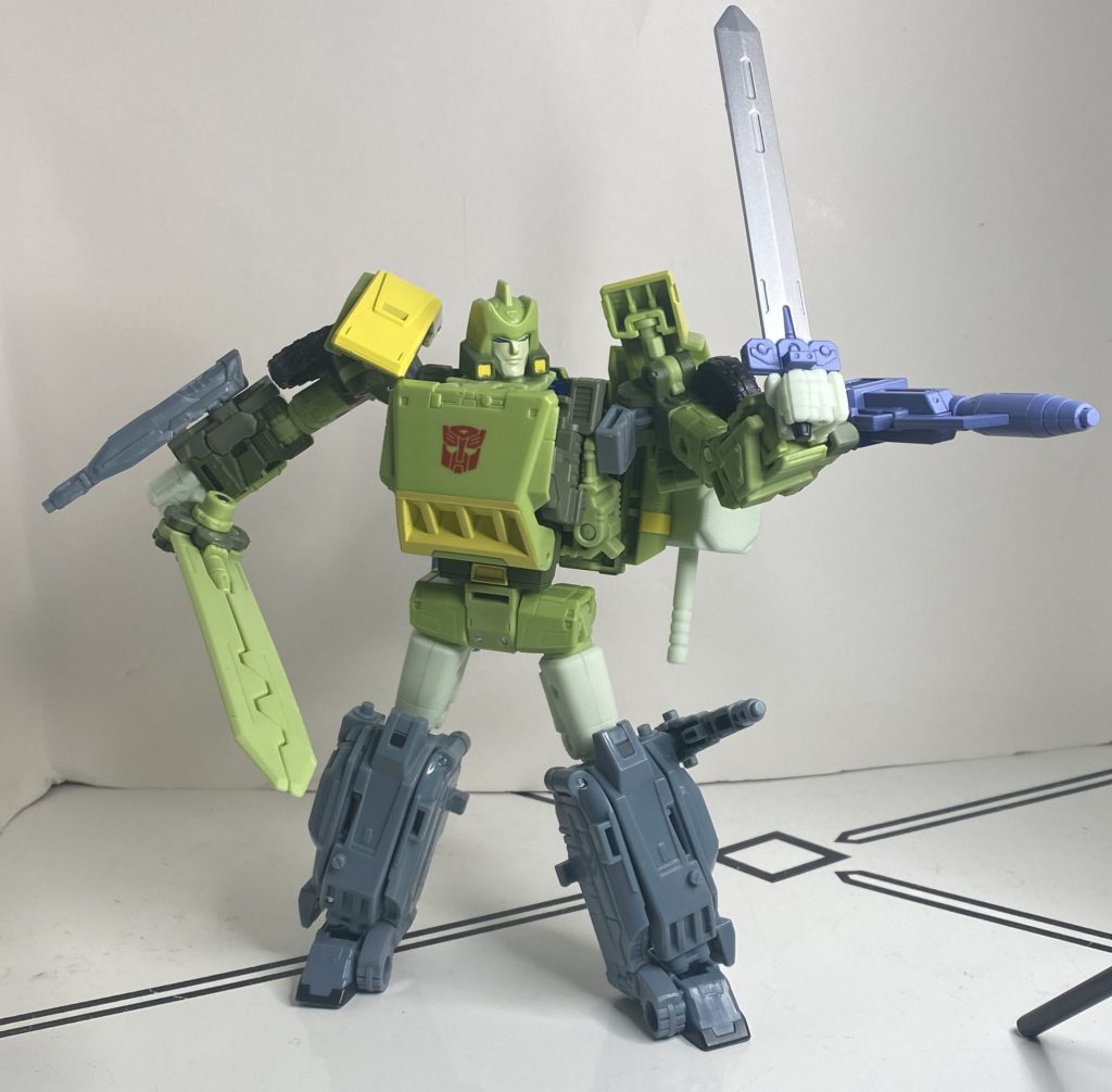
Flexing the budget.
His final feature’s super-janky for multiple reasons: Flip his right arm upside-down at the elbow swivel, rotate his wrist so his hand’s facing up, flip out a panel on his arm, and flip out a tiny little wrist-gun. All of this engineering exists entirely so they can replicate the “We’re outnumbered!” *Shoots at Starscream* bit.
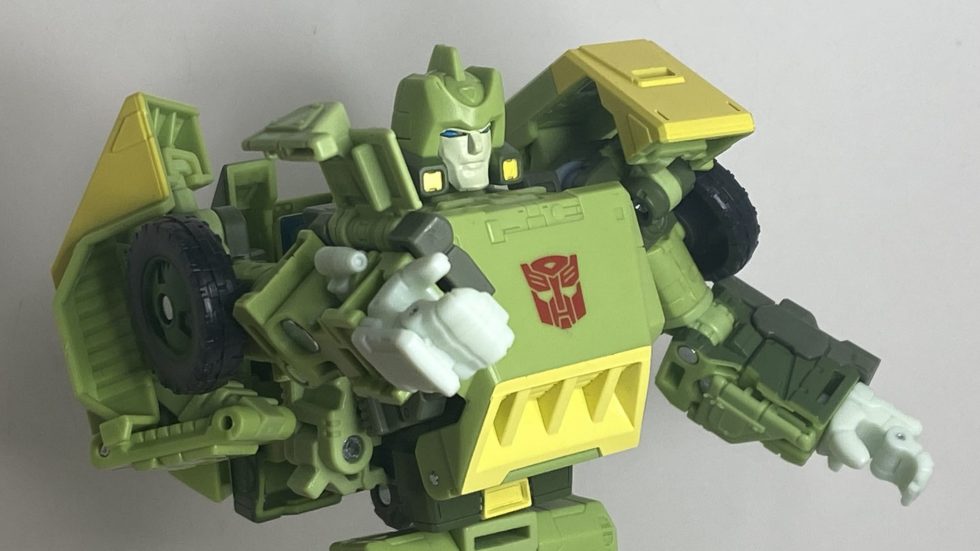
The end result.
And it’s kind of a mess. For one thing, it pops out of the top of his arm in the animation, hence the complicated rotation here that leaves him without an elbow joint. But more importantly, it exposes an odd tolerance problem: The unfolding panels on his forearms are on an extremely loose rotation joint, and sheer gravity can make them pop out, rotate, and sag.
It’s a strange bit of jankiness that a retool like this ought to fix, and it becomes more of a problem in other modes. And speaking of that!
Transformation to Car Mode
So, this is complicated enough that I still need instructions, and likely will for the foreseeable future. The abstract of it is simple (fold up the chest, fold in the feet, compress the arms, do a belly flop), but there’s a lot of manipulating of tiny panels, and more importantly, a lot of tiny tabs that need to snap in just-so. VERY IMPORTANTLY: In particular, you need to make sure his shoulderpads peg into the back of his upper arms when you fold them back, or they won’t sit right in his hands. This is also a secret tool that will help the copter mode, later on. Additionally, I’m still not really sure how to align all of the stuff that makes up the midsection of the car (his thighs, feet, and roof), I just kind of press and squeeze them until I hear a big snap.
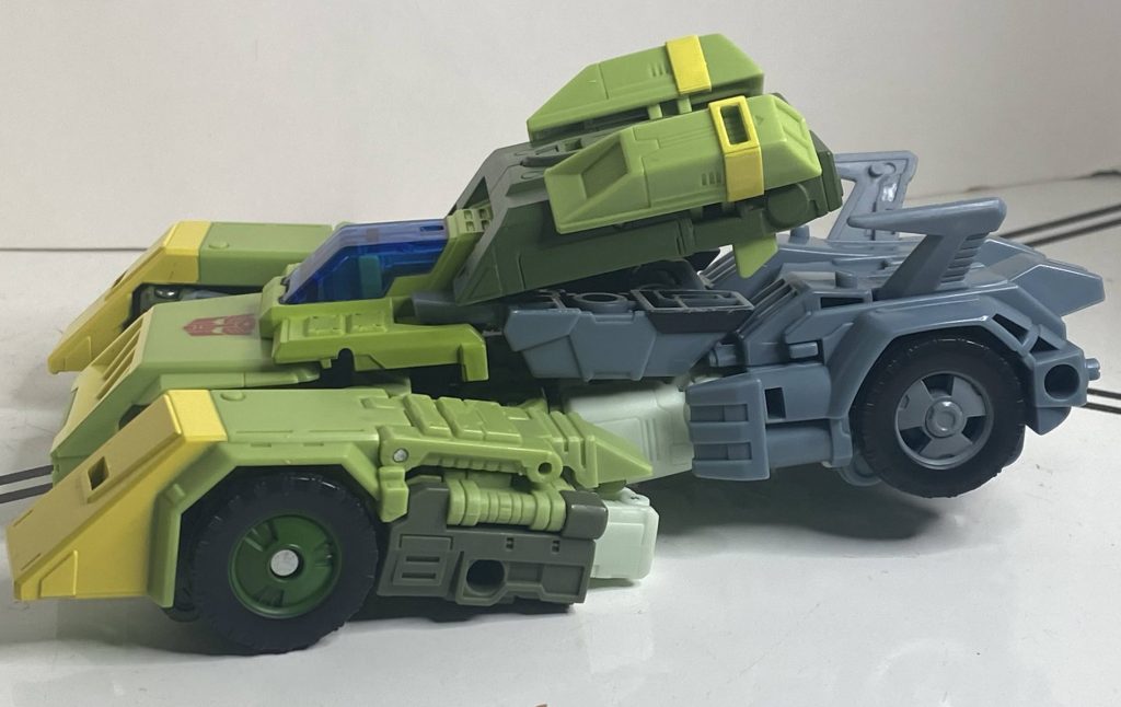
At its worst, I need to adjust it out of this mess.
So, it works, but it’s a bit shaky to get there.
Car Mode
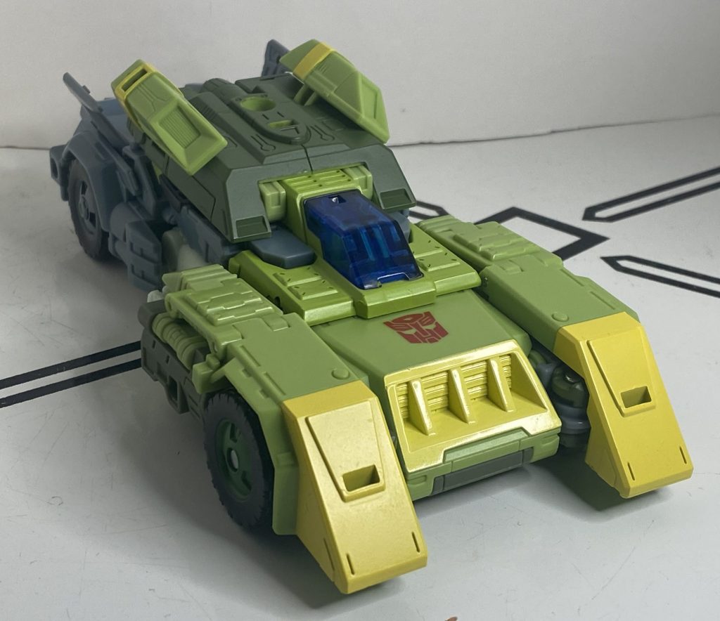
A vintage vehicle from the year 2005.
This is a fun kind of futuristic space vehicle. It’s partially a big, armored tank-like thing (with the tiny cockpit providing a sense of scale,) but then you have Jetsons-esque details like the swoopy fins in the back section. It’s a style clash that I like.
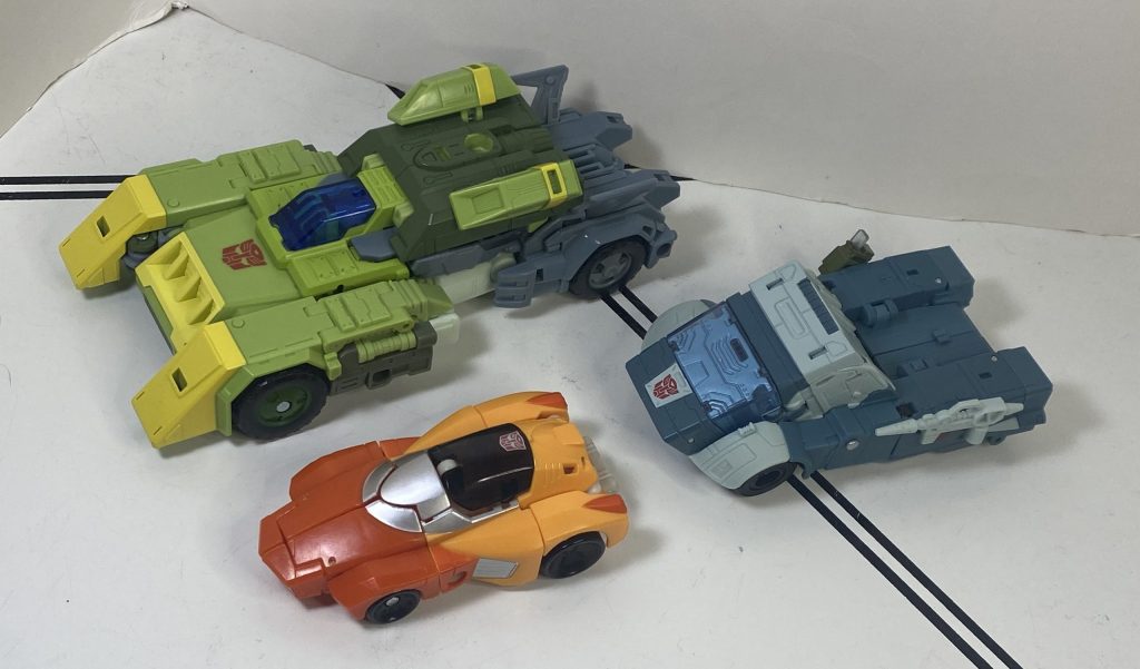
Importantly, he fits in well with the movie guys.
It’s also funny comparing it to the animation model, because the panels on his roof are supposed to be tinier, and the fins at the back larger, but they’re reversed.
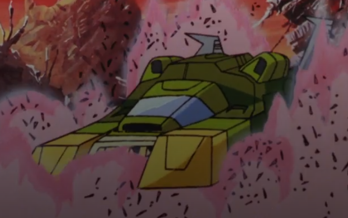
To be fair, it’s only in the movie for a few seconds, partially obscured by dust. I had to take this screenshot myself!
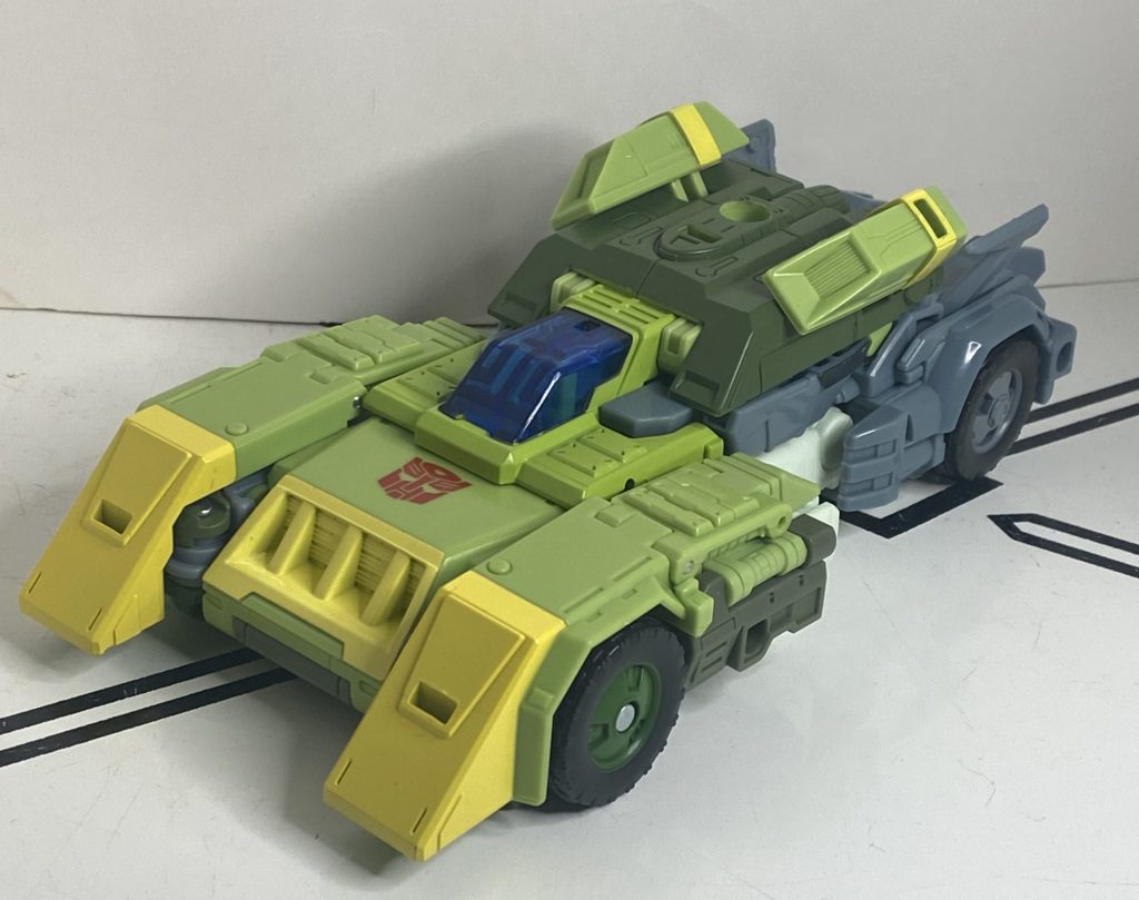
Looks close enough to me.
Doesn’t matter much, though, it looks good here. So, this is pretty big for a car mode, but still not Leader-class big. I’d say he’s comparable more to Legacy Tarn.
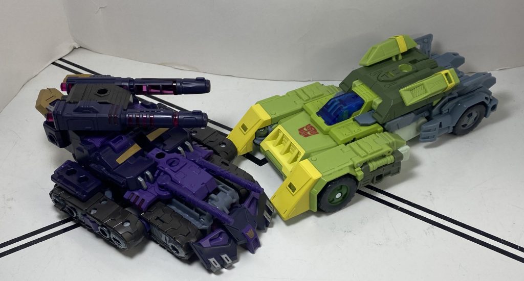
Okay, he’s actually bigger than the Tarn Tank.
It’s a panelly, complicated sculpt, mostly due to all the transformation steps, and they’re trying to hide his fists beneath his unfolded shoulderpads, to no avail (same with his thighs). But, it’s a Cybertronian Space Car, so it bugs me less than it would. Meanwhile, his colors are a bit more green, and a bit less gray, and some clear blue is added in the form of that tiny cockpit. He’s also got painted rims on his wheels!
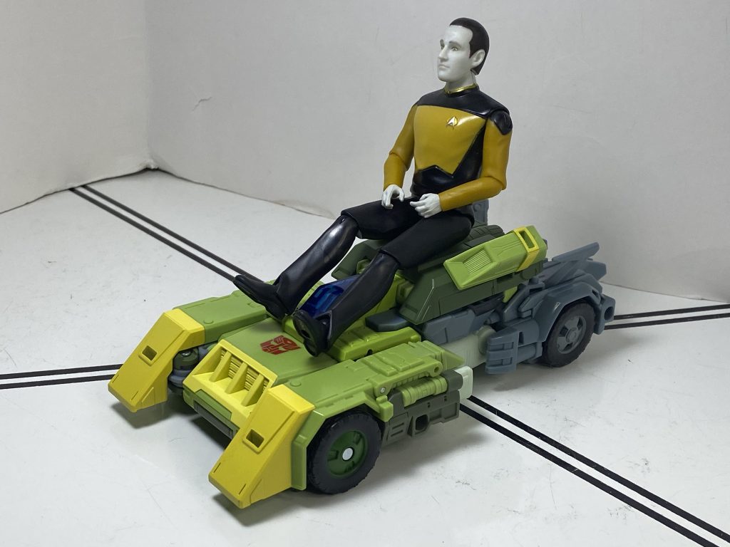
Yes, Data, it’s still green.
I’ll say this for his construction: As hard as it is to get everything in place, even with his robot mode feet kind of hanging there in the middle of the car body, slightly off of their tab (if there’s a way to get them to line up, I haven’t found it), the whole car still manages to hold together well, and even rolls on his four wheels, which pleasantly surprised me, since those are usually the first thing to not work when a Transformer’s this complicated.
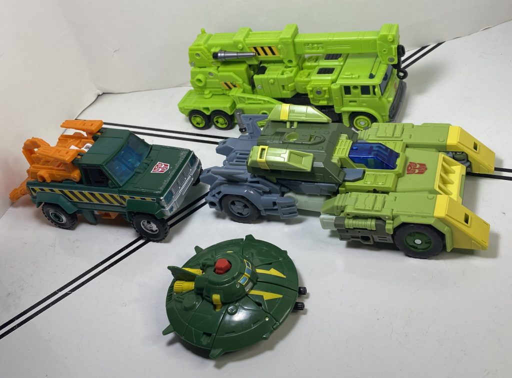
Heroic green machines.
That’s the only unique feature in this mode, with the rest being accessory storage. And let me tell you, the instructions recommend some weird ones. One of them is putting his green sword on his roof, specifically by the peghole it uses for his copter mode (the instructions are insistent on this), meaning it spins freely.
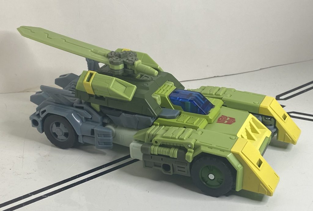
Yeah, no.
You can always just flip it over and use the much more stable rectangular tab, but that still doesn’t answer the question of why this armored car needs a backwards sword on its roof. Or a smaller, front-facing sword that can’t clear the windshield.
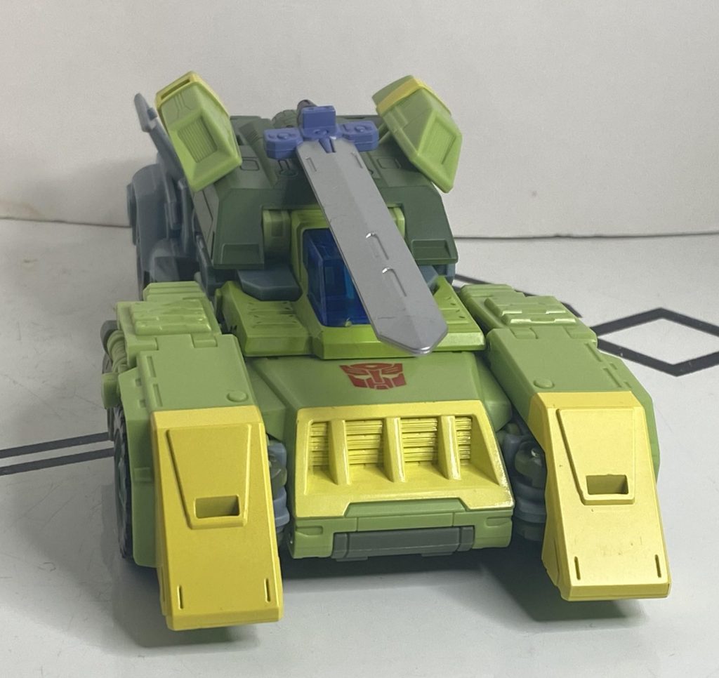
A completely useless threat display.
You can always just cover him with guns, though, between the three rectangular pegholes on his roof, and the four 5-Millimeter ports on his sides.
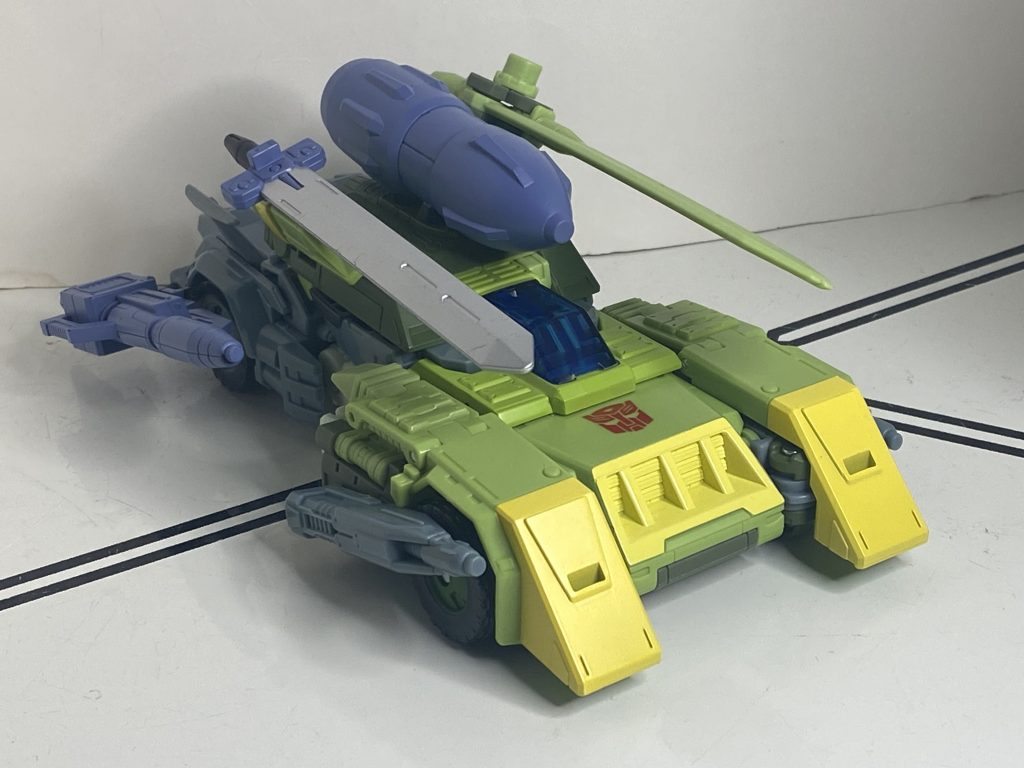
You don’t want to hit that bomb.
It’s much more fun, and slightly more practical.
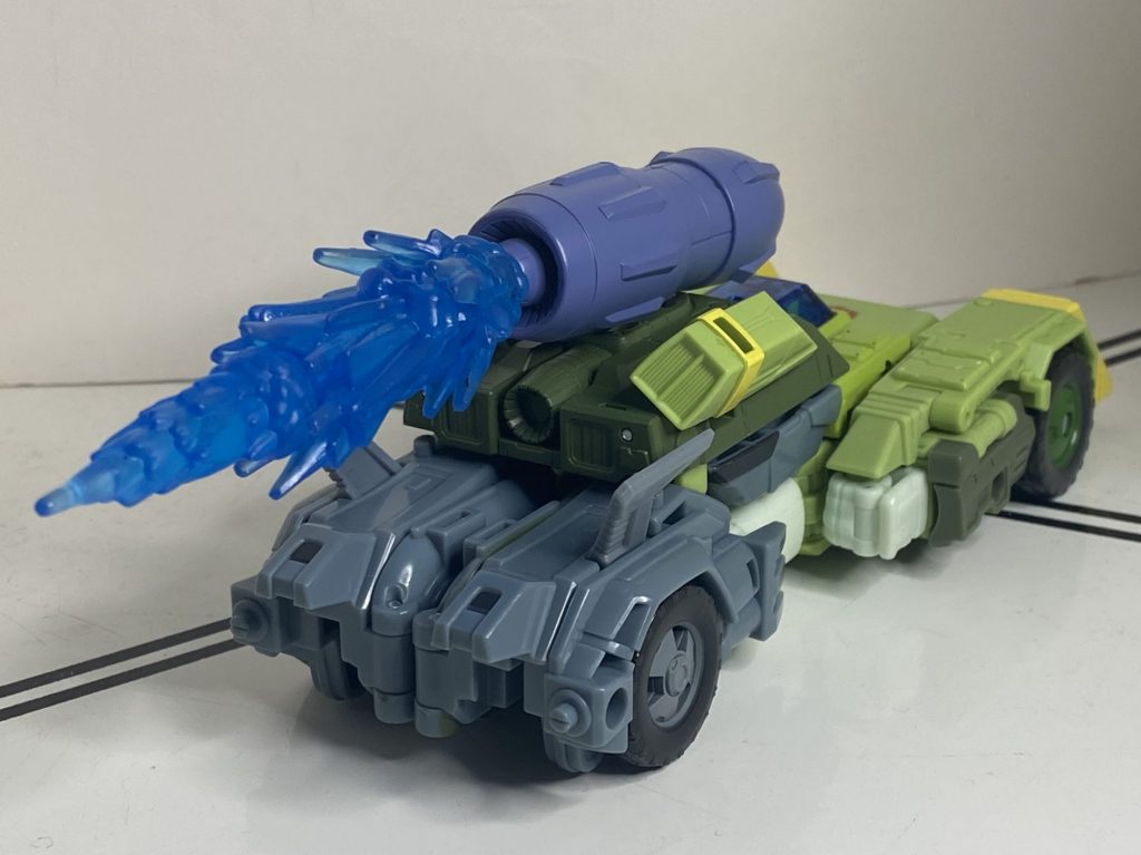
Only slightly.
Transformation to Copter Mode
This is technically easier than robot-to-car, if only because a lot of the tricky work with the midsection is already done. That being said, there’s just enough complicated rotational business going on with his legs here that I, again, needed to consult the instructions. So, remember back in the transformation to car mode, when I said that it’s really important that his shoulderpads are plugged into his upper arms correctly? That’s relevant here, because those panels on his forearms that flip out (one exposes his little arm laser) form little winglets on the sides of the helicopter, and will not pop into place unless the shoulderpanels are flush from being plugged in, because those extra millimeters make all the difference.
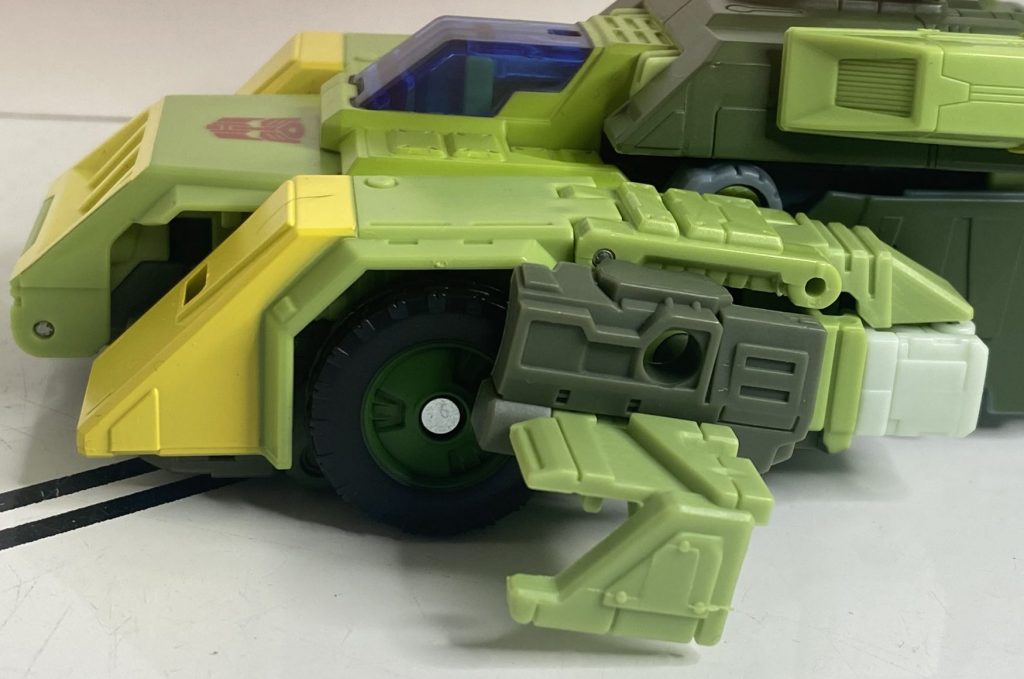
If the winglets aren’t straight, and won’t sit flush, you need to plug the shoulderpads in correctly.
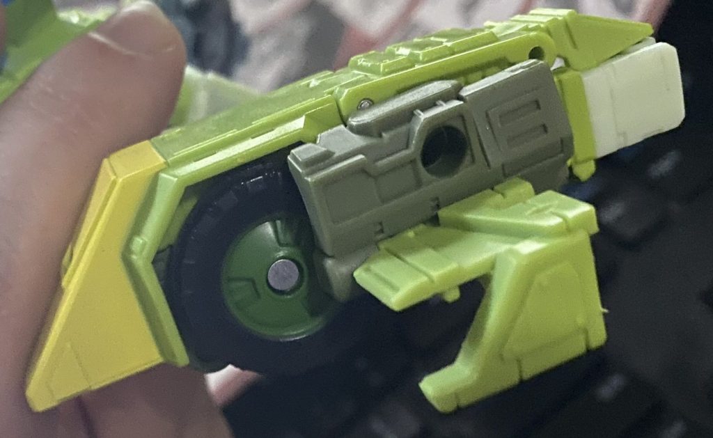
How it looks with everything correctly lined up.
I didn’t discover this until a long time after I bought this guy, and just assumed there was a critical design flaw with the winglets, since they didn’t go on straight, and wouldn’t plug in at all. Lastly, you transform his larger, green sword into rotors, and pop it in on top of him, and you’re done!
Copter Mode
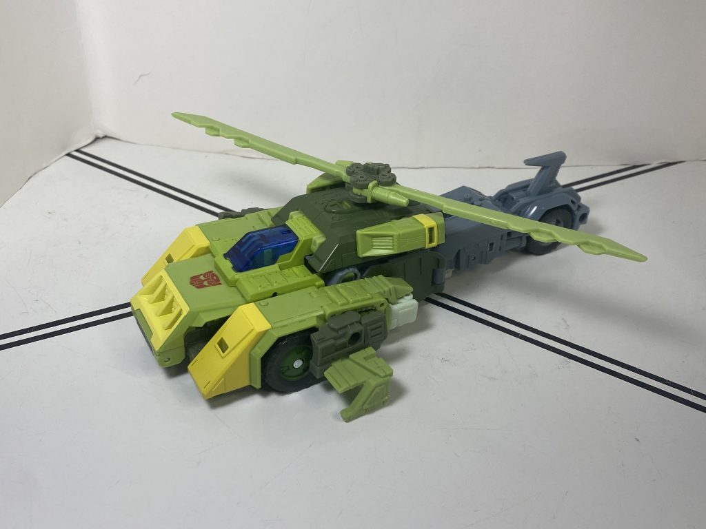
Fwumpfwumpfwumpfwump
Technically, Springer’s still the size of a normal Voyager in this mode, but he feels much larger, thanks to the long tail and thick front end.
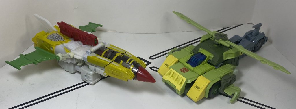
Jhiaxus is a bit bigger, but Springer is noticeably denser and heavier.
Despite having the same cockpit as his car mode, he also manages to feel significantly different, which is impressive. Lots of details have been moved around, and other things have their context shifted (like the rear wheels being the tail rotor), and it’s got a more slab-y vibe to it, which is funny, since this is the flying mode.
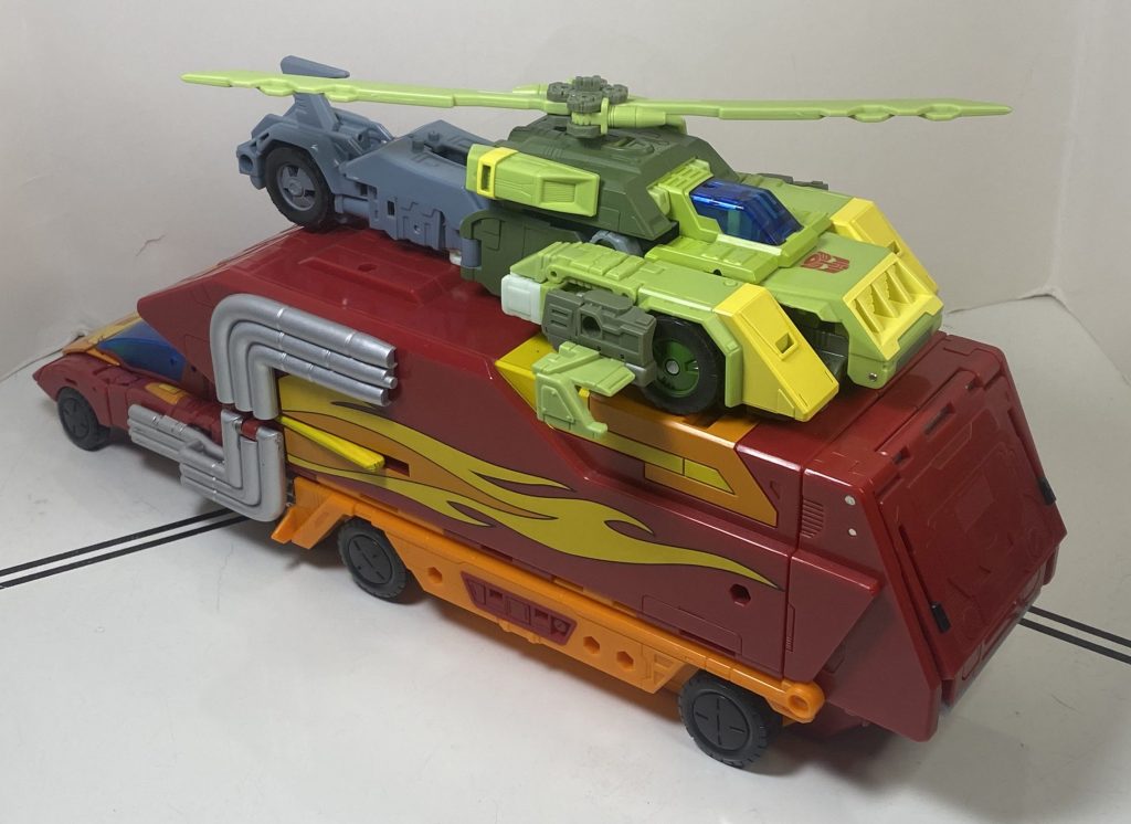
Rodimus Prime makes for a good launching pad.
I like it, though, it’s got very swooshable energy. There is an odd choice with the sculpt, here, and it’s his rotors: The blades are…how do I put this…symmetrical? When they’re supposed to point in opposite directions. It’s because the sword splits down the middle, but a little rotational joint could have probably fixed that. Still, it doesn’t bug me as much as I expected.
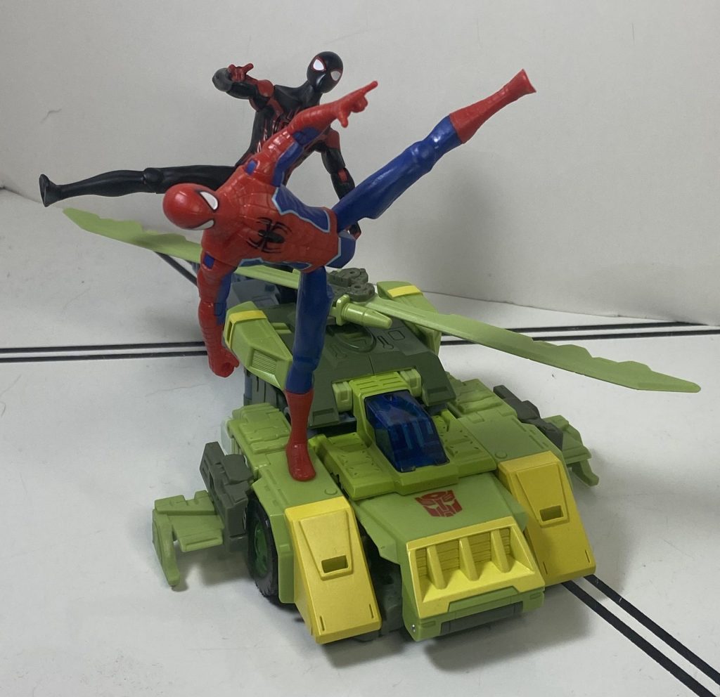
These two can ride the helicopter, but only because they’re quick enough to hop over the blades.
The colors are blocked the same way as the car mode, though, with few surprises, except for one detail: An odd strip of dark green paint at the front end of his tail, meeting his midsection. It’s kind of thinly painted over the gray plastic.
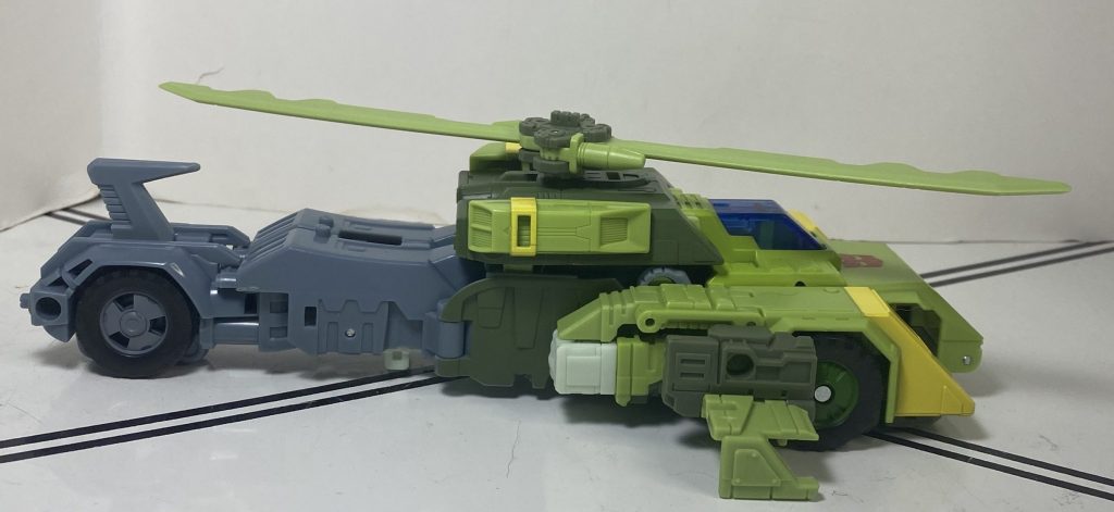
It’s right in the middle, there.
For features, the rotor spins nicely, and he still rolls on his wheels, for takeoff and landing! You can mount weapons on his roof, if you can avoid them hitting the propellers, and he’s got the same four pegs across his body, though the ones on his tailfin can’t really host guns that aim ahead. But he flies, so them aiming up and down makes sense!
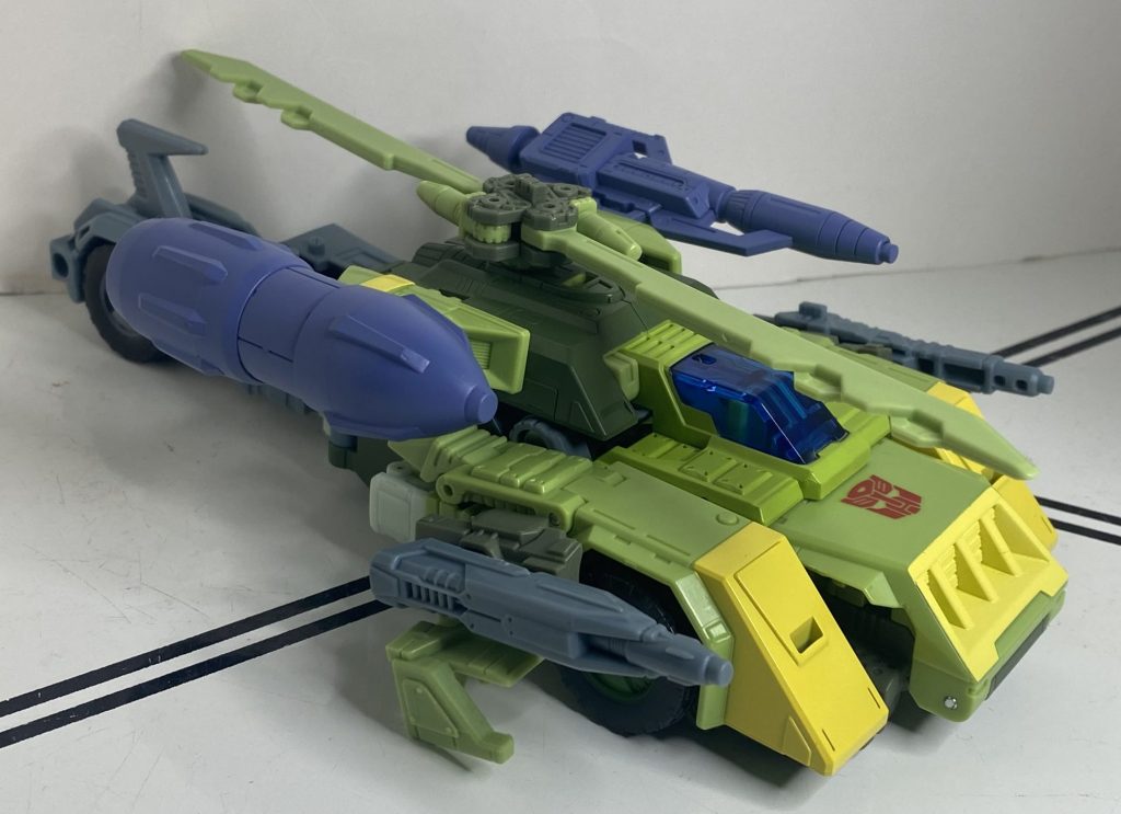
A Gunship, which is also the name of a great Retro Wave band.
Overall
Well, I’ll say one thing off of the top: I think this guy justifies the Leader-class pricepoint, just due to the sheer amount of stuff he comes with, which is not something I expected to think about the accessories. As for the robot himself, I do think he’s a bit too complicated for his own good when it comes to his transformations, and I feel like he’s going to end up living in robot mode on my shelves, because of it. And while there’s a few other little issues, generally he’s a pretty solid, if overly complex figure. But more importantly, unlike the Siege one, he’s memorable. It feels like the purpose of this retool was to implant a soul to a figure that somehow didn’t have one, and it was a complete success. Which is especially surprising for Studio Series 86, a line that I’ve found tends to make figures that feel like soulless box-checkers.
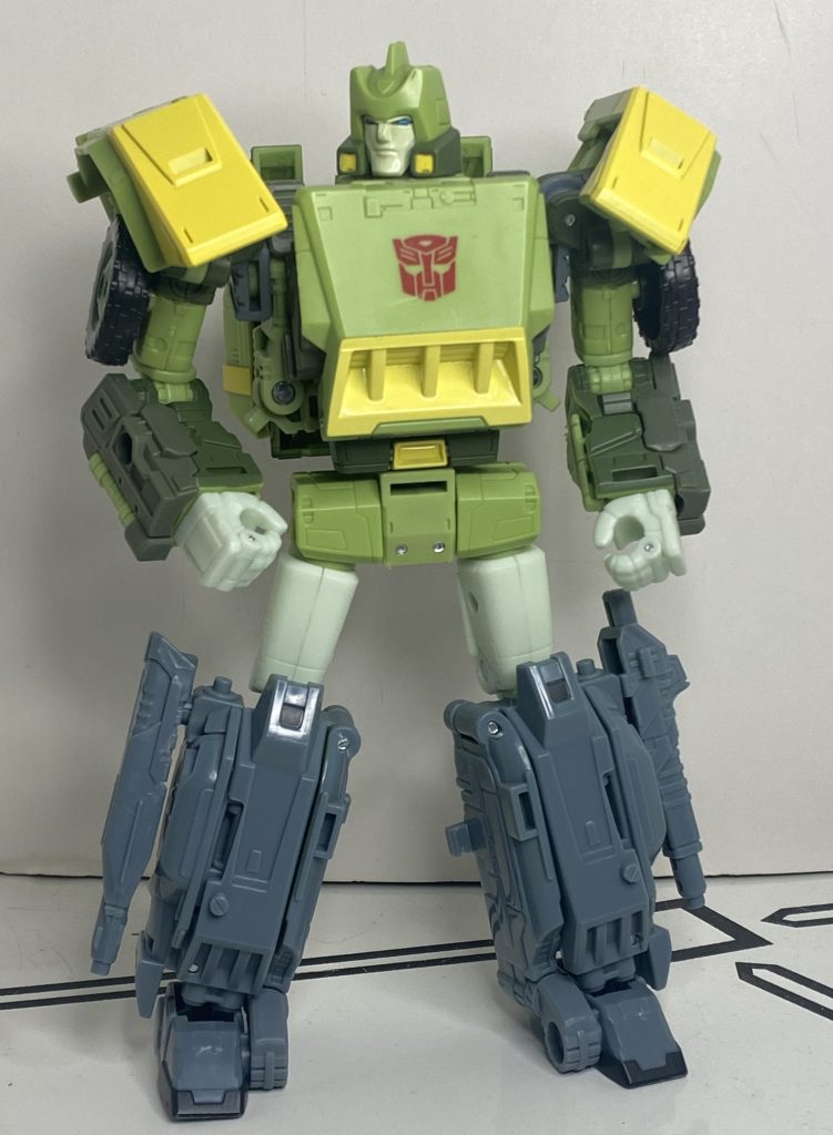
Even just standing there, he’s got charisma.
So, this isn’t a 10/10 guy. Like I said, he’s overcomplicated in ways that make me shy away from handling him. But he’s still, overall, pretty good. So I’ll say this: If you don’t have a Springer, get this one. If you have, like, the old Thrilling 30 Springer, though, this isn’t really essential. And if you have the Siege one, and don’t like him, or find him boring, or forgot you owned him, get this one.
For over 200 Bot, Non-Bot, and Retro Bot Reviews, click here to view my archive.


