I guess I’m on a Marvel Comics kick! I talked last week about a new figure of Marvel UK’s biggest original Transformers character, Death’s Head, so this week, it’s only fair I talk about probably the most well-known Marvel US original character: Straxus, the Decepticon Lord of Darkmount.
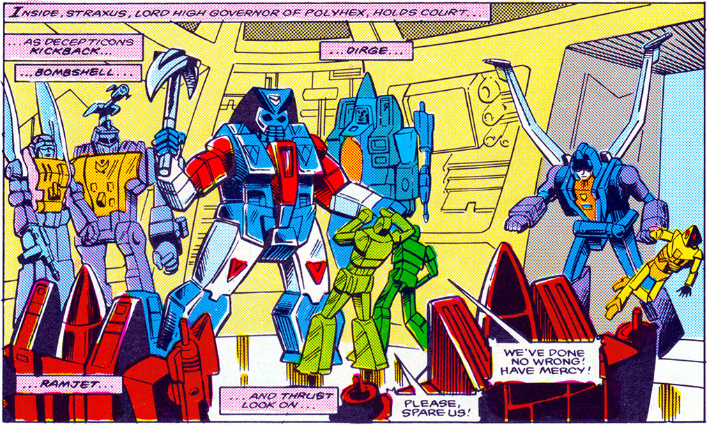
Surrounded by actual toys you could buy on shelves.
Straxus was created by Bob Budianski (and drawn by Don Perlin) to serve as the main bad guy in issues 17 and 18 of the original Marvel Transformers comic. The story saw us shifting focus away from Earth, and catching up with what was going on over on Cybertron. It turns out, things were bad! Straxus and his cronies (who also consisted of the 1985 Decepticon Seekers, and the Insecticons, to sell toys) had taken over the city-state of Polyhex (or the entire planet, according to the UK stuff), and ruled it with an iron fist, as Blaster, Perceptor, and a resistance cell made up of the 1985 minibots (and an ill-fated original character named Scrounge) tried to survive, and take him down before he could send reinforcements to Earth.
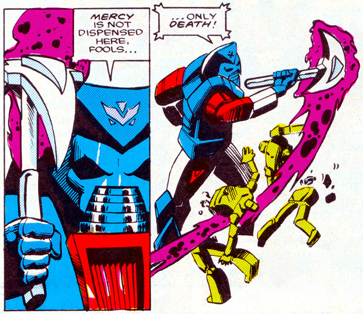
He only said this once, but it’s basically his catchphrase, to me.
As a character, Straxus was sort of a one-note Horrible Villain, but he did it with a loud, cheesy flare, and even in the pages of a baroque 80’s comic, managed to come across as hammy and larger-than-life in a way that endeared him to readers (it’s me, I’m readers). Those two issues would be his only appearances in the US comic, but he’d go on to cause problems in the Marvel UK stories, including a body-swapping scheme involving Megatron that led to a weird, gigantic retcon that I can’t get into here. Since then, he’s never made the leap to animation, but has continued to have little roles, mostly cameos, in other Transformers comics, trading on how strangely memorable his turn in Budianski’s writing was.
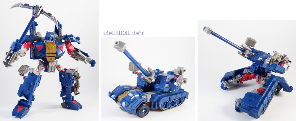
The first time he made the leap from page to plastic.
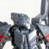
On the merchandise side of things, he, surprisingly, already got a figure way back in 2010’s Transformers Generations toyline, pictured above, and one that was a fully original tooling, too! But it was a tiny little Deluxe, and arguably didn’t really communicate the grandeur his character needs (and since then, all he’s gotten was a couple repaints here and there). And so this new version, from the Transformers Generations Comic Edition line, is very welcome, even if it was kind of hard for a Canadian to get (I had to order him off the America-only Hasbro Pulse site, with shipping and exchange, since the whole line wasn’t carried by any Canadian retailers). This figure itself may be a retool of Kingdom Galvatron, reviewed here, and as we’ll get into, that was actually a smart choice for him.
Robot Mode

The big blue meanie.
A lot’s been changed from Galvatron here. By my unofficial count, we’re looking at new lower legs (but not feet), a new pelvic plate, a new chest, new forearms (and thingies hanging off them), a new backpack, and a new head. Importantly, it’s enough to make him scan as a new character, not as “Galvatron with a new head.”
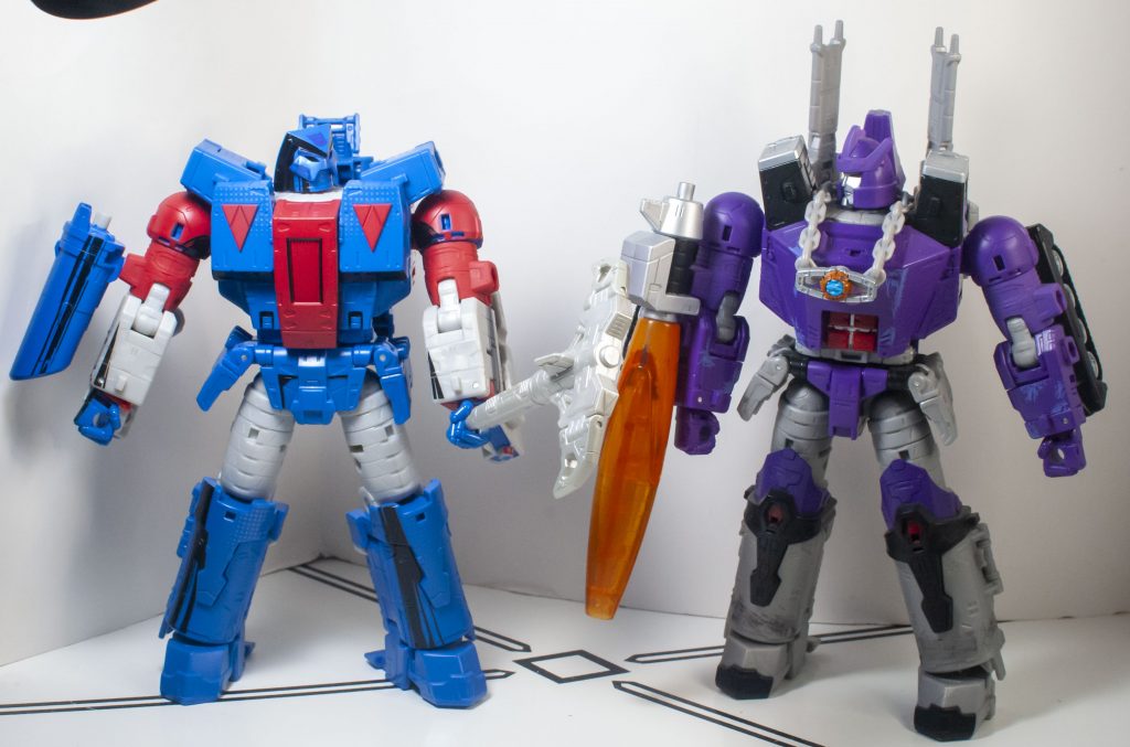
“Unlike that lout, I have peripheral vision.”
See, Kingdom Galvatron’s proportions always felt a bit off to me, when it came to representing the character. He was too wide, too stumpy, too barrel-chested. But, all of those things work for Straxus, with his booming, larger-than-life personality, so they’ve become strengths.
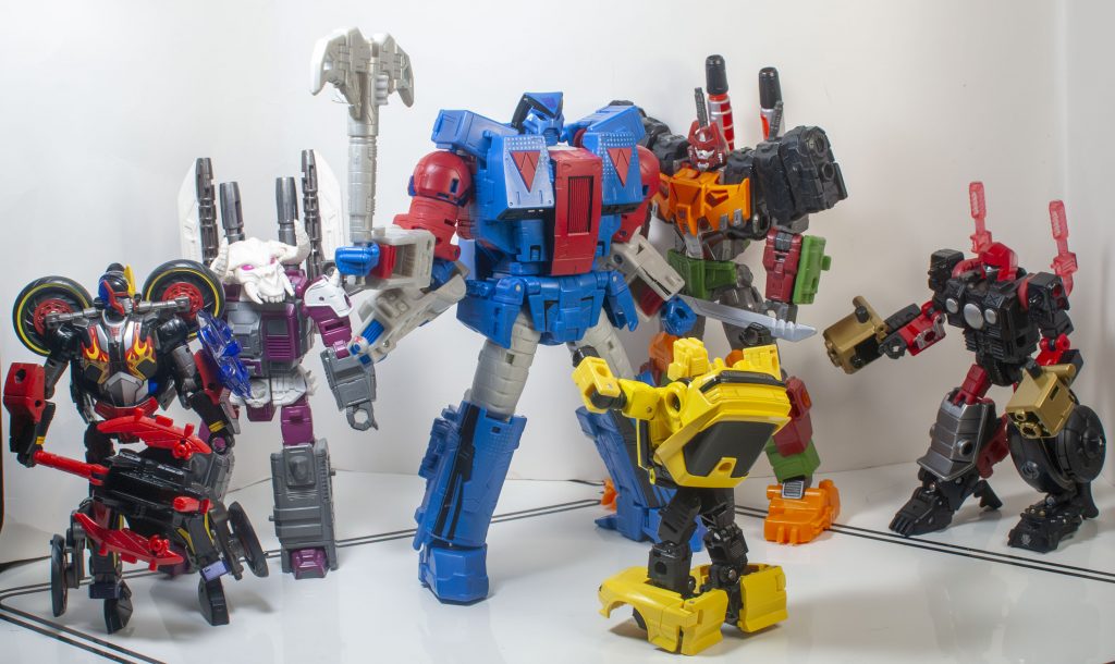
That awkward moment when I realized I owned no other characters present in the original comic panel.
When it comes to source material accuracy, it’s a finicky thing, because Straxus didn’t really have a proper character model drawn up, and was always a bit sketchy, but I will say, this guy’s a bit of a mismatch proportionally. Straxus, as depicted in the Marvel comics, had a huge head, and bulbous limbs, whereas this guy’s just got the big torso, and everything else is regularly sized. But hey, this guy has to transform, unlike the comic book villain, so that’s all forgivable, especially since he still communicates size and mass the way he is.

Death’s Head doesn’t like being grouped with the other Marvel Original Baddies.
For specific details, new torso looks right, with its upside-down Legend of Zelda Triforces, and central cockpit…thingie. The limbs, even with the retooling, are all less accurate, but again, the comic was sketchy, it all feels correct. One thing I’ve done in every photo here is intentionally mistransform his shoulder pylons, by splaying them out, instead of pointing them vertically, because it’s a Galvatron-only detail, and flattening them makes them less obvious. Plus, it means he actually has peripheral vision.

Nothing going on beneath the mask.
That new head, despite being a lot smaller than his comics version, is excellently sculpted, and leans into the weirdness of his design, where it’s a kind of cobra hood and mask, without any kind of face or eyes underneath it, just a metallic neck, like there isn’t even a person there.
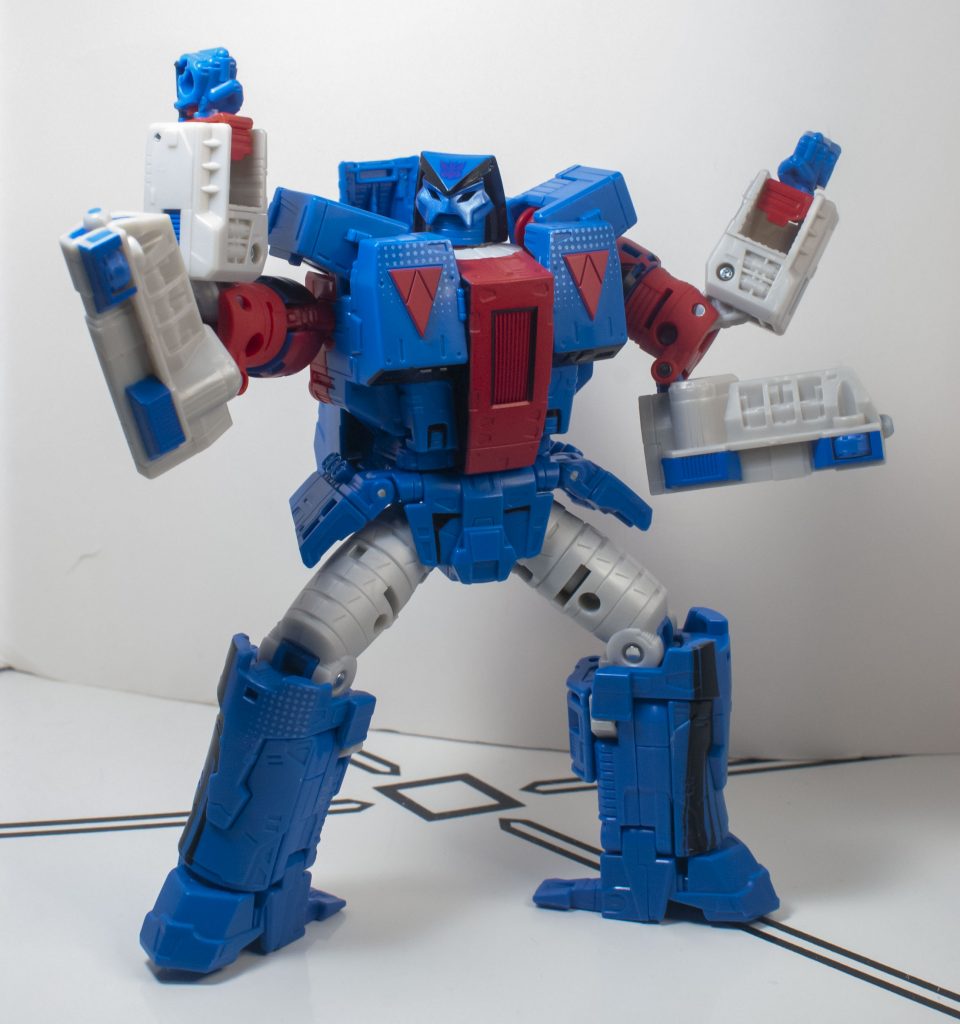
“How supremely irritating!”
The big problem that I have with the sculpt, though, is the things hanging off his arms. They were tank treads on Galvatron, and they’ve been retooled into boxy, techie things here. They stick out way more than on Galvatron, and often feel like they’re in the way. They’re new parts, so I wonder if they couldn’t have been removable or something, and turn into extra guns for him. The sculpting on their front does vaguely suggest weaponry to me.
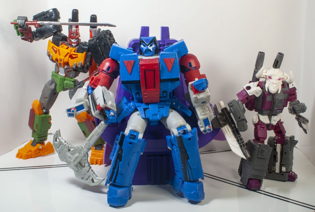
Demanding that all his guards be skeletons feels like a thing he’d do.
The colors on Straxus are another thing that you can’t judge on accuracy, because they kept changing from issue to issue (and sometimes panel to panel) in the original comic. There was some blue, red, and silver, and sometimes yellow! This is a non-yellow version, angling more towards how he appeared in issue one. So he’s deep, navy blue, deep red, and silvery gray, with accents of black. It’s all very straightforward, except for the “Comic Edition” paint on him.

He’s bathed in light, but still engulfed in shadows.
That’s a gimmick of this subline, a kind of special paint job that’s meant to represent inking, shading, and coloring from old-fashioned comic book pages. On Straxus, this mostly translates into black paint in various spots on him, imitating “shading.” It’s often asymmetrical, like on his forearms and legs. This kind of odd paintwork isn’t usually something I’m fond of, and I think it looks bad on some of the other figures in this line, but here, it’s subtle enough to look good, in my opinion.
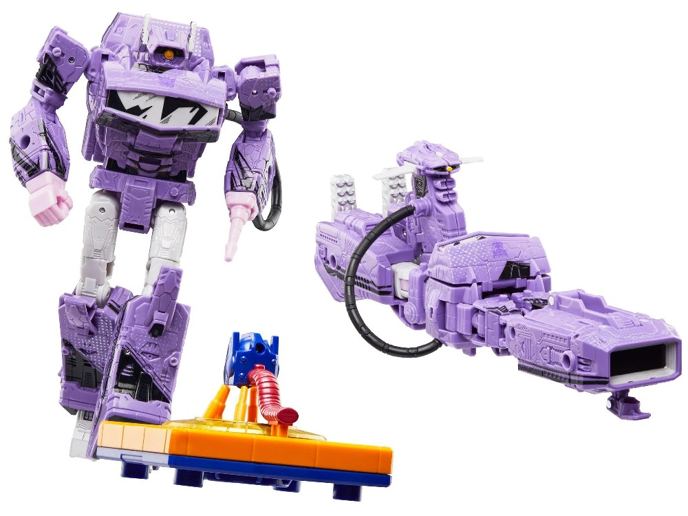
Shockwave is one that I think this paintwork gimmick looks bad on, for example.
It helps that a lot of the shading on Straxus, like the black on his headsculpt and under his pecs, is often where shadows are naturally cast on the figure in real life, so it feels more like a trick of the lighting, than something artificial. He’s also got a pattern of ben-day dots (i.e. old comic book coloring) on his pecs and knees, but it’s, again, subtle enough to feel like a natural part of his deco.
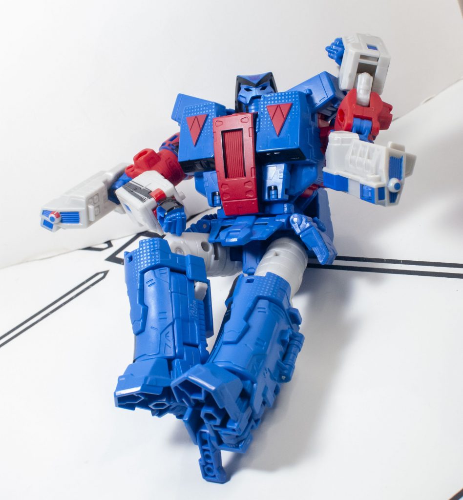
“All natural, my dear!”
Granted, it is a bit damning that I keep coming back to “this thing I don’t like is subtle enough not to bother me,” when it’s supposed to be a selling point, but it is what it is, and what it is is a good-looking figure.

Performing a musical number about the Smelting Pools at Darkmount.
In terms of build quality, like I mentioned above, Straxus feels generously dense and chunky in your hands, making you forget his short-for-a-Leader height. He stands really well, too, thanks to generous heel spurs. The only fiddly part is those dang arm-mounted….thingies. They just don’t stay in place, and love to get flung around as you pose him.

On his way to dispense death.
Speaking of that, Straxus is very poseable! He feels like his shortness means he’s got more money spent on joints, so he’s got a lot of little extras, like ankle and wrist swivels, and double-elbows. Straxus doesn’t feel like he should be bendy, but he is. His only real issue is that his waist is blocked from moving very much by his backpack. There is a weirdly specific issue I have, though: His arms aren’t flexible, or long enough for him to double-hand his accessory, and he should be able to, because he prominently did that a lot in his comic appearances, including on the cover of the comic that’s used on his packaging.
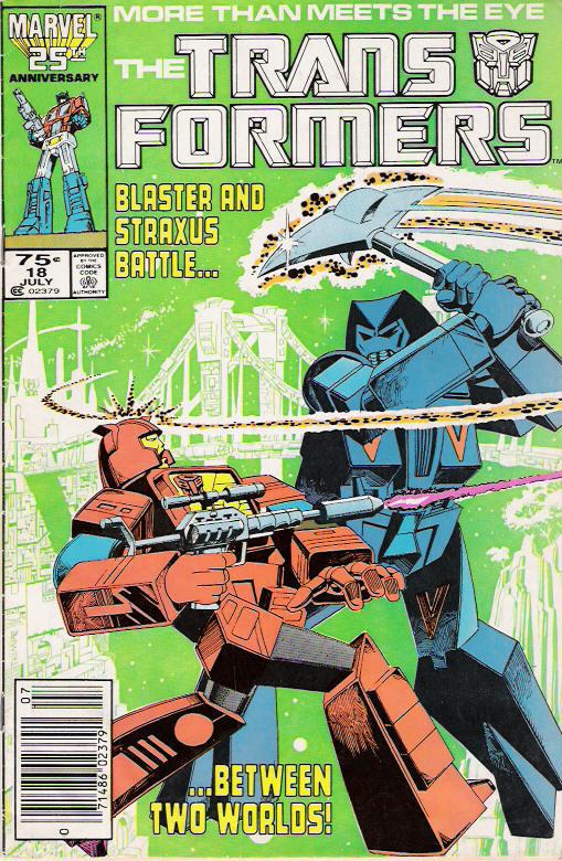
Two-handing his weapon on the comic cover….
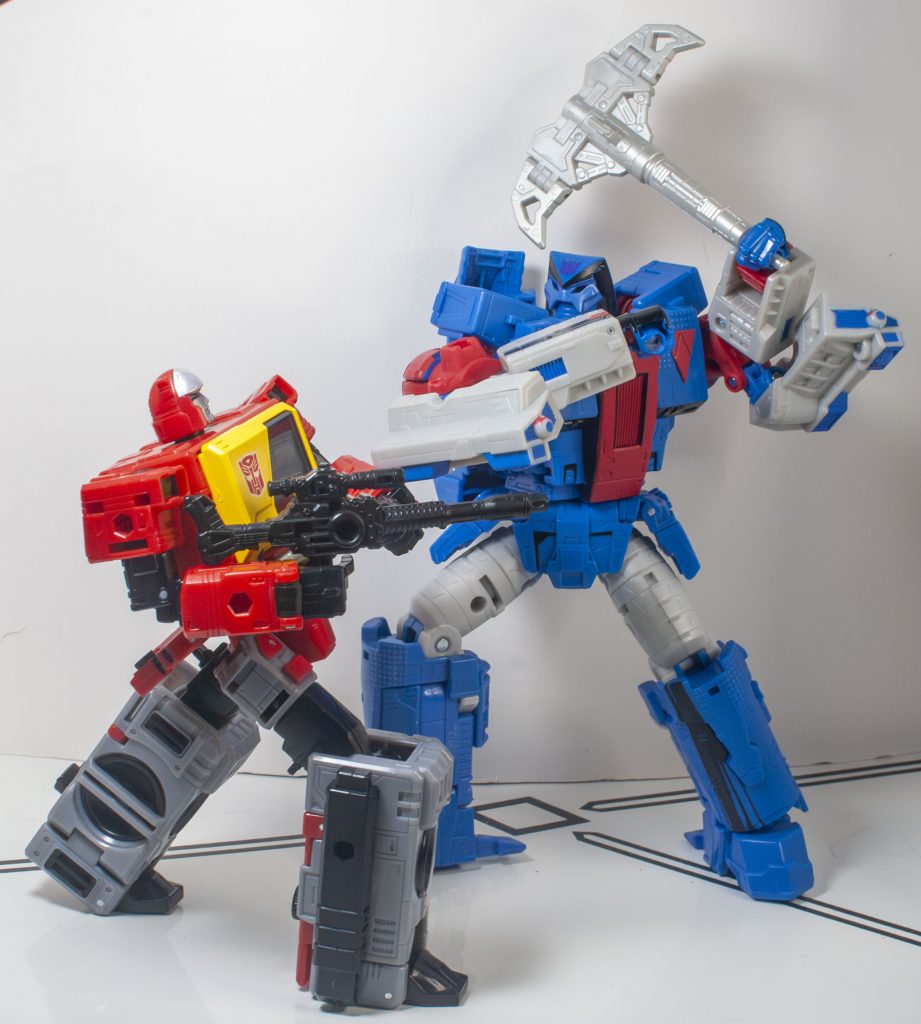
…And my best attempt at imitating it in real life, where he has to one-hand it.
But, to be fair, they’d need an entire new tooling built around making that pose happen to pull it off, because most Transformers can’t do that with their accessories.
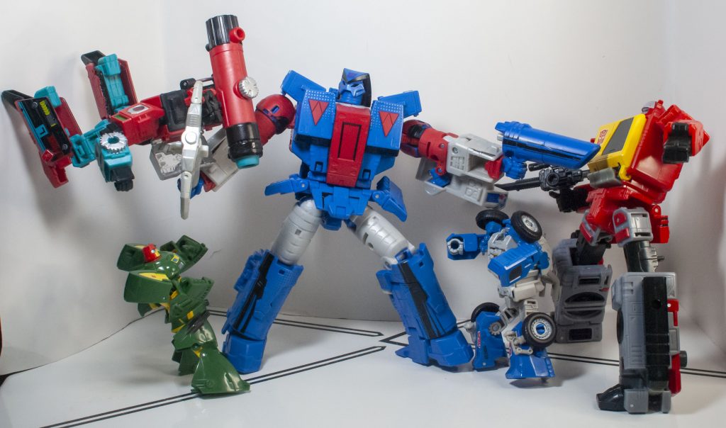
What he can do is hold his own against the Autobot Resistance.
Speaking of accessories, Straxus has got way less than Galvatron. While there’s less stuff overall that he could come with, Galvatron straight-up made some of his accessories up, so it is a bit of a drag to see less stuff here. In terms of what is, here, though, Straxus has got his famous pickaxe, which looks appropriately mean.
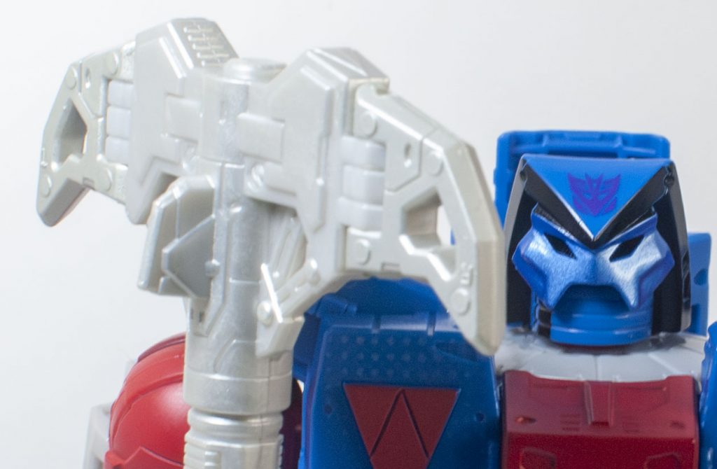
“Mercy is not dispensed here, fools….”
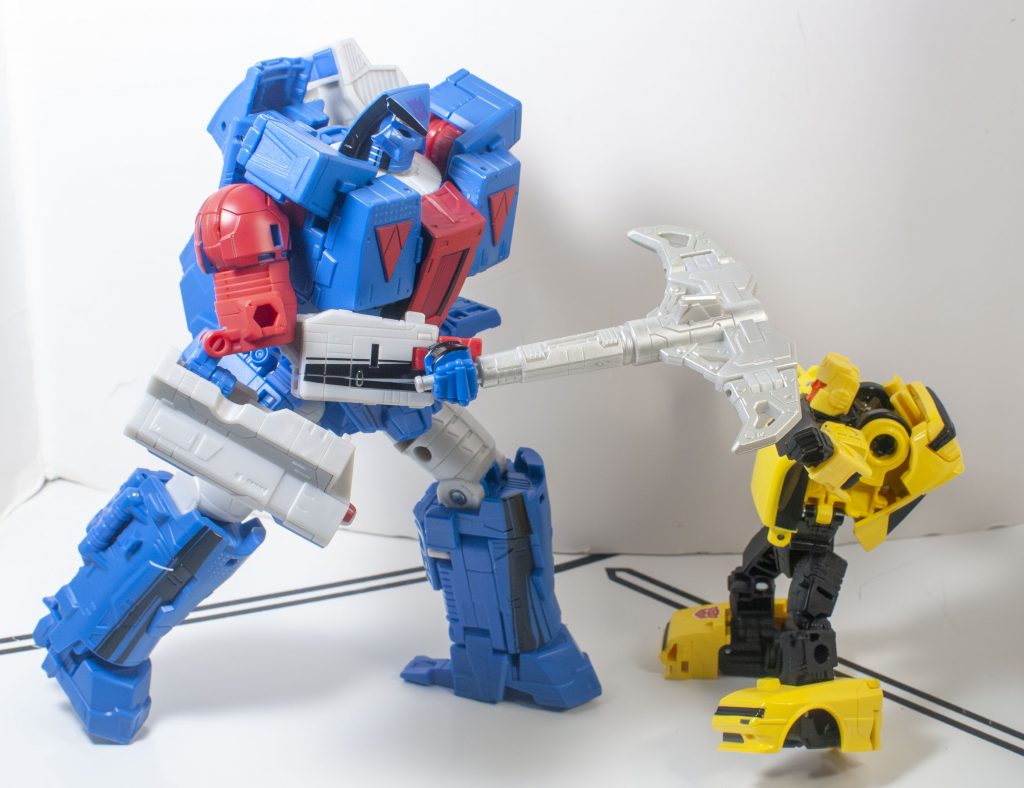
“….Only death!”
Its appearance was never consistent in the comic, but I will say that it feels way too small. That thing should be larger and meaner! At least his wrist swivels mean he can spin, dip, and slice it really effectively, even if it’s on the puny side.
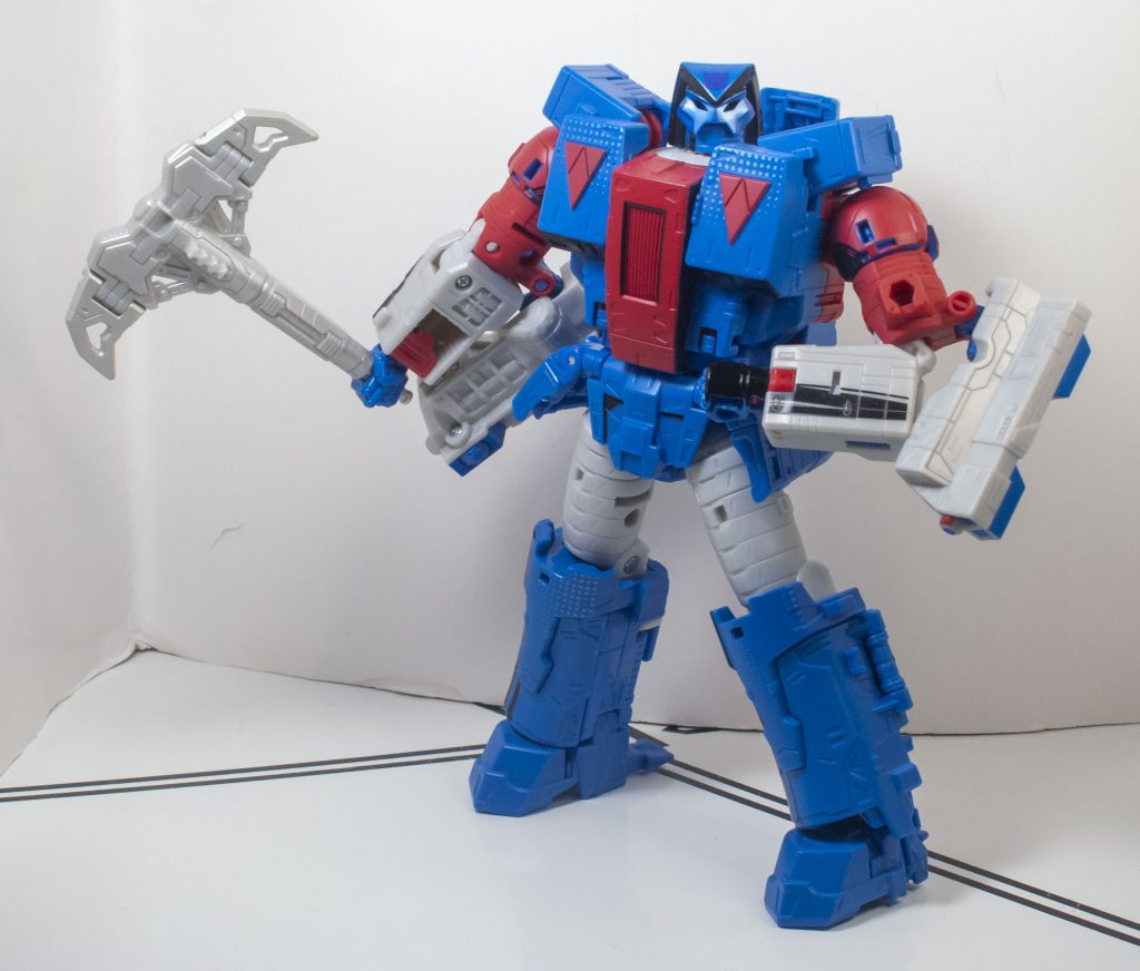
Go on, make a comment about the size of his weapon. He dares you.
His other accessory was invented for this release, and it’s a little round blue cannon, with a slice of that painted-on black shading through the middle of it.
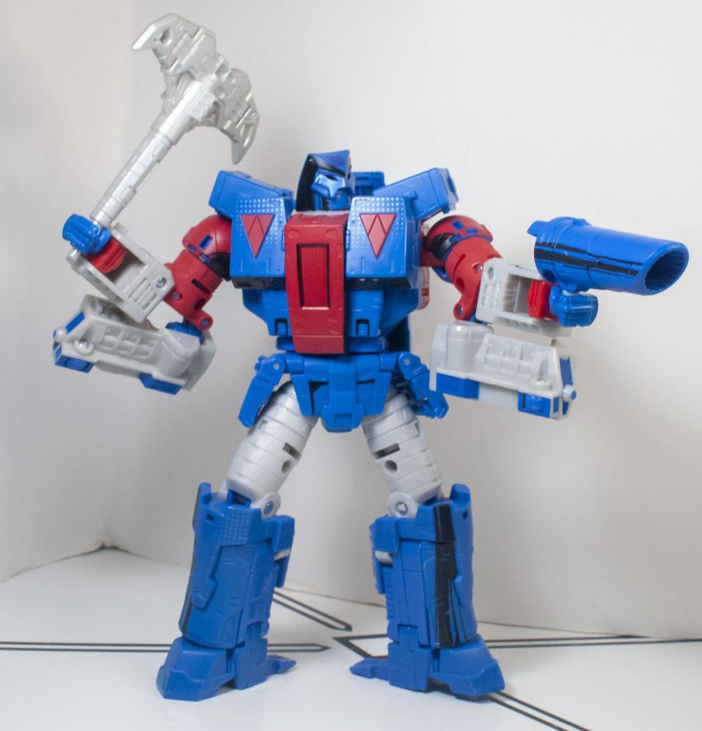
The better to blast with.
He can hold it in his hand, and it reminds me of some kind of hand-cannon for big game hunting, which matches the character’s vibes. One awkward thing about it, though, is that the barrel is too big for blast effects. You have to find one that you can awkwardly cram in there.

I managed to, but it was tough.
He can also mount the cannon on 5-millimeter ports on his upper arms, left over from Galvatron, and he’s got an additional set of ports under his feet, making him feel less accessory-compatible than he ought to be.
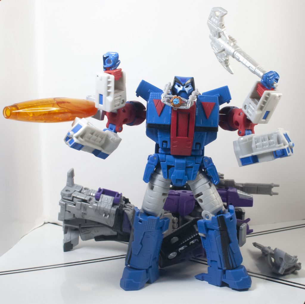
This can’t end well.
He can also store one of his accessories on his back, or the other, but not both at the same time.

Does he slice them?

Or does he shoot them?
Transformation
Like I said with Galvatron, this guy transFORMS. Apparently on Galvatron, this complicated transformation was to facilitate a quirk of the animation model where the torso changes colour, the pursuit of which is part of the same “tooner perversion” school of engineering that netted us the Origin figures (which, to be clear, I really liked). On Straxus, this just means he has a strangely long, involved transformation, for no clear reason.

This is the simple part!
But! Here’s the thing. It’s a really fun transformation, where it’s never unclear what you need to do, it just has like 7 million steps to it. There’s all these moments where you think things aren’t going to lock in, only to discover little pegs and holes you didn’t realize were there. So, it’s a lot, but it’s very fun and friendly, not like the drudgery of, say, an over-complicated Masterpiece, or a particularly bad third party figure.
Alternate Mode
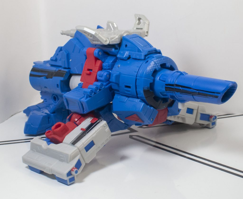
The big, blue, booming baddie becomes a blasting barrel.
So, this is half the reason why he was a Galvatron retool. You might take a look at this space-cannon alternate mode, and go, oh, they just kept Galvatron’s alternate mode. But here’s the thing: Straxus changed into this in the comic. Just check out a photo:
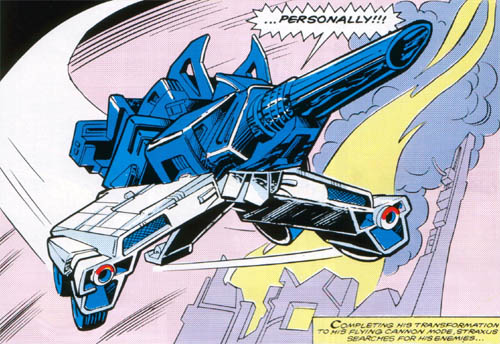
Exhibit A. Well, okay, it’s the only exhibit I’ve got.
That’s right, a year before Galvatron existed, Straxus just happened to also change into a flying space-cannon, and as far as I know, no one making the comic knew that next year’s big bad would have the same altmode, so it’s seemingly a big cosmic coincidence.

And extremely convenient.
And a lot of this retooling, including the little pods, and the new cannon, are imitating specific comic details, making the whole thing even more impressive. My favorite little trick here is how his pickaxe stashes on top of him, and its fins splay upwards, to imitate specific details of the Marvel design. It almost makes the undersized accessory worth it.
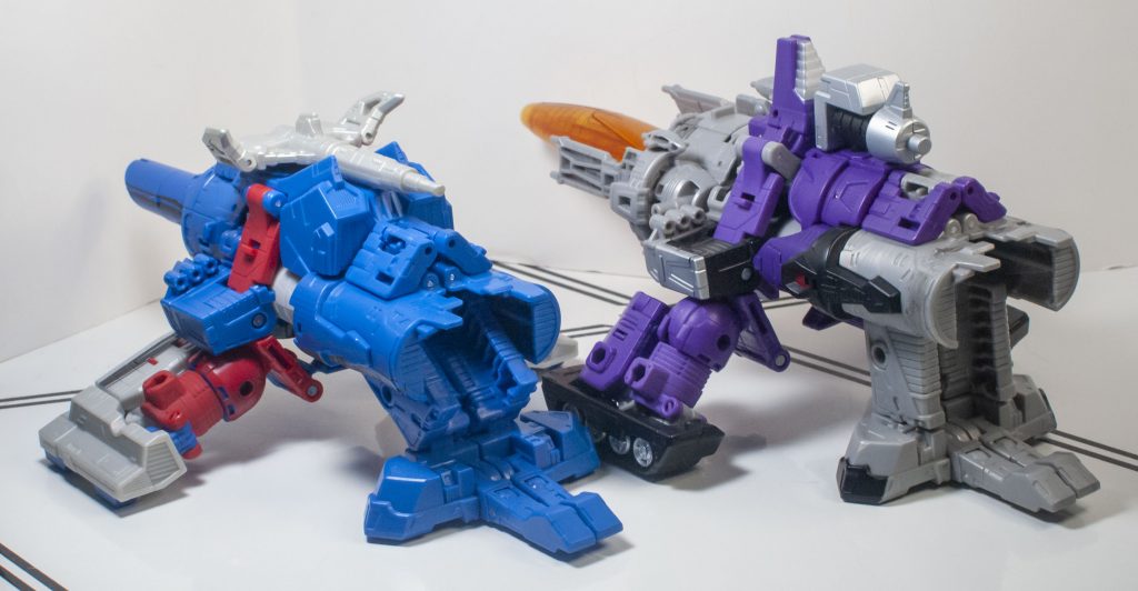
Forced to droop.
Another funny consequence of the retooling is that he’s lower to the ground than Galvatron is, thanks to his rear leg only being able to descend diagonally to the ground, instead of vertically, like on Galvy, so his whole shape’s a bit different.

My attempt to raise him up a bit.
This mode also makes some of his Comic Edition shading make good visual sense, by having the black deco on both his legs, and cannon match along a similar horizontal line.
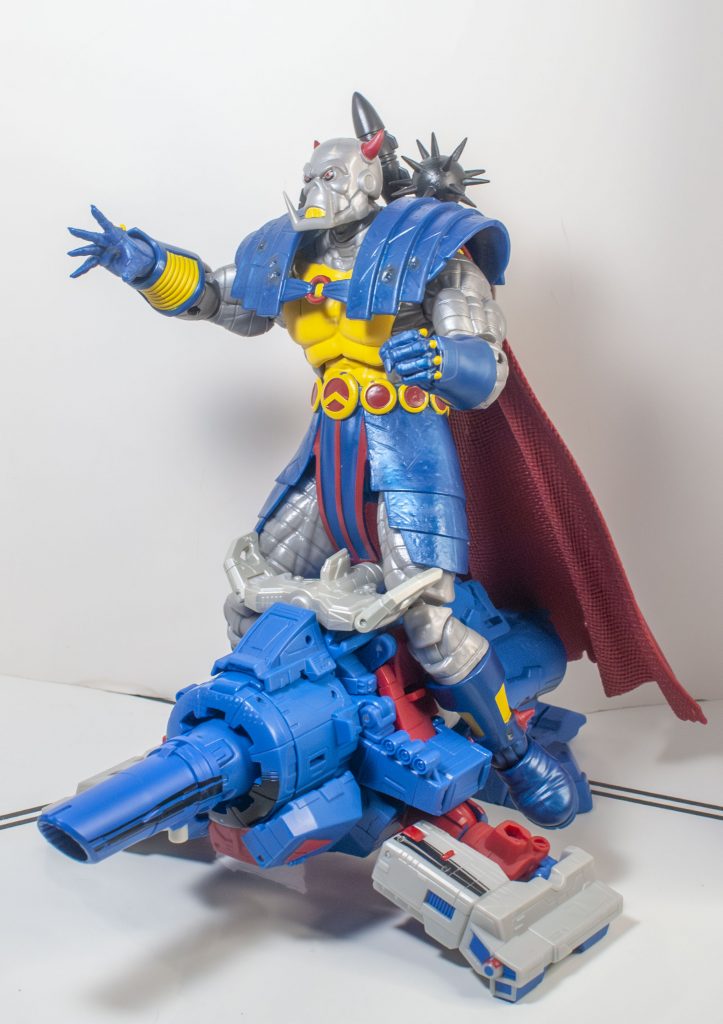
An unlikely partnership, but Death’s Head needed a lift.
There’s almost not much to say about this alternate mode, beyond the impressive trick of being so accurate to what’s on the page, though I think a reason for that is his lack of features. All of his accessories are being used to help form the alternate mode, that cannon’s too wide to use blast effect, and he can’t really roll, since his new treads, strangely, only have one set wheels in them, while the ones on his rear leg are still there, so he drags more than he ought to.

Not very conducive to ground travel.
You can make use of the two 5-Millimeter ports on his left and right support arms, though, to add some extra armaments.

He doesn’t care that one of them doesn’t shoot, it’s about the aesthetic.
Still, the whole thing’s really stable, and it looks nice, at least.

“Did you SEE the Straxus? They FLIPPED the glitch!”
Overall
I think this guy’s kind of a lateral move from Galvatron. He’s got fewer accessories and features, but a lot of clever retooling, and a presentation that generally feels more lush. And, to be clear, Galvatron was a very good figure, so a lateral move means this guy’s good, too. As Straxus, this is absolutely the best version of him we’ve ever gotten, and it feels like he really captures the inherent bombast of the character, that loud, hammy attitude that led this one-note bad guy to become so well-liked, and that makes it worth it to me.
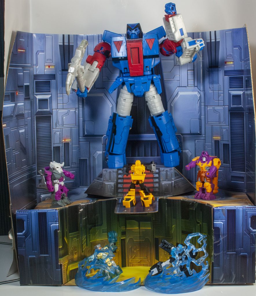
And not worth it to victims of the Smelting Pool.
The rest of the Comic Edition line didn’t really grab me, since it’s paint jobs I don’t like on figures I already own, or could easily own, or characters too obscure for me to really want to go through the trouble of importing. But this guy, he’s just right, and if you’ve got a soft spot for him like I do, this is an easy recommend, even with the extra trouble of getting him to Canada. And even if you’re not specifically a Marvel Transformers-head, he’s a unique-looking retool of a good figure, different enough to feel special. “What’s not to like?”
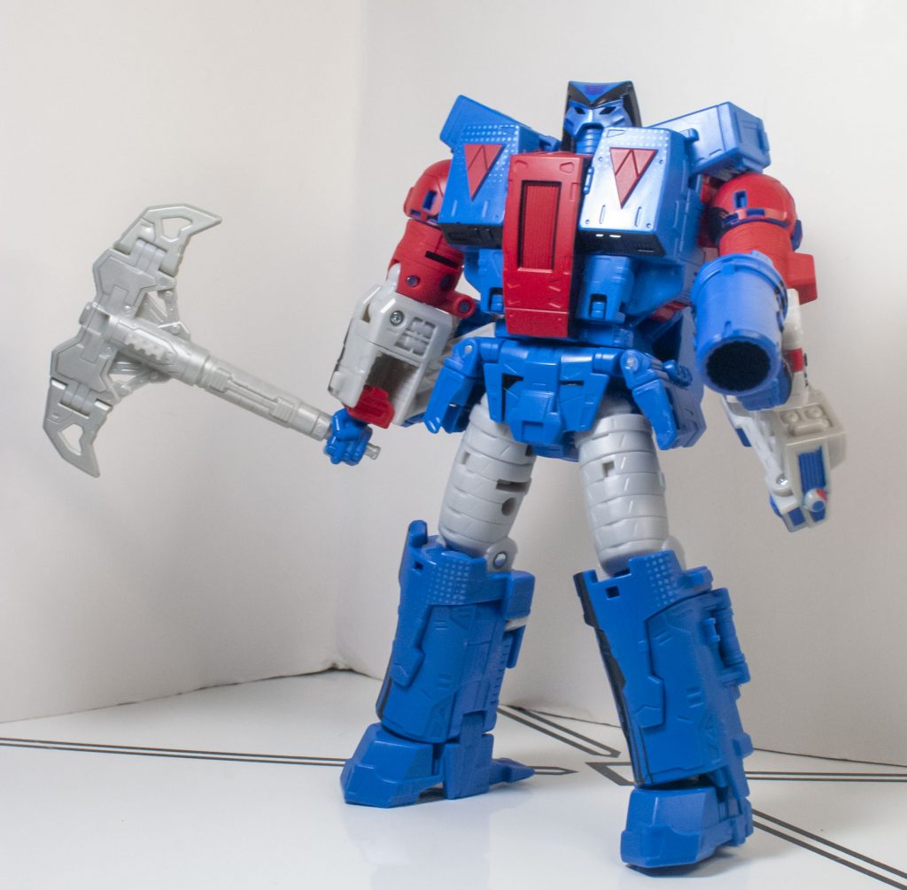
…He asks you, pointedly cocking his weapon.
For over 200 Bot, Non-Bot, and Retro Bot Reviews, click here to view my archive.


