Is a new coat of paint all it takes for me to come around on a figure? Am I just a mark for obscure deep-cuts that appeal to my really specific aesthetic proclivities? That seems to be the entire idea behind the Toxitron Collection, the latest Wal-Mart exclusive batch of Transformers: Legacy figures. The concept: A big batch of repainted robots, with their new color schemes homaging various older canceled repaints from Transformers history, mostly from Transformers: Generation 2. Because Generation 2 came out in the early 90s, it has a reputation for color schemes that were gaudy, bright, and eye-searing, with that whole aesthetic being the other thing that ties the Toxitron collection together.
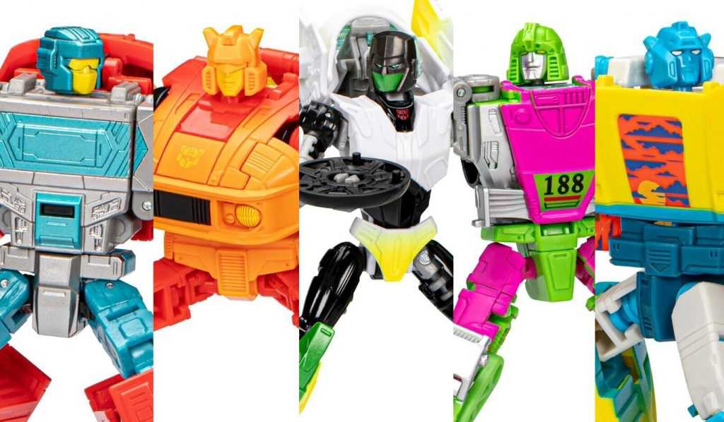
Blinded by the light.
I am, of course, a giant mark for a good Generation 2 reference (it was where I started with Transformers), and the deliberately loud color choices of that period l appeal to me. Honestly, it’s taking all my restraint (and periodic glances at my shelf space and bank account) to not just go in on the whole Toxitron Collection. So, for now, I’ll stick to this single guy, a repainted version of the Autobot Mirage, referencing a planned-but-cancelled Generation 2 repaint of his original ‘84 toy, in a bright pink and green color scheme.
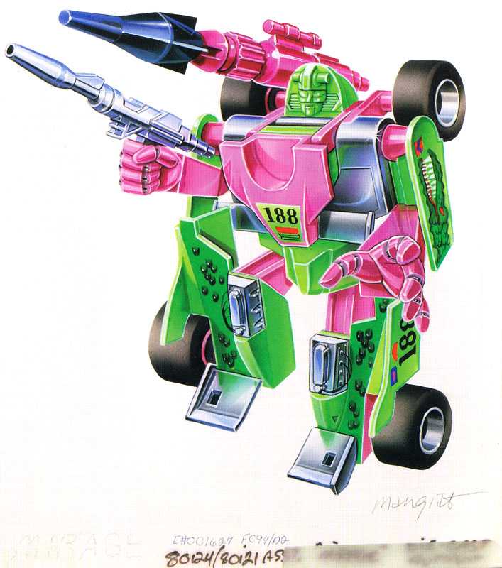
The packaging art for the cancelled toy, which give us our clearest look at what his colors would have been.
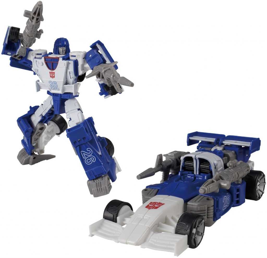
Here’s the thing: This new figure is specifically a repaint of Kingdom Mirage, a figure I didn’t really like.
Bleh.
I stick by everything I wrote in my review at the time: Kingdom Mirage was an extensive retooling of Siege Mirage, which was done, in theory, to give him an Earth mode (despite his Siege figure already having something that looked like one), and improve his cartoon-accuracy. But in practice, the retooling did neither, while making pretty much everything about him worse, including his transformation, joint tolerances, and even his ability to properly use his accessories. I’ve since sold the Kingdom one off, because it sparked no joy (I kept the Grimlock he was packaged with, though. He rules, even if parts of him are yellowing a bit). So, why would I buy another copy of this figure? Because of the colors.
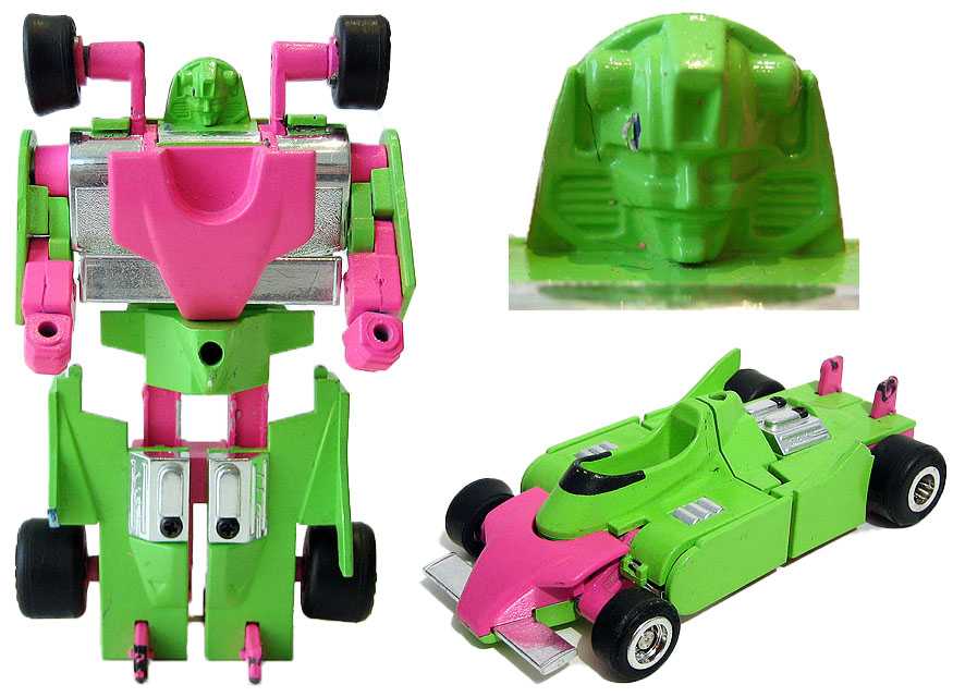
A hand-painted prototype, providing a less-complete look at his planned colors.
In fact, I already own a Mirage update in these cancelled G2 colors, in the the form of the unofficial Third-Party release. Ocular Max’s Sphinx Regenesis (reviewed here), a TFCon exclusive Masterpiece-scale take on the design.
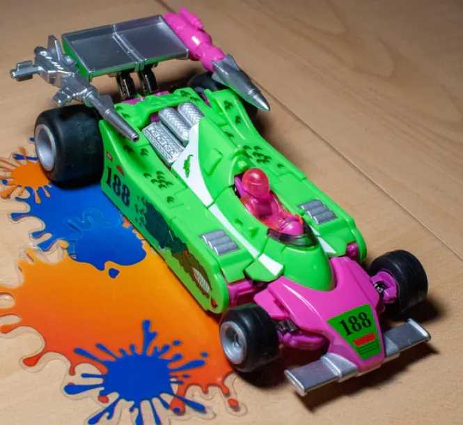
Still a favorite of mine.
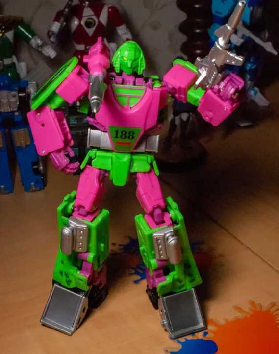
At the time, that figure’s colors, outside of being the kind of Generation 2 thing I love, really reminded me of the aesthetics of Splatoon, one of my favorite video game franchises, itself kind of a love-letter to loud, bright 90’s culture. And so, I decided that he wasn’t Mirage, he was N-Zap, a bot with the personality of a hyperactive 90’s video game mascot-protagonist, who spent his time engaging in racing and battles for sport, instead of making war. And now, there’s another easily accessible version of this colorscheme I’ve imprinted a character onto, available as a mainline figure. There was no way I could turn this down.
Robot Mode:
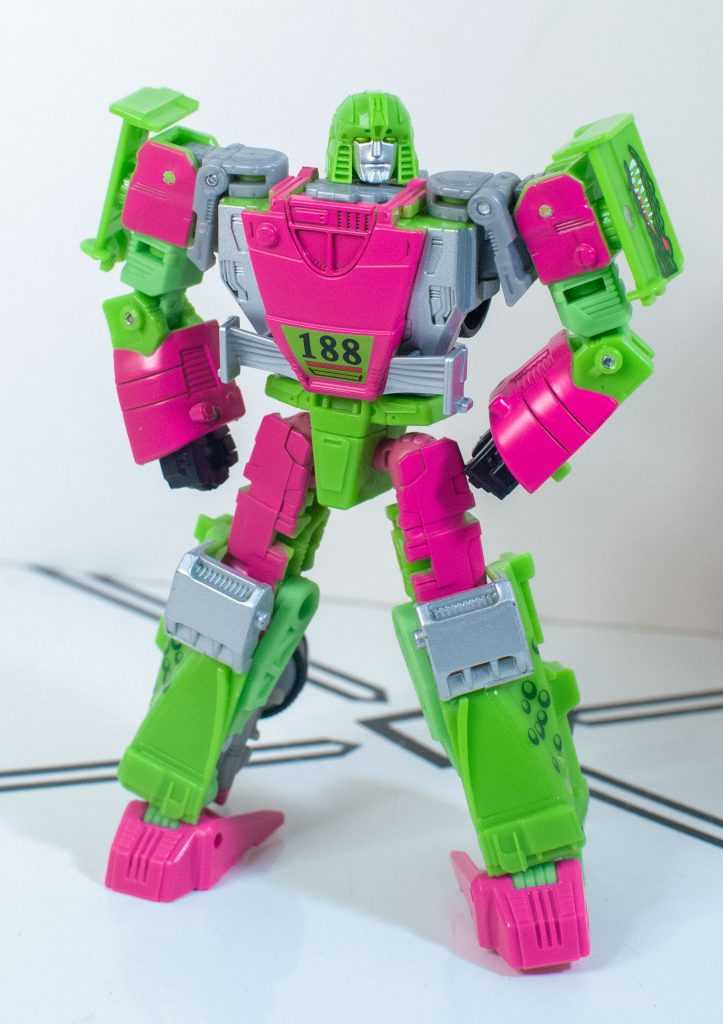
I had to really mess with the colors of these pics after taking them to make sure the pink didn’t look too purple.
You know, removed from the context of the Siege version of this guy existing, this isn’t a bad representation of Mirage at all. It helps that the only real “iconic detail” he had, outside of his headsculpt, was his formula-1 hood chest, which is here, and sculpted well enough that you don’t immediately notice it’s a fake, with the real car hood having split into his legs. Proportionally, he does feel a bit too broad-shouldered and linebacker-esque, with Mirage seeming like he ought to be a bit slimmer, but I think that’s mostly due to me remembering the Classics Deluxe toy from 2006, rather than how he was actually drawn or animated in any 80’s fiction.
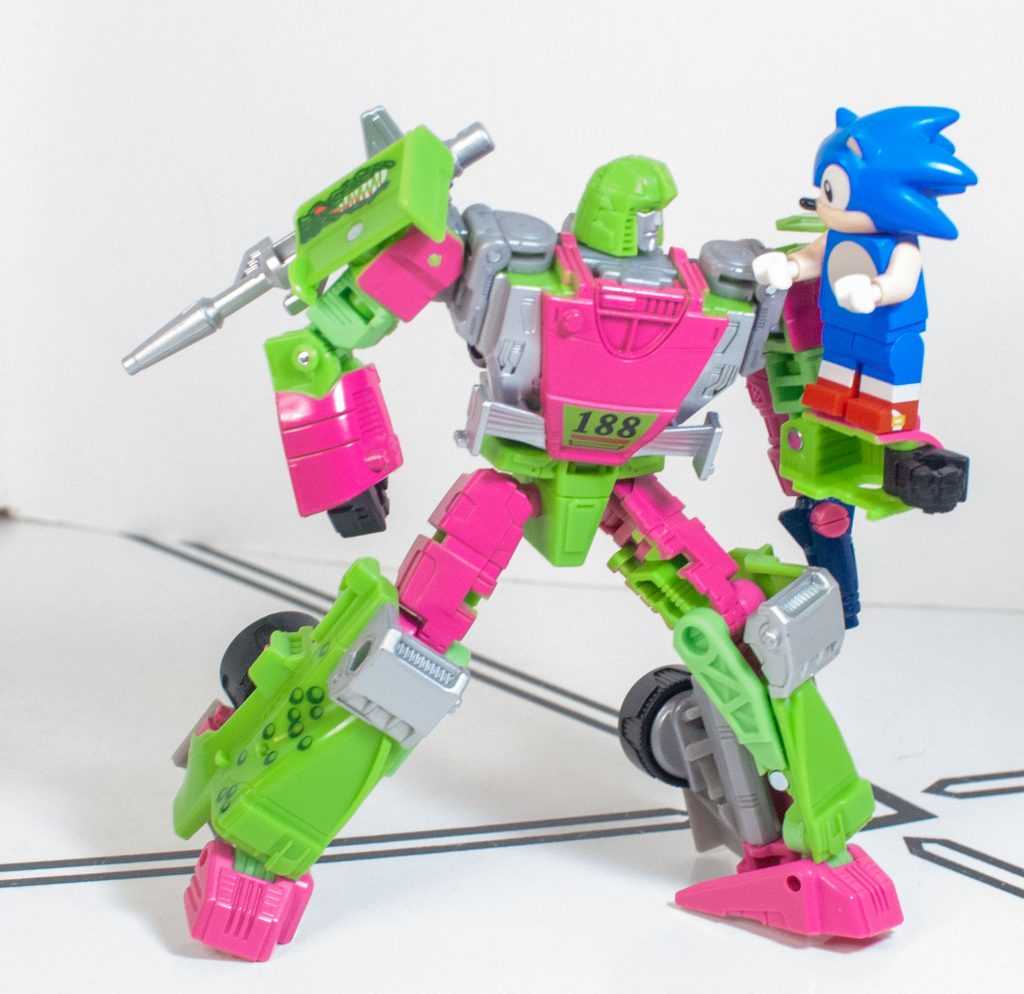
90’s speedsters unite!
Of course, there’s a fact that I need to bring up yet again, which is that he’s supposed to have a shoulder-mounted cannon as part of his design, since both his original toy, and his animation model did, but this one does not, because there’s no way to place the included accessory on his shoulder. I mostly care because the Siege version had a shoulder mount, and the designers tooled it out when making this supposedly-more-accurate version. It’s just a baffling choice I will never fully get over.
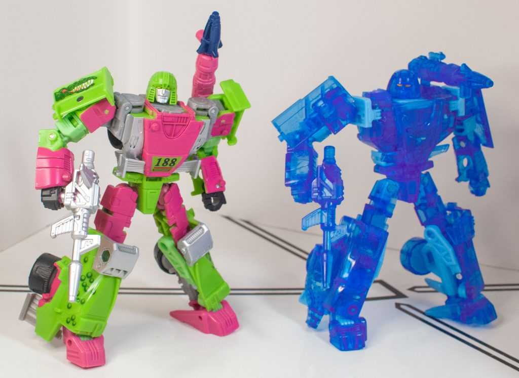
TFW you project an illusion that’s a better tooling than you (Siege Holo Mirage pictured).
But, you know, I already don’t look at this as a representation of Mirage, thanks to that fan-character repurposing, and on his own, he’s a pretty cleanly sculpted, nice-looking robot, with the only real altmode parts hanging off of him being little shoulder panels, and a kind of a mess of wheels and car-front parts behind his lower legs.
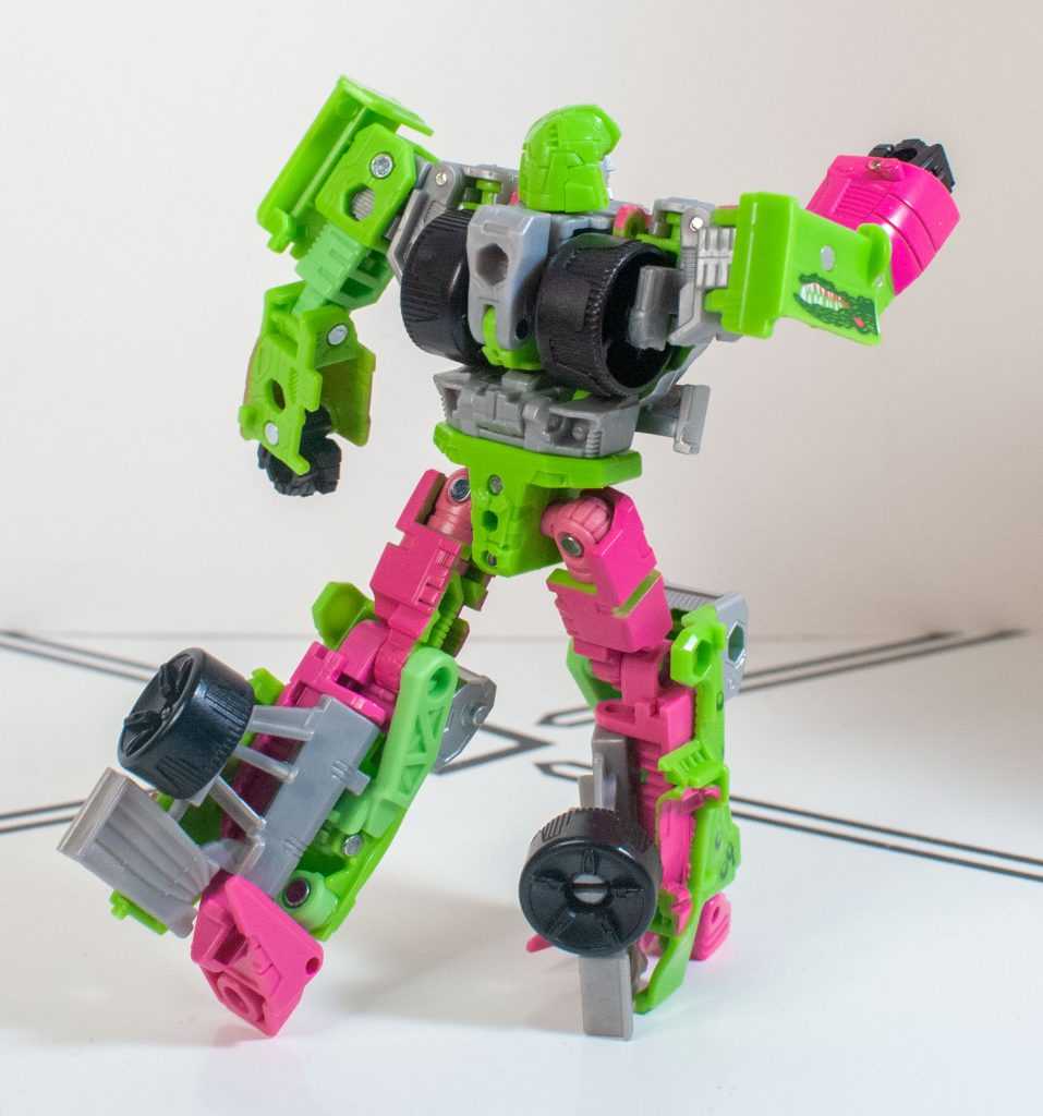
Running from the paparazzi’s unflattering angle.
The headsculpt’s another thing that felt off to me at the time, it’s a bit too long and narrow to read as Mirage, but looks good on its own merits, and does have those interesting ridged “sideburns”on either side of his little helmet, above a serious, determined facial expression.
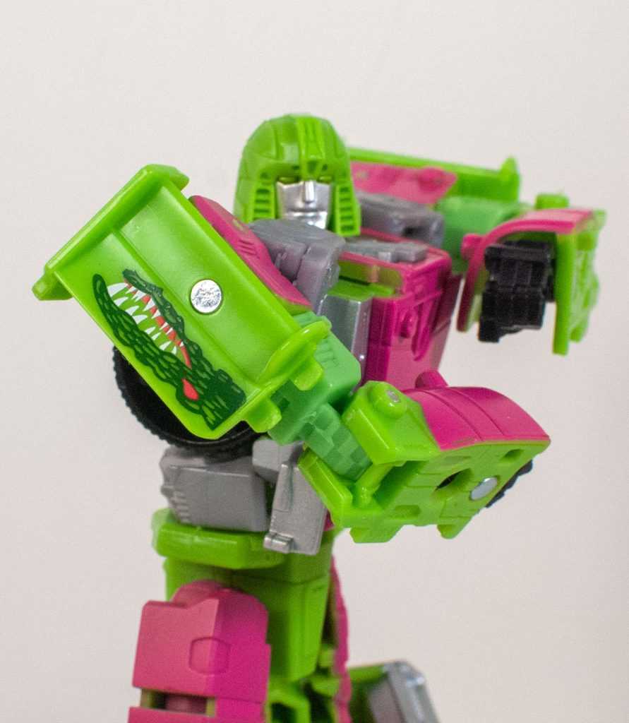
“Check out my tats!”
The star of the show is, of course, the colors, which are a bright, lime green, and a vibrant, purplish pink, and they’re still as brilliant here as ever, looking kind of like those two-tone velcro sports balls every 90’s kid somehow had (at least in my neck of the woods). Beyond that, he’s got some silver paint, and bits of gray and black plastic.
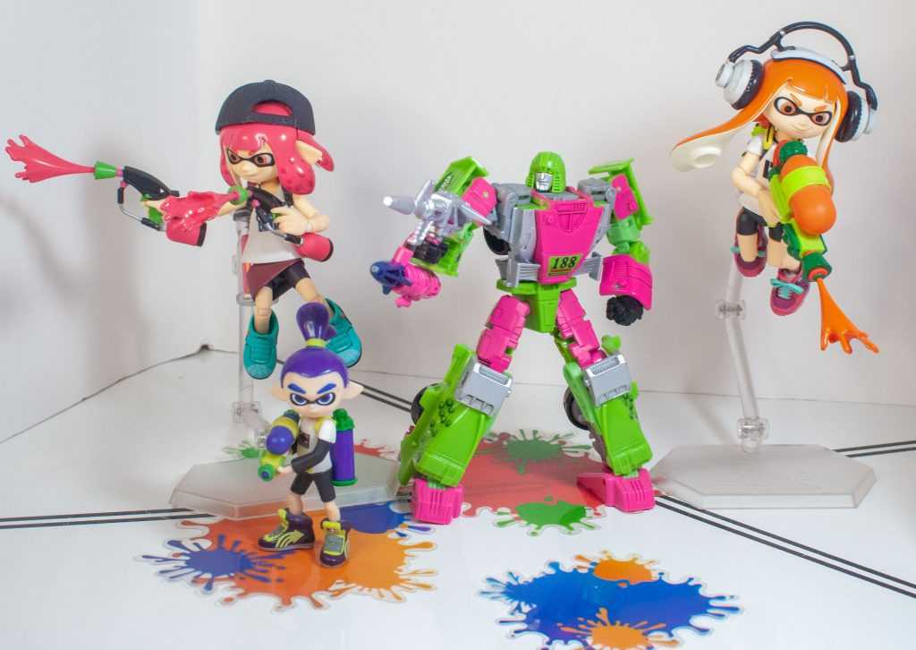
He fits right in with the Inklings, in those colors.
It’s the fidelity to the source material here that really gets me. We never saw a fully-painted sample of this unreleased deco, just his packaging art, and there’s a lot of paint on this version that specifically replicates the layout and details of that packaging art, including the “188” on his chest, the “scales” on his legs, and, most impressively, the gnarly-looking, graffiti-like crocodiles on his shoulders. This feels like a labor of love.
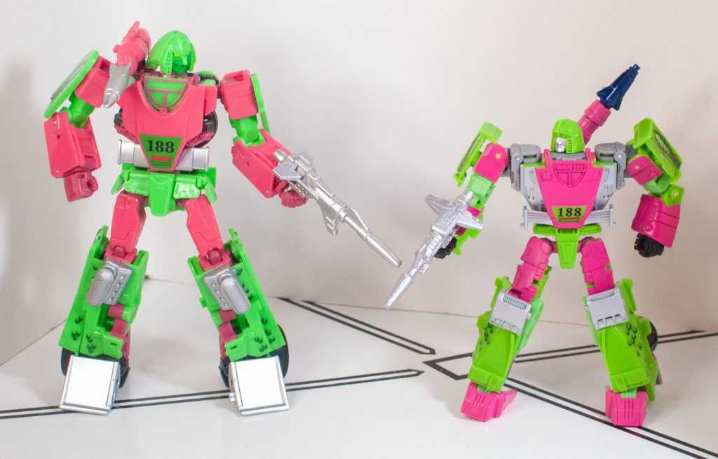
It’s not just the photography, they genuinely have different shades of green and pink. Sphinx is darker overall in person, though,
It’s also really interesting comparing it to Spinx Regenesis, and seeing all the little ways they differ. Sphinx’s silver feet are more accurate, and there’s a tiny couple of tampographed sticker details Sphinx has that this doesn’t, but Mirage properly leaves the little panel at the top of his hood-chest solid pink, and adds silver to his face so it’s not a field of blank green.
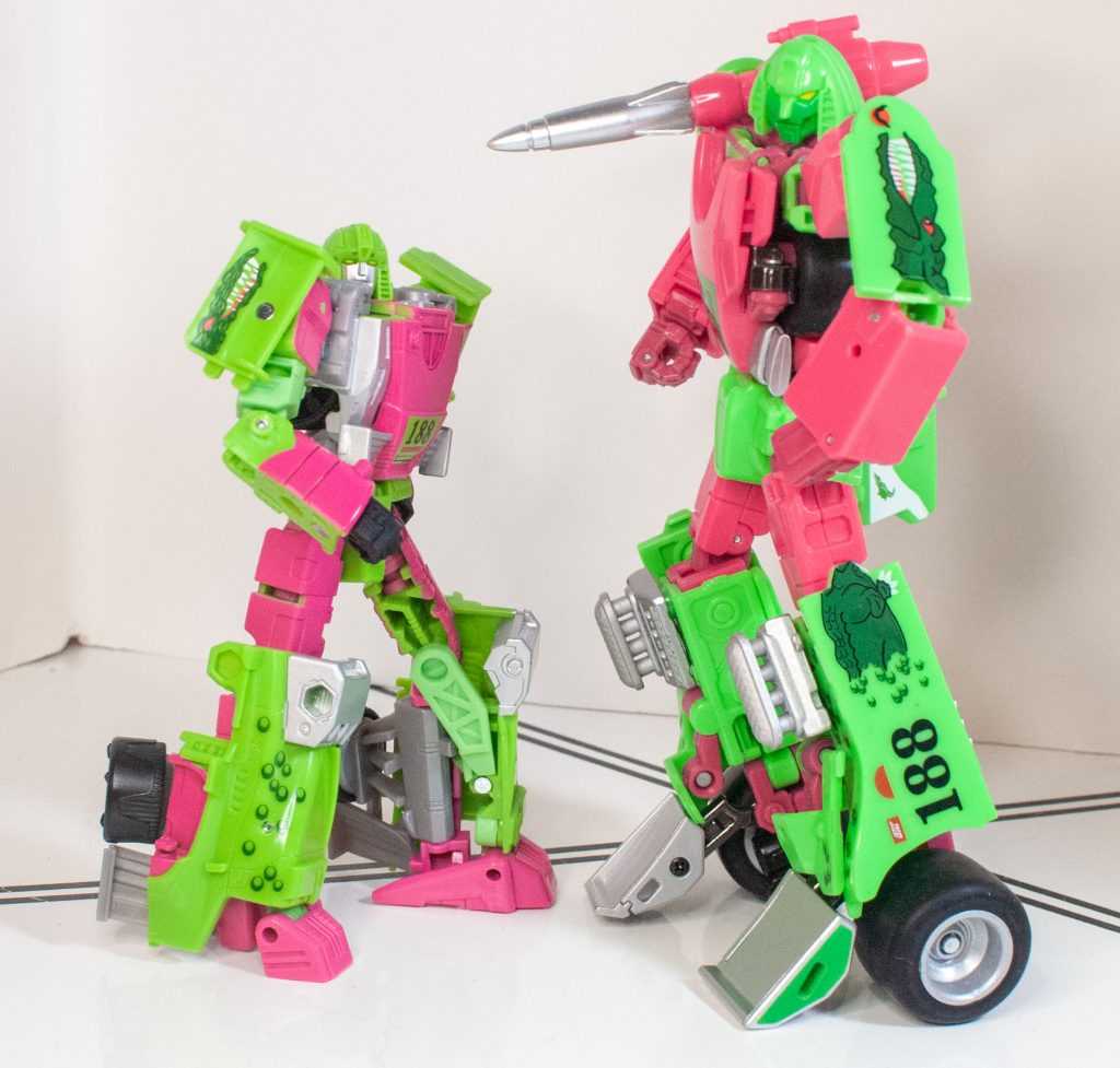
Matching tats!
Either way, it’s just a lush look, and it appeals to me immensely.
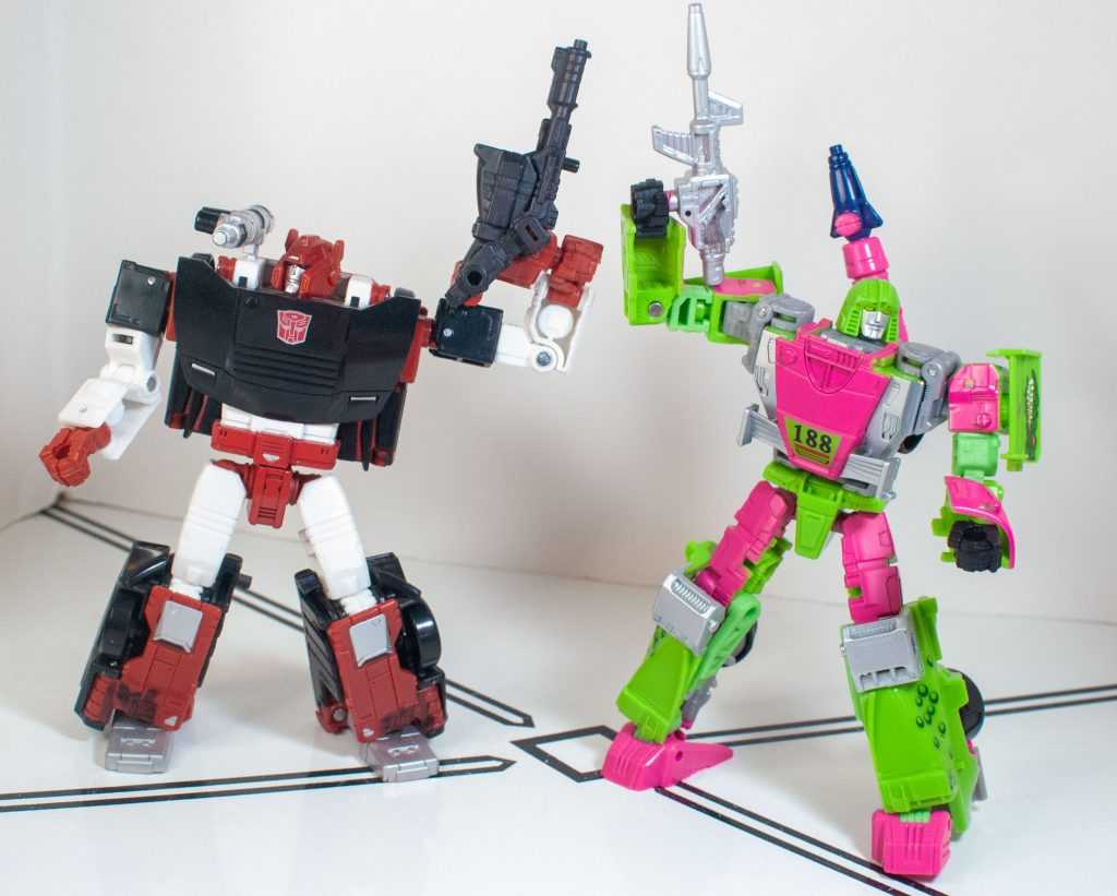
Generation 2 was a land of contrasts.
Now, maybe it’s bias, or maybe it’s an actual fix by the designers, but Mirage’s tolerances and construction feels improved since the Kingdom release. Specifically, his knees aren’t incredibly tight. Instead, all of his joints are now in the same “tighter than I expected but within good levels” zone (unlike Netflix Wheeljack). His lower legs are still a problem, though. Basically, the pile of vehicle mode stuff that’s hiding inside them doesn’t peg in or secure in any meaningful way. It stays there just fine on friction, but when bending his knees, if you move his lower leg forward, the Pile O’ Parts doesn’t move with it, and just splits his lower leg into two.
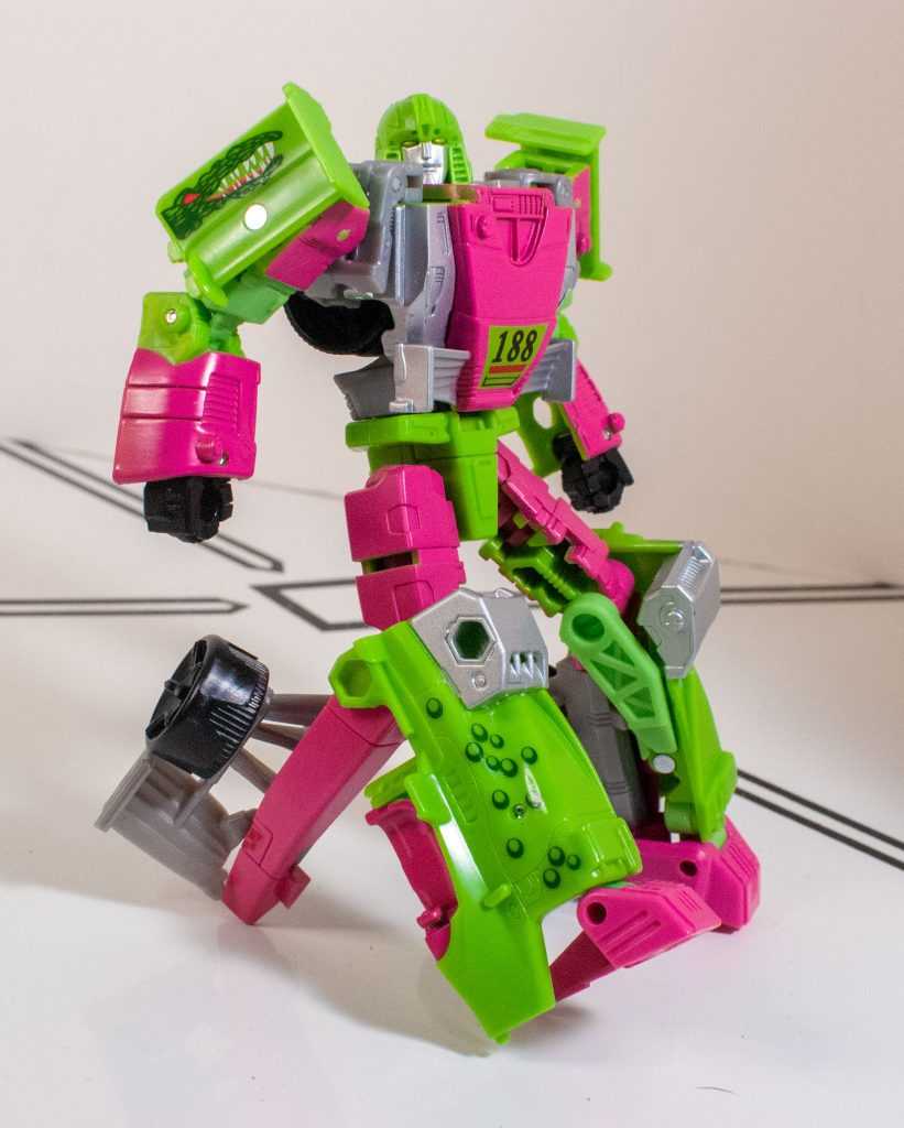
Move his knee forward, and this just happens.
And no, this wasn’t a problem with Siege Mirage, it started with the retool. You can keep the stuff in place by grabbing the whole lower leg as you pose him, but it still feels like an odd, glaring design oversight, one a few tabs could have fixed.
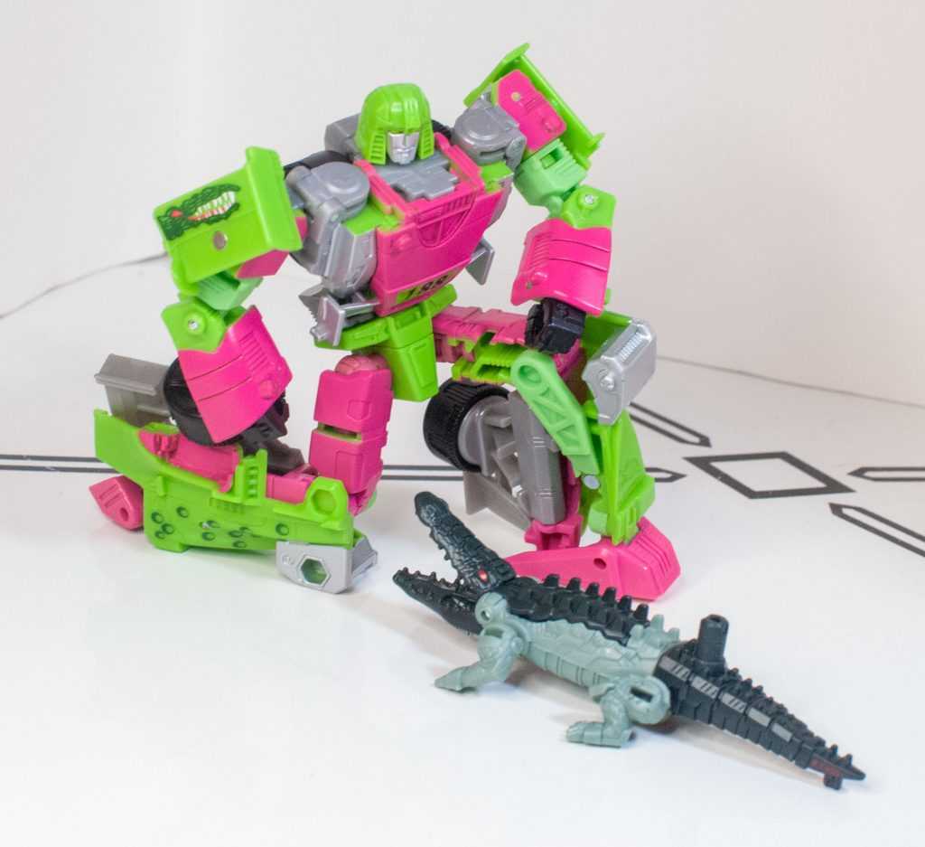
Gators gotta stick together.
One thing that they did improve in the retool was his poseability, which he’s got loads of.
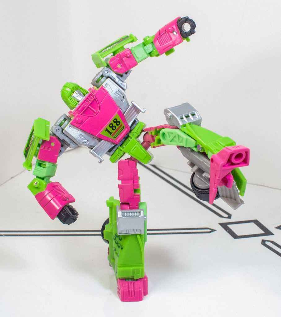
Taste the rainbow!
His ankles are omni-directional (and have a big footprint, letting him stand very well), he’s got all the proper knee, hip, elbow and shoulder joints, he actually has an ab crunch that you can access by unhinging a joint above his waist (something you never see on mainline figures), and he’s got a neck joint with a bit of up-and-down wobble to it.
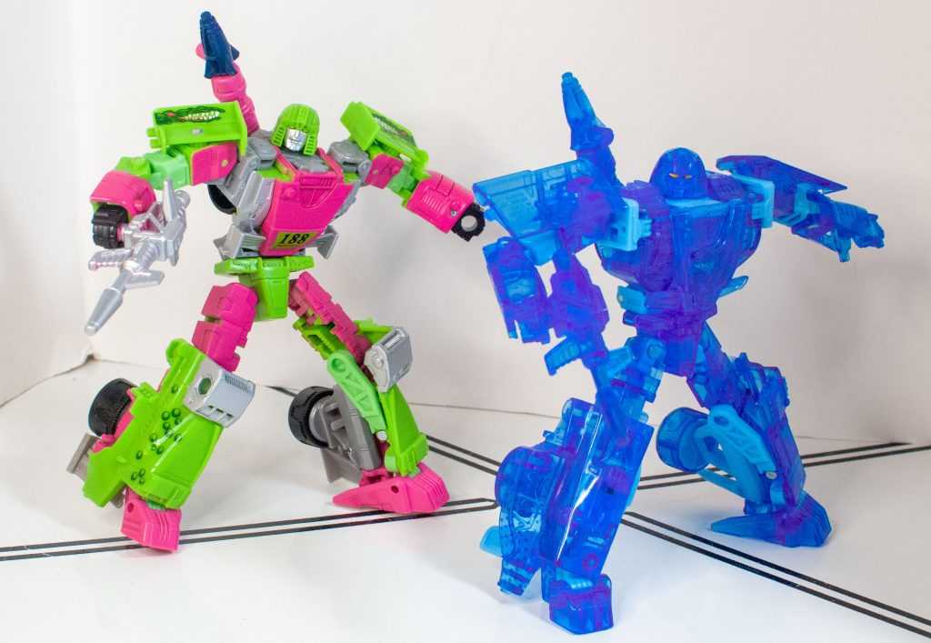
To make things fair: He can ab crunch, and Holo Mirage can’t.
It goes well with my self-selected Energetic Speedster personality that I gave him, because it’s easy to pose him in dynamic ways.
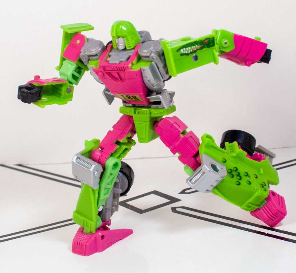
When you forget you change into a racecar.
Mirage has got a pretty good stack of accessories. First, he’s got a rather large, detailed, G1-style laser rifle, painted up in silver.
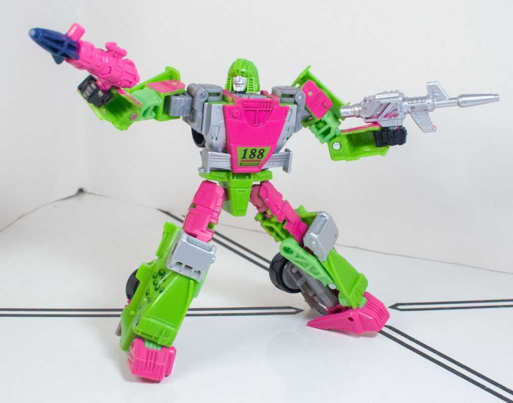
Trading his shoulder launcher for Dualies.
Next, he’s got what’s supposed to be his shoulder launcher (I know, I’ll let it go), cast in pink, and, in an interesting dedication to accuracy, has a missile that’s painted a unique shade of very dark blue, simply because that’s what it looked like in the packaging art (Sphinx Regenesis just went with silver). The missile can pop out, for a third accessory, and has a peg to hand-hold it, or mount it, in addition to the launcher having a peg on it bottom, one on its back, and a 5 millimeter hole where the missile went.
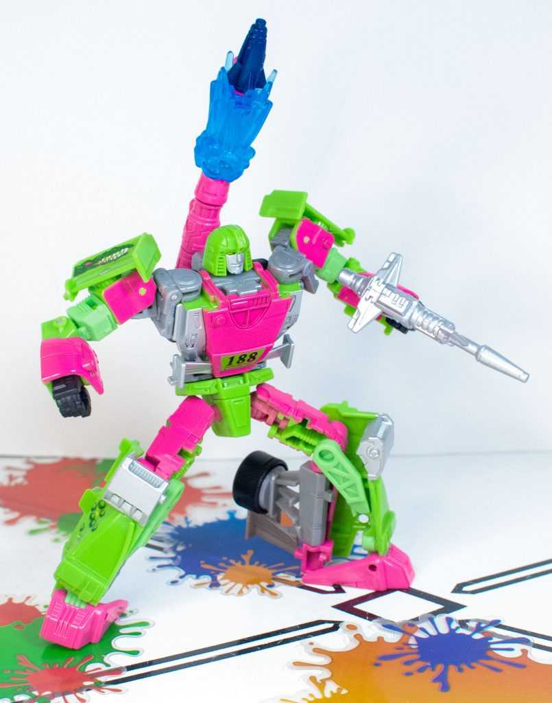
Deploying Inkstrike!
This makes all three accessories feel pretty flexible (the laser rifle’s got a rear peg, too). And, while he can’t shoulder-mount anything, there’s actually a lot you can do with these accessories on Mirage himself, because he’s got 11 entire 5 millimeter ports across his body (not counting his fists).
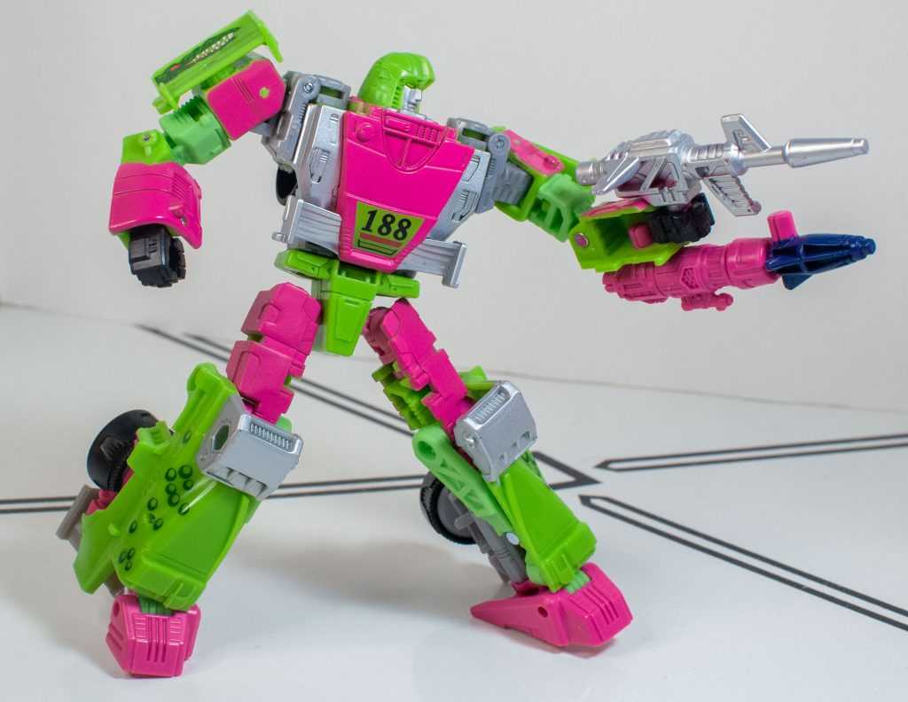
Put them together, and you’ve got a Squelcher.
Importantly, there’s another fix here: The 5 millimeter port on his back actually works now, instead of being too big, as it was on Kingdom Mirage. So you can kind of mount his missile launcher there, and tilt it sideways, to simulate where it’s supposed to go.
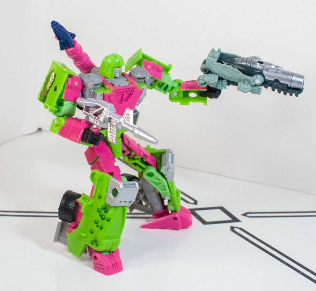
Croco-combination!
But I have more fun finding different ways to assemble his accessories.
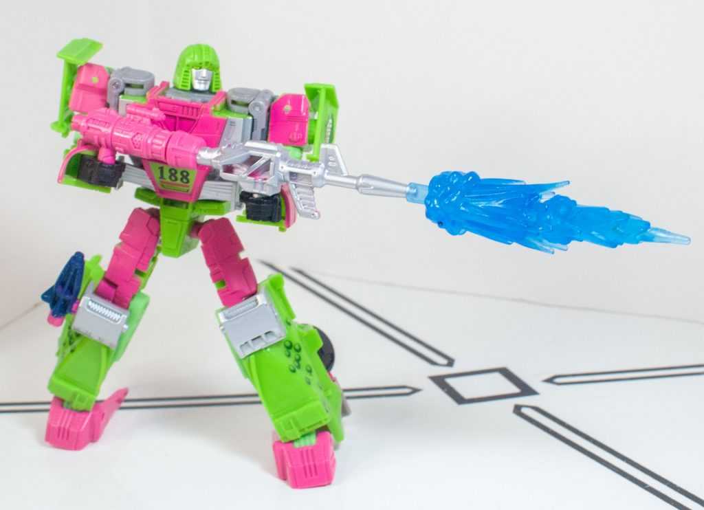
The longer the gun, the bigger the blast. That’s just science.
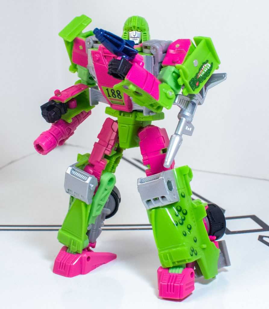
He’s gonna throw it.
And that’s before adding in additional weapons from whatever -Izers I have handy. There’s a lot you can do.
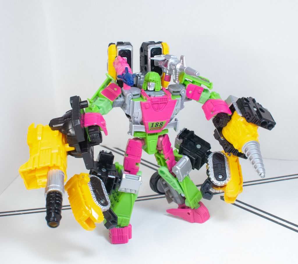
Oh hey, now his guns fit over his shoulders!
Transformation:
This is another area where it definitely seems like the tolerances have been improved from the Kingdom version (or at least my copy). Before, a bunch of tabs involved in this transformation just straight up didn’t work. The sides of the car (formed from the shins) needed to plug into his torso, but didn’t, and the rest of his legs needed to plug together to form the car’s front, and also just didn’t, leaving a big seam down his body. But this time, they work! Somehow.
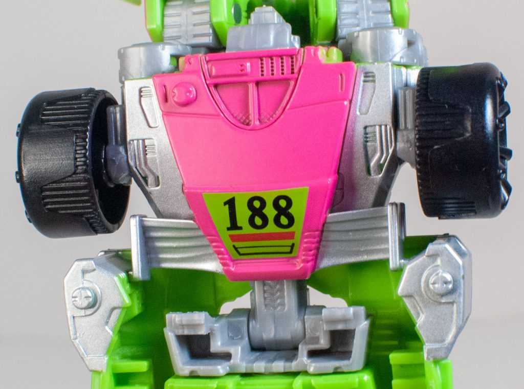
Those tabs on either side of his silver fins just didn’t plug in before.
Of course, it’s still a transformation that feels a bit too complicated and involved for its own good, with a lot of maneuvering parts around other parts without much clearance, focused around a shellformer-ish clipping of the two halves of the car that’s still a struggle to pull off.
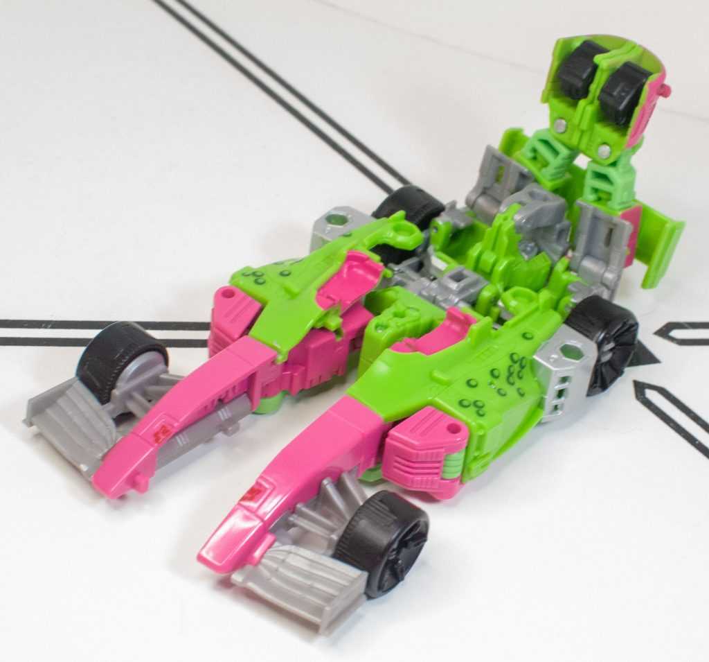
Uniting the halves is awkward.
It’s not impossible (especially with the fixed tolerances), but it’s not as fun as it ought to be. And again, it’s heavily re-engineered from the Siege transformation, which was a lot faster and a lot more fluid. On this one, I still find myself massaging the back end, clipping and unclipping things, trying to see if there’s a way to get it to all fit together a little better, but there really isn’t, with the biggest standout issue being that the cowling behind the car’s cockpit feels like it ought to plug into the body somehow, but doesn’t, just hovering above it.
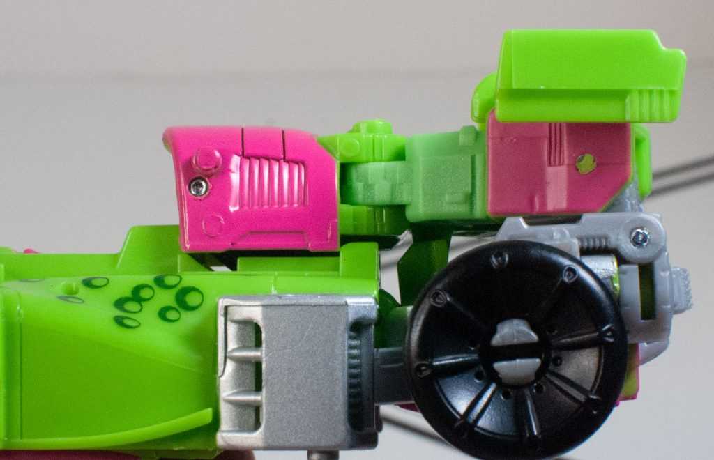
That pink cowling in question just kind of hovers.
Vehicle Mode:
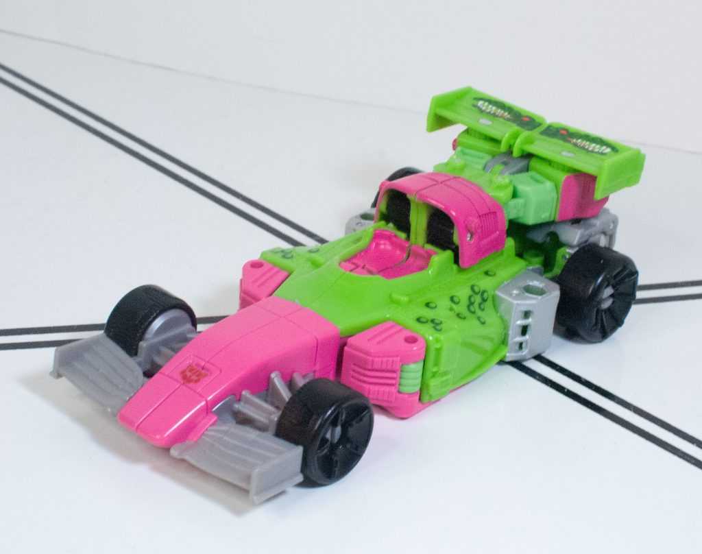
Nyooom!
At the end of it all, you get a Formula-1 racecar, one that came out pretty good-looking, even if it’s not a heck of a lot different from the Siege one (mostly just trading in a bubble-dome cockpit for a tiny sculpted driver’s seat.)
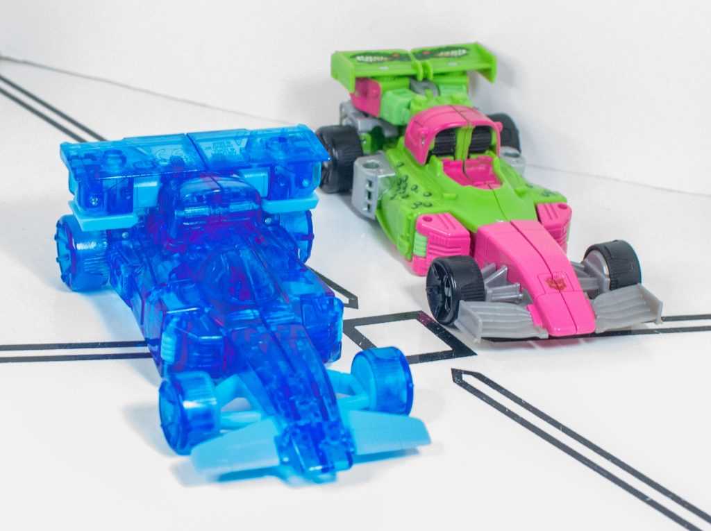
To be fair, the new tooling also looks a little more aerodynamic.
There’s a bit of kibble near the spoiler, in the form of really obviously folded-up robot arms, but the whole thing manages to look pretty slick. Now, I did say that the car pegs together a lot better than the Kingdom version, but it’s still a very seam-y alternate mode, with a big split down the nose, and right through the cockpit that feels like it ought to close up more than it actually does.
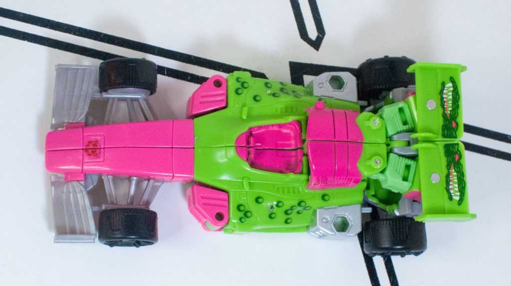
This is about as good as I can get it.
This is especially evident when you pick it up and handle it, the handfeel’s kind of rickety, and it’s the kind of figure you keep reflexively adjusting, trying to make everything fit together better than it does.
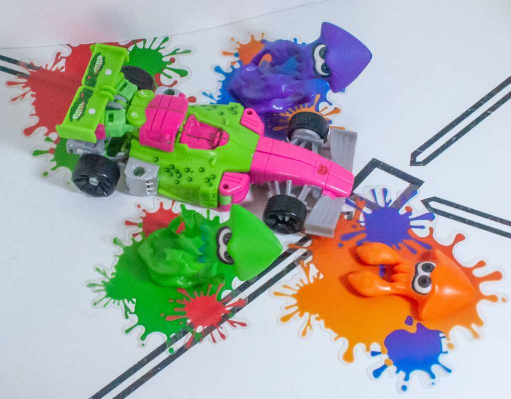
Inkopolis traffic jam.
For colors, there’s a bit more room for creative interpretation, since we’ve only seen a rough hand-painted prototype of this mode on the original, which means Mirage varies a lot more from Sphinx Regenesis in this mode.
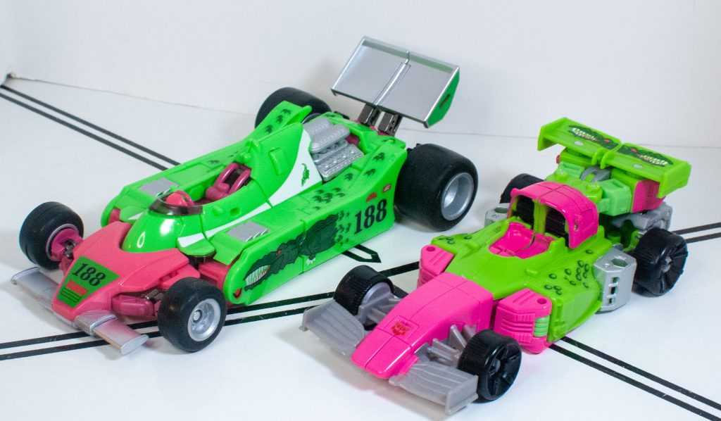
Same vibes, though.
But we’ve got the same pink and green, with a lot more of it being paint as opposed to plastic, and its blocking in this mode really makes me think of watermelon candy, moreso than the robot mode.
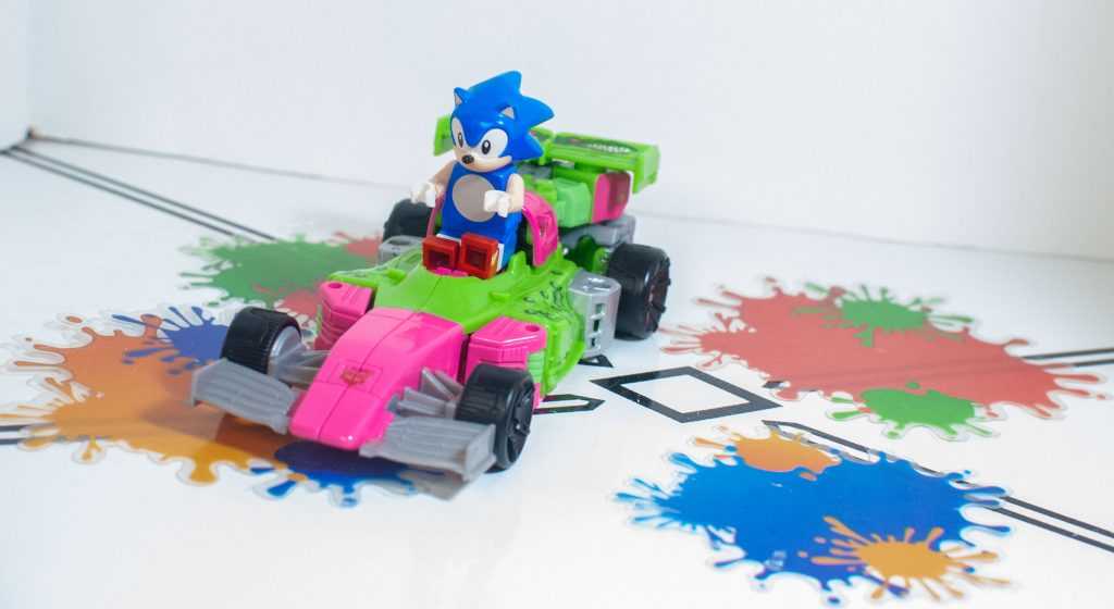
For when Sonic feels like slowing down.
There’s a bit less silver, a bit more gray, black (unpainted) wheels, and the gator tampos have been moved so the “scales” are along the car sides, and the two gator heads are facing away from each other on the green spoiler.
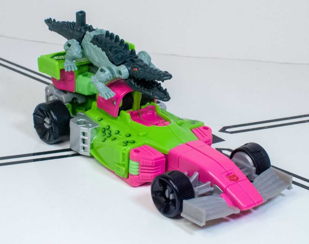
Gatoraider? No, Gator-rider.
Perfect colors, no notes.
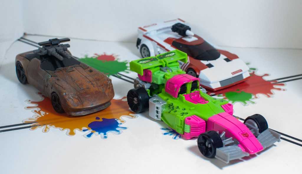
The fanciest racer on the track.
Well, okay, they did add a little Generation 2 Autobot Symbol to the car’s nose (and it’s thankfully not misaligned, since it’s split down the middle), and for petty personal character reasons, I wish it was absent (N-Zap belongs to no faction!). Ehh, maybe it’s his racing team.
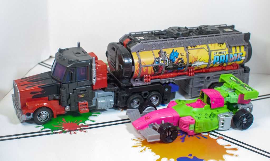
He doesn’t want to associate with a leader that burns down forests.
For features, he’s kind of bad at rolling, since this car’s ground clearance is, like, a millimeter. To be fair, actual Formula 1 racers are like that, too, since they can pretty much only run on specialized, bump-free tracks.
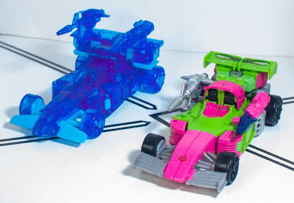
One thing they genuinely did improve on the retool: His weapon mounting points.
For features, meanwhile, most of his weapons ports are now inaccessible. However, he’s got one near the back of both sides of the car mode, just in front of the spoiler, and you can mount each of his weapons on one of them, for a good-looking attack mode.
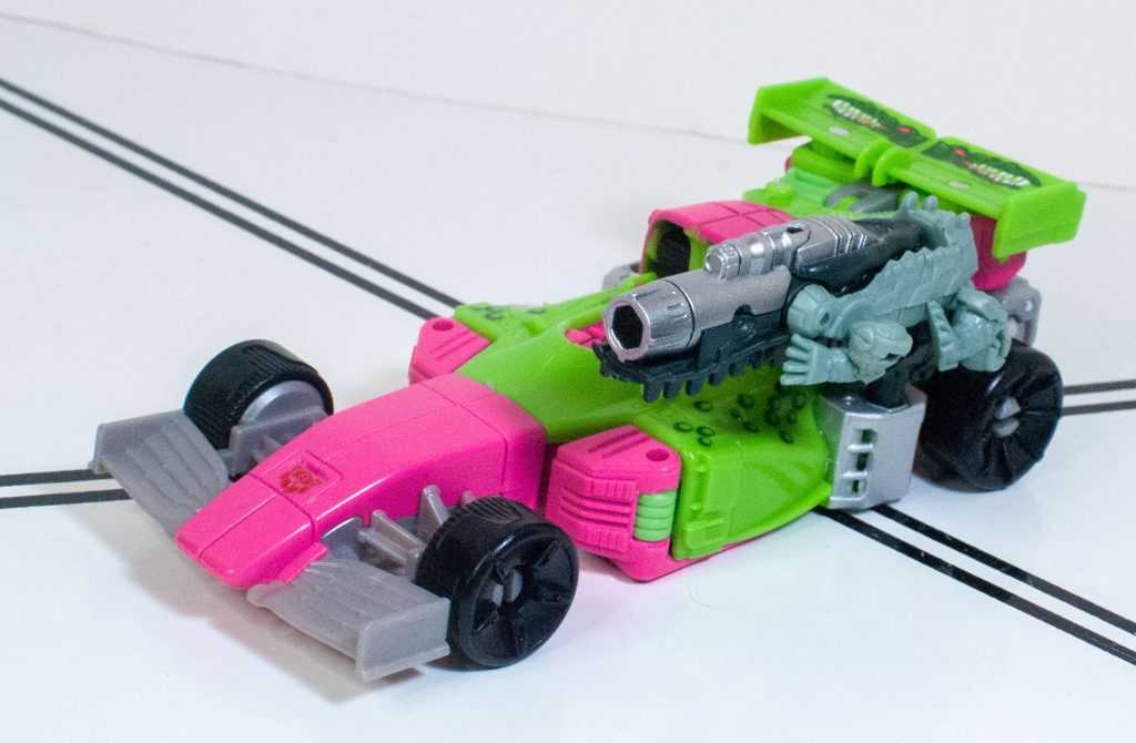
Perfect for a Gator-Gun. Croc-Cannon? Alligator Armament?
Overall:
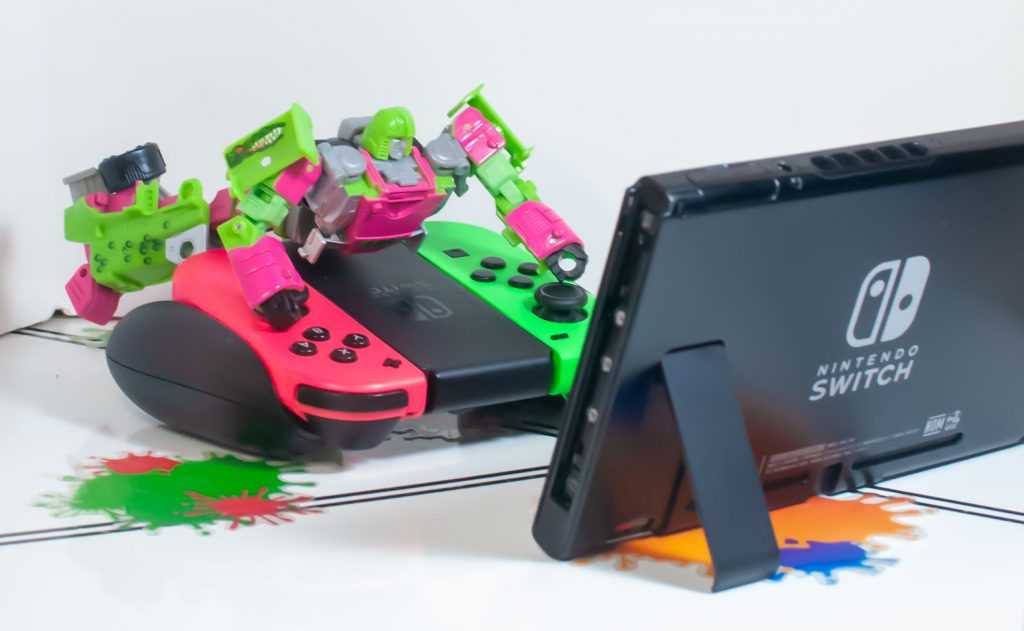
Relaxing after a long photo shoot.
It’s interesting. I didn’t care for the original deco of this retool, mostly because it was a pretty definite downgrade from the Siege version (and I’ll go on record as saying this would have been better if it was a repaint of the Siege version). But I like this Mirage redeco a lot better than the Kingdom release of it. Maybe time and knowledge has made me feel better about the whole package. Or maybe just repurposing him into a new character, removing the expectations that being Mirage gives him helps. Or maybe I’m just a mark for a lush colorscheme.
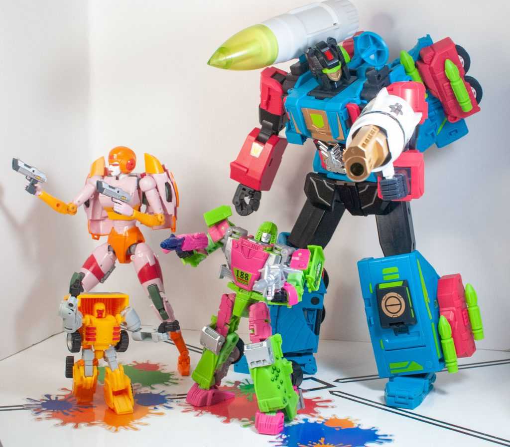
I have a type.
It is truly a good-looking repaint, one that slavishly homages an oddball corner of Transformers history. And, to be fair, it does feel like they fixed a lot of parts-fit and tolerance-related issues this time around.
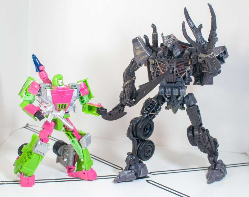
Transformers is a land of contrasts.
Still, he’s kind of a janky figure. His legs don’t fit together well, his transformation’s fussy enough to be bothersome, and his altmode only sort of holds together. There’s just less jank this time, and a more interesting colorscheme. I’d say, if you really like what they did with the paint job, it’s worth braving the figure’s shortcomings to experience it. And I do find that I actually like him just fine this time around, he actually sparks the joy that the Kingdom one didn’t. It’s all about that Splatoon/Watermelon/Crocodile flavor, I guess.
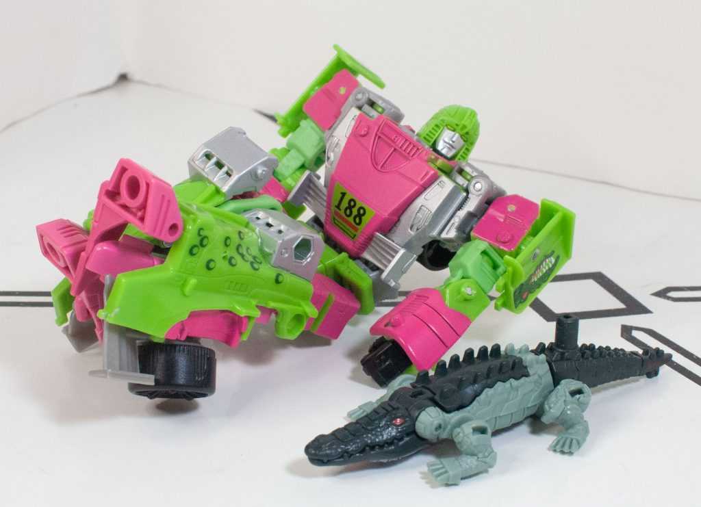
Tasty!
For over 100 Bot, Non-Bot, and Retro Bot Reviews, click here to view my archive.


