
Y’know what we need more of in these times of economic insecurity? Action figures that cost less than ten dollars. That’s what led me to collect the first two waves of Hasbro’s Spider-Man Epic Hero Series figures, which I reviewed last year, over here.
As I’ll get into later, most of these guys are still on the shelves, so it’s worth re-reading.
To recap, Epic Hero’s a mixed-brand line of 4-inch action figures (i.e GI Joe Scale), mostly made up of various Marvel brands, but with a Star Wars imprint as well. My love of the wall-crawler’s well-documented on here, so I went in on one of their Spider-guys, and then another, and then another (often while grocery shopping), and eventually I wound up going completist on the smaller guys. I ignored the vehicles and mechs and things, though, because Pete and friends shouldn’t have the money for that stuff.
“Pay my rent, or buy a fancy branded motorcycle to fight crime with?”
Now, a thing about cheap toylines like this is that they tend to not have legs. They’ll last for a couple waves, and then quietly be retired. But, oddly enough, the Spider-Man line’s got a lot of legs (makes sense, I guess). As of this writing, it’s still going, with the whole size class having been slightly rebranded as Epic World of Action. Granted, the line’s very heavy on reissues and slight repaints (the third wave consisted entirely of re-releases in new packaging, and no new figures), but that just means you can jump in right now, and not have missed much.
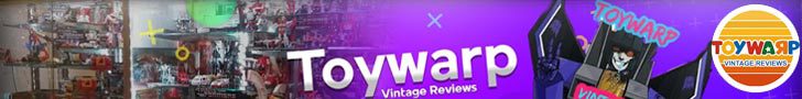
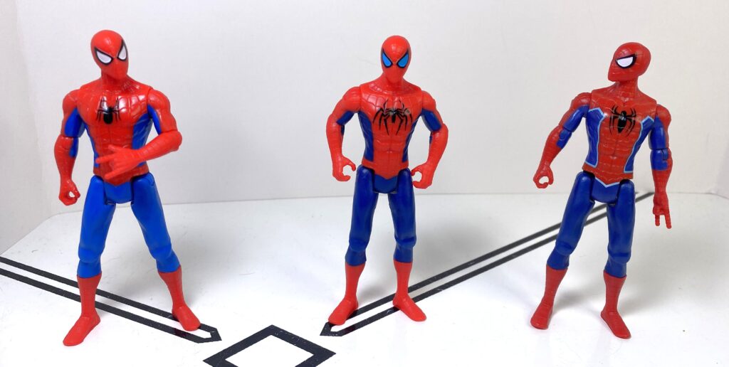
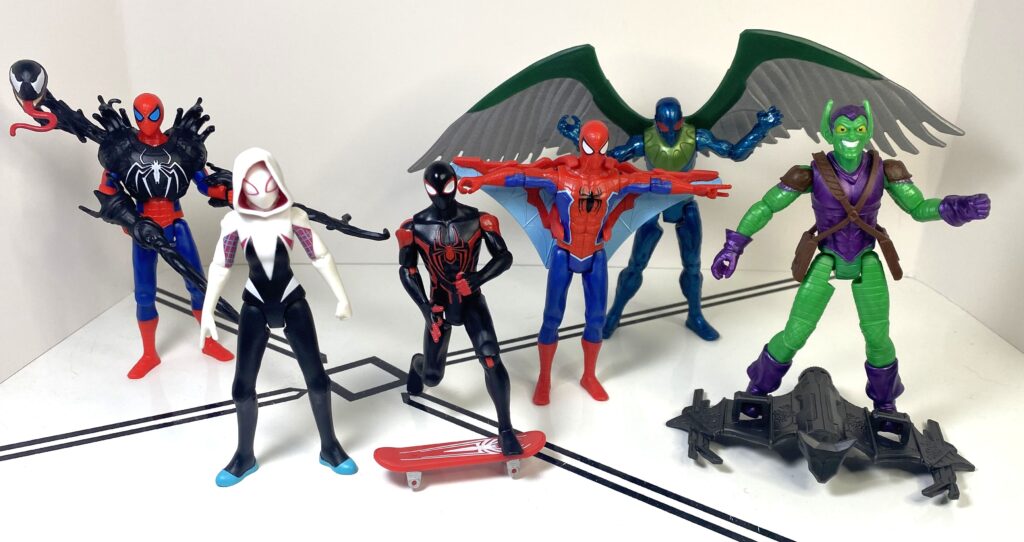
(Almost) everyone is (still) here (as of Wave 4)!
So! The point of this review. Basically, I’m just going to run through the stuff I’ve gotten since last time I looked at this line. Funny enough, most of it cost more than ten dollars, but that’s only because most of it was multipacks. So, without further adieu, enjoy these pictures of (and words about) Spider-Man.
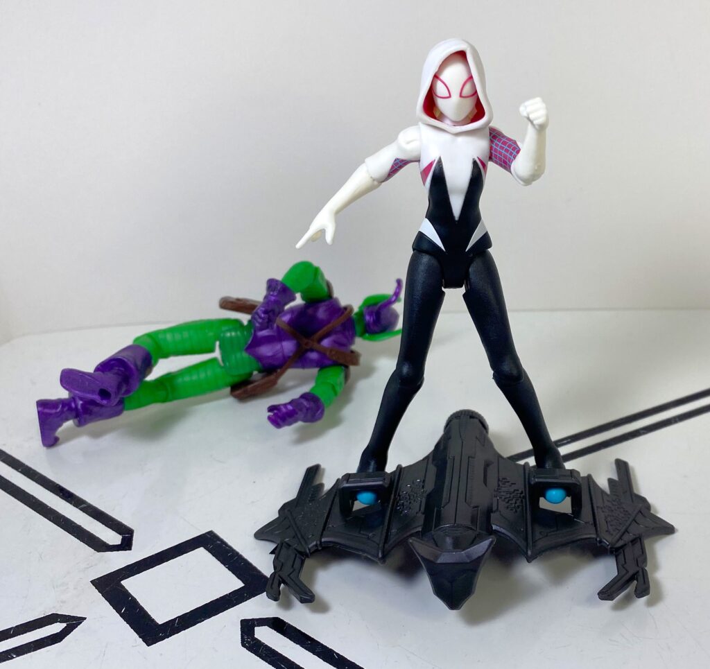
Spider-Man versus Green Goblin
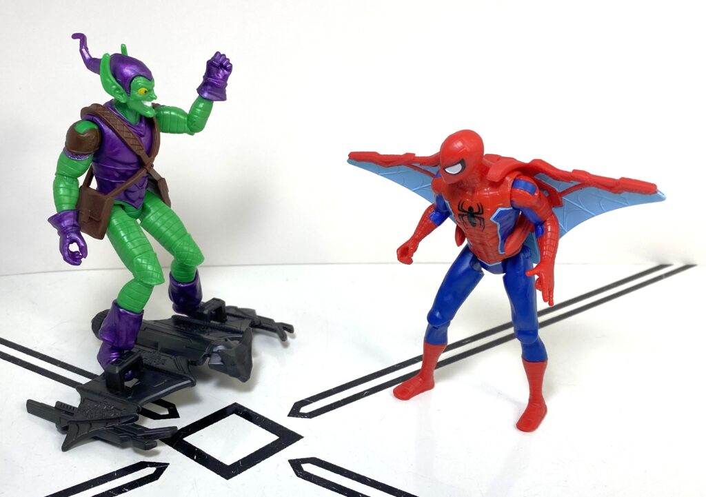
War for the skies!
First up, we’ve got a couple of two-packs that came out last year. They seemed to be de facto Toys R Us exclusives here in Canada, which probably means Target in the US. Either way, I see that Toys R Us still has them on their Canadian site, so they’re certainly gettable by someone in 2025.
“Who am I? I’m honestly not sure.”
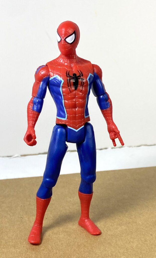
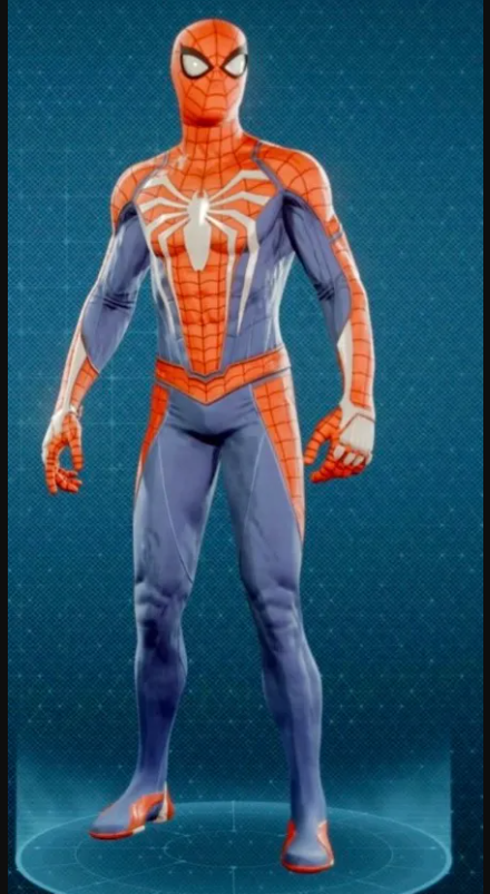
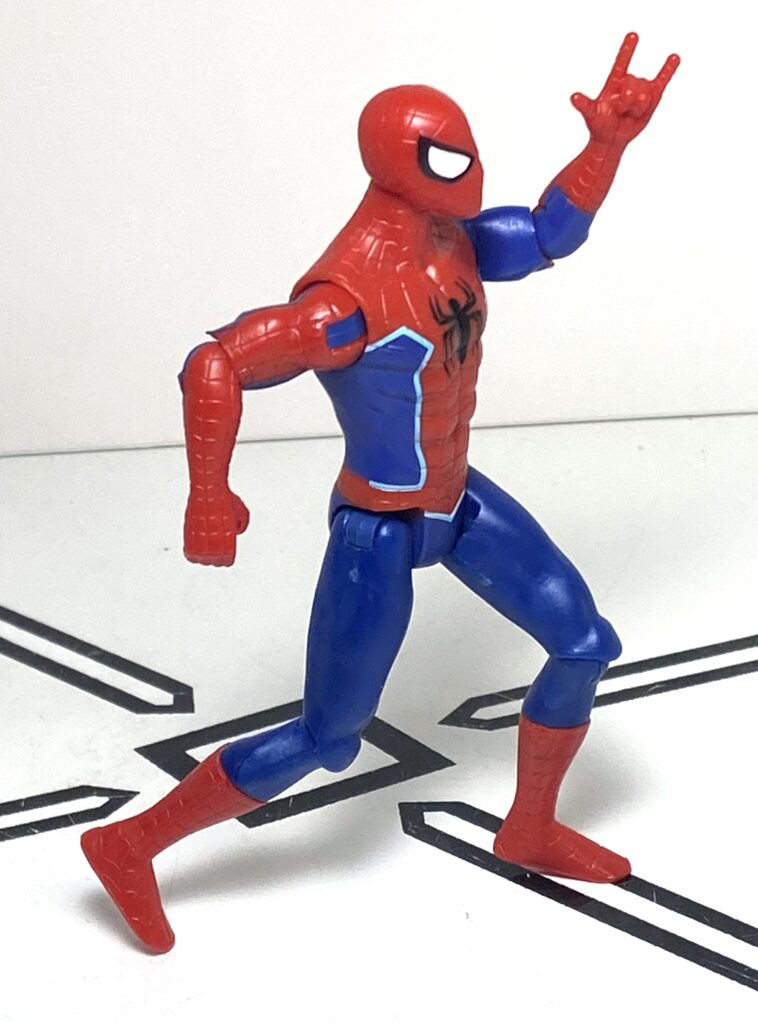
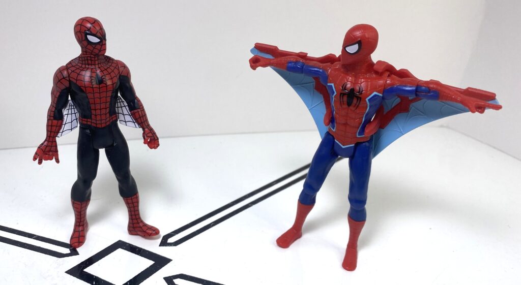
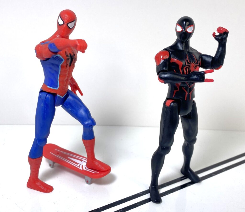
Now, I’m big on media accuracy, as a collector. I like “the guy from the thing.” So, random toyline-only repaints tend to not really appeal to me, and that’s what’s going on with our default Spider-Man in this set. He’s a straight redeco of the vanilla Peter Parker that’s been available every wave of this line, which also makes him a good baseline to remind you about the key features each figure has.
New package, same product: Losers.
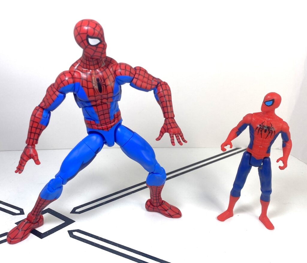
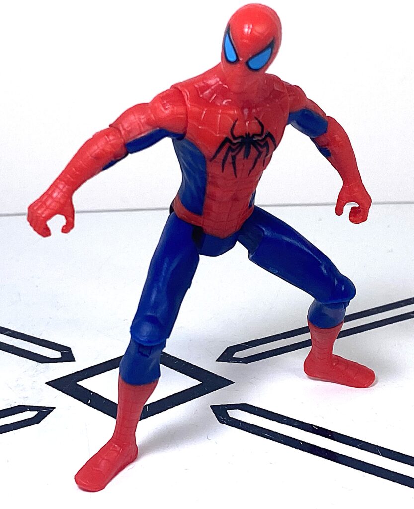
Sculpted to resemble the evergreen Spider-Man design we know and love, Pete scales well with Transformers at 4 inches, and has a build that’s not too bulky, more athletic, but still has defined musculature, particularly around the abs.
They don’t literally scale, but spiritually, they do.
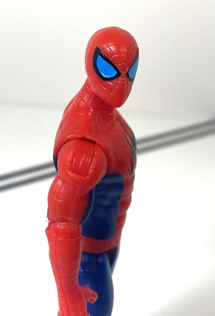
I’d say the only downside of the sculpt is, to be blunt, that the pelvis region of these guys still look kind of odd, the way the hip joints are cut, a problem nearly every one of these figures has.
Don’t look at it too closely.
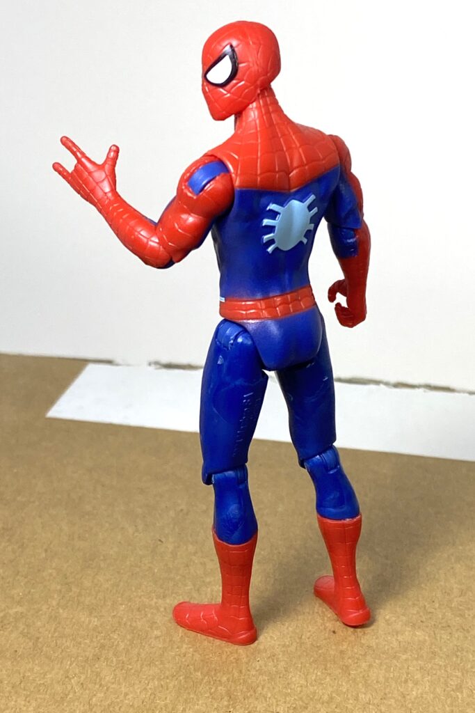
The colors are where they played with his look on this repaint. He’s still the traditional red and blue, just darker shades of both than the original release, and he’s still got the same painted black and white eyes. But the big thing is that the locations of the blue on his torso have been moved around a little bit, and there’s light blue outlines added to the edges of them around his torso, plus light blue added to the spider-logo on his back (the black logo on his chest is also a bit bigger).
He wanted to make sure we knew who he was.
It’s not an exact match by any means, but I wonder if they’re sort of loosely trying to evoke the Spider-Man of the Insomiac video games, minus the big white logo that one has on his chest.
I’m not seeing things, right?
One slight downgrade on this version, though, is that the joints in his shoulders aren’t color-matched, so he’s got bits of blue there that really stand out against what’s supposed to be a red zone.
He’s hoping to distract you from it with his Super Mario jump.
Articulation and build quality is still the selling point on this guy. Like nearly every Epic Hero release, he’s got nine points of articulation. His knees, hips, elbows, and shoulders are all universal joints, giving them a huge range of motion, including swivelling on top of bending, while his head’s on a ball joint, letting him look up and down. A slight hitch in all of this is that his shoulders and elbows use stiff ratchets as a part of these joints, so you’ve got to wrench them between static positions when posing them. Because of that, he’s not as bendable as a large Transformer, or a Marvel Legend, and standing him on his modestly-sized feet in a pose can be a bit tricky, but for 9-ish dollars, it’s above and beyond what you’d expect.
Borrowing an accessory from his predecessor.
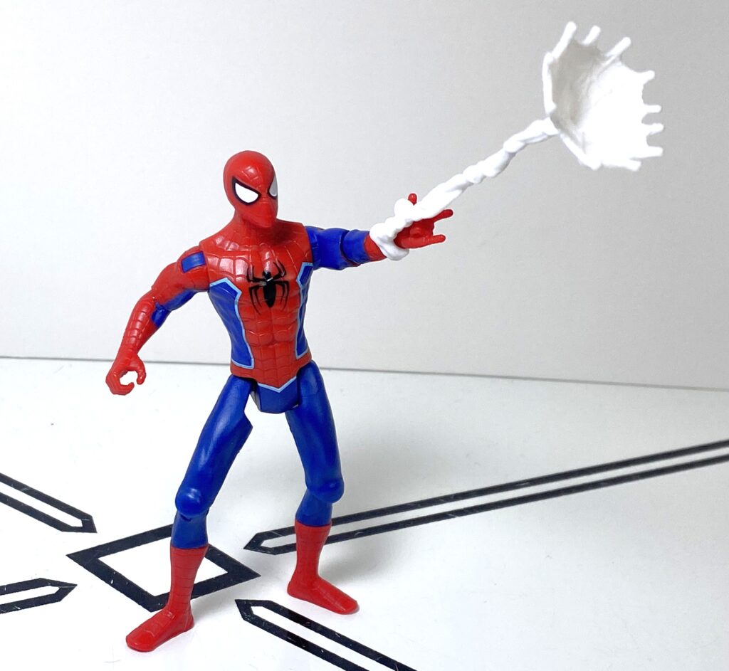
So, accessories and features. He doesn’t have his web-shot effect anymore, but you can still clip one onto his left hand (with its sculpted web shot gesture) if you want, or put any small accessory you’ve got lying around into his right hand.
I’m assuming this was donated to him. Lord knows he can’t afford it.
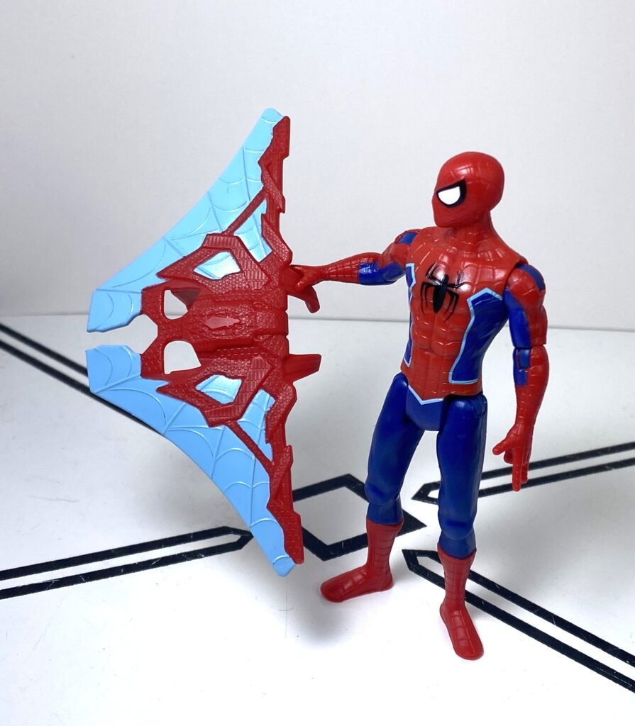
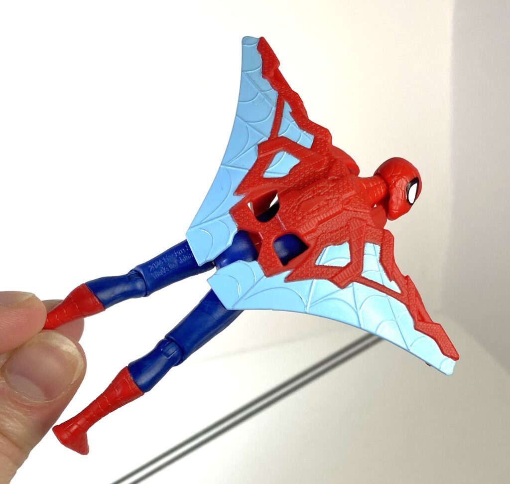
What he does come with, though, is a huge, new accessory: A high-tech wingpack. It’s made out of the same rigid-but-slightly-flexible materials as the rest of him, and clips onto his shoulders and waist.
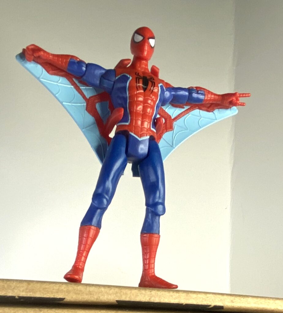
Going for the vibes of his counterpart from the Distinguished Competition.
It’s cast in the same red as his body, with paint apps in the same light blue as his highlights. The shape of it, combined with the way the wings have sculpted-in webs, makes me read it as a re-interpretation of the underarm webs he was drawn with in the earliest Spider-Man comics.
“Unlike you, I can move my arms without it looking wierd.”
Despite that, the whole thing looks high-tech in a way I wouldn’t associate with the broke Mr. Parker, so it feels a bit incongruous.
Swooshable, though.
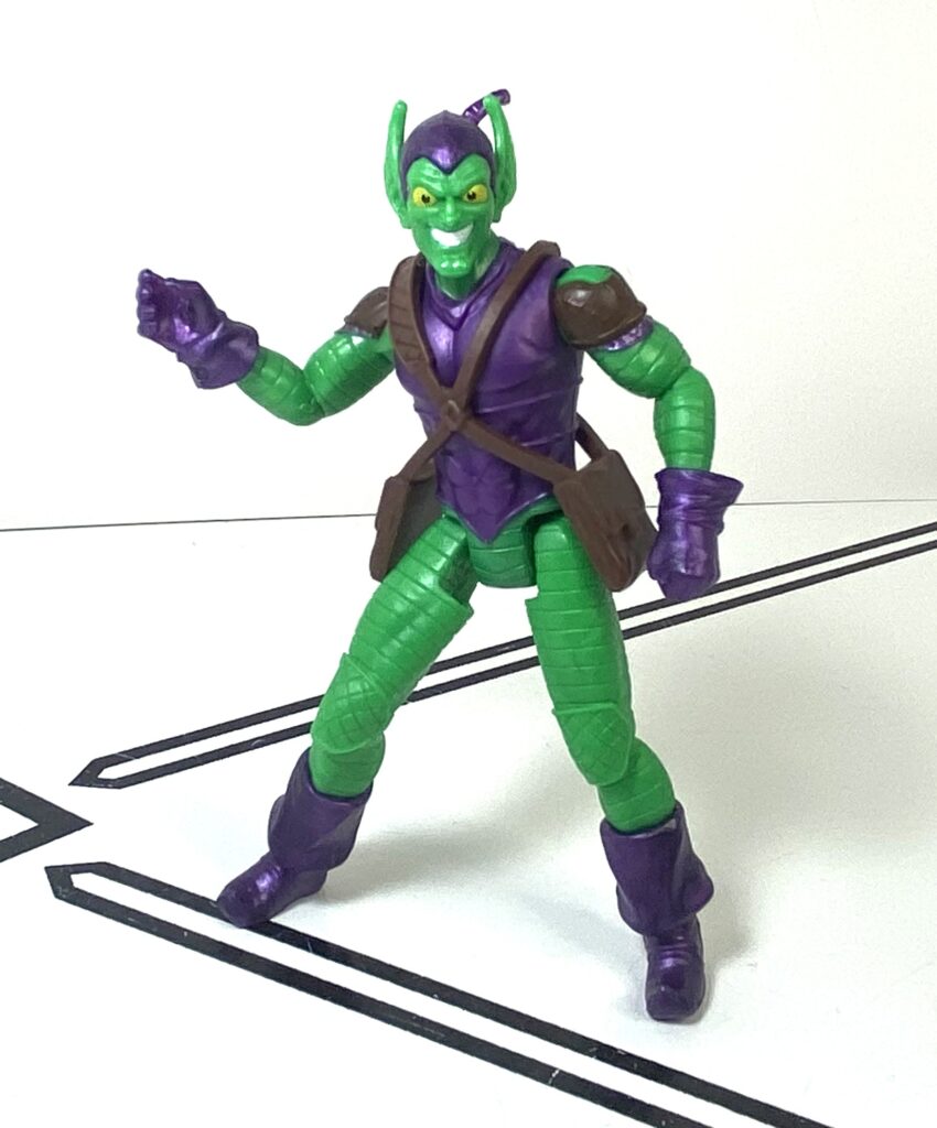
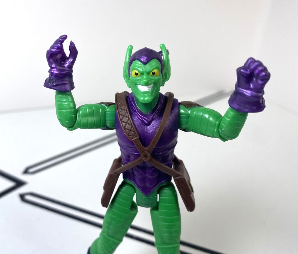
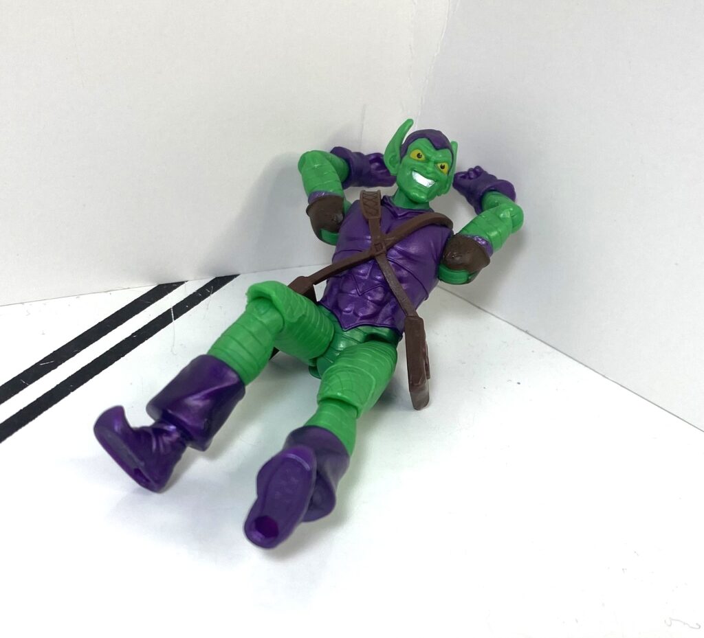
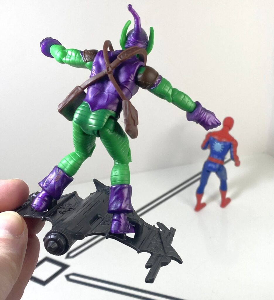
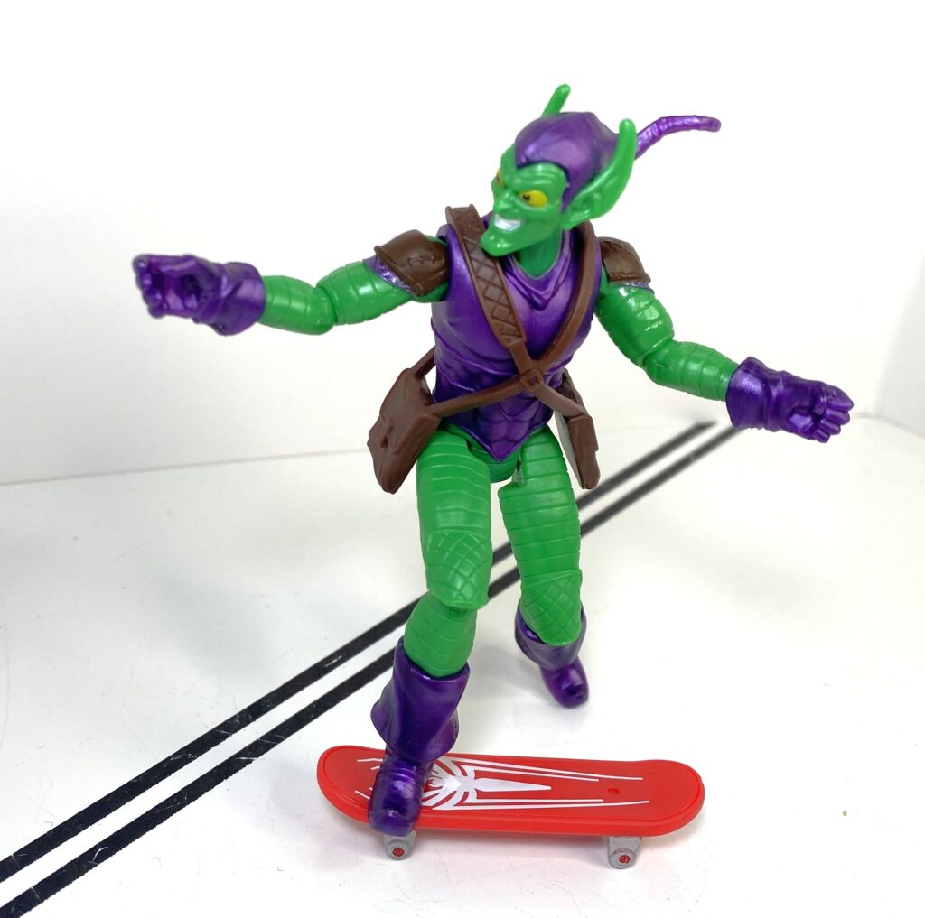
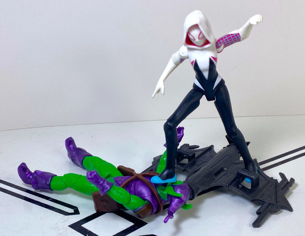
Now, the other half of this two-pack is why you’d want this, in that it’s an entirely new tooling: It’s the Green Goblin, Spider-Man’s original arch-nemesis, when he’s not relegated to being a meme machine for Willem Dafoe movie quotes.
“I’m something of…Y’know what I sacrificed….*sigh*”
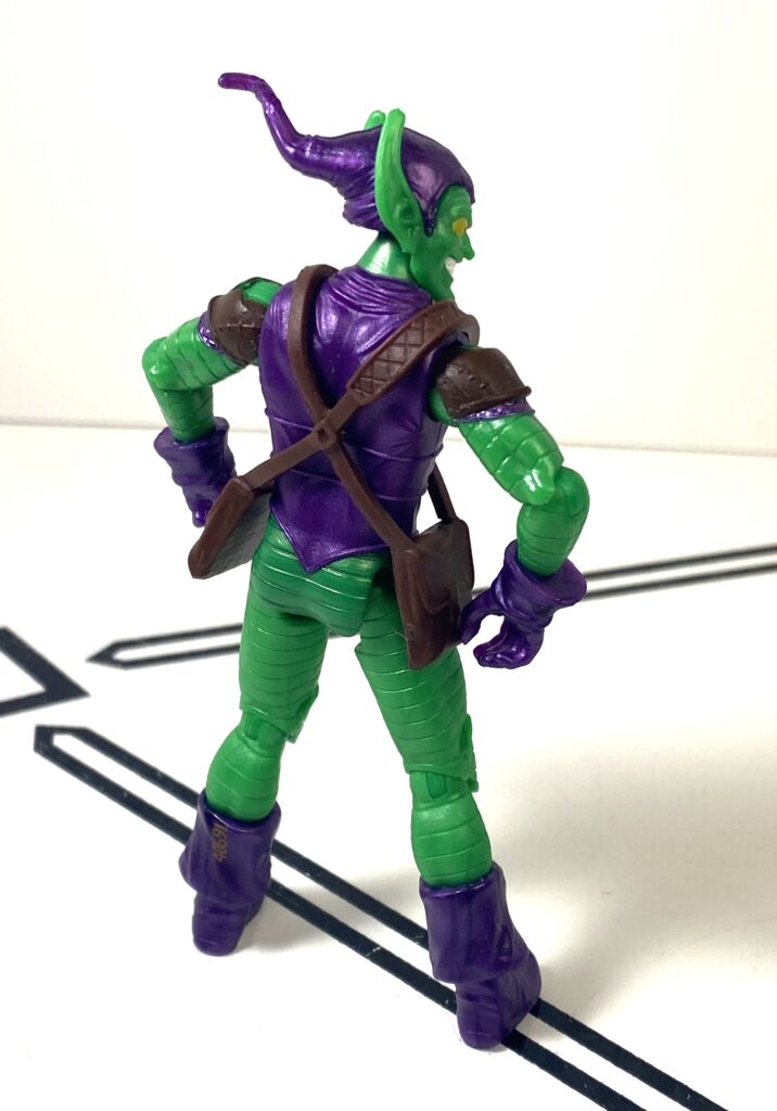
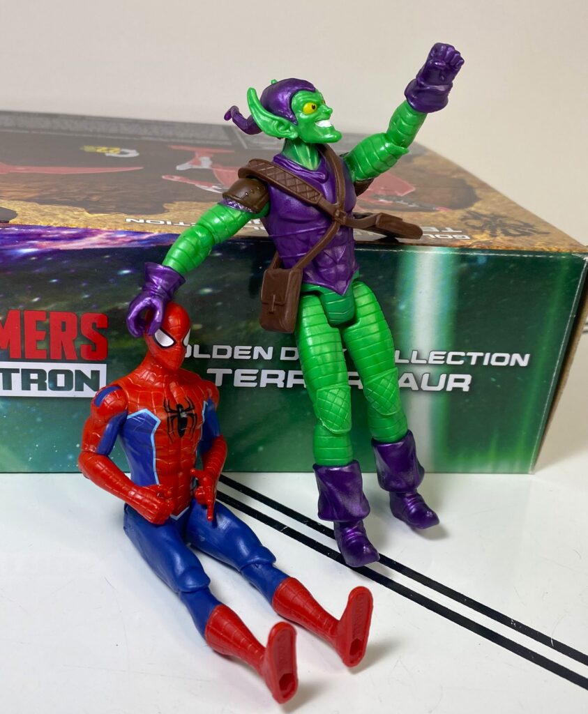
This is an extremely classically-styled Goblin. He’s not a dead ringer for how he looked in his Steve Ditko days, but that’s clearly the inspiration, between his elf-y shoes, his manic expression, his huge ears and pointed hat, all of that stuff. By the way, it’s a wicked headsculpt, and I have to mention that expression again.
Dafoe on a bad day.
The design differences mostly come down to his suit being sculpted more like plated armor than….whatever costume he had in the original comics, and it works pretty well. Green Goblin would totally sculpt fake abs into his stomache, like he’s got going on here.
“Y’know, I’ve heard the Green Goblin’s shredded.”
The most impressive bit of his construction, though, is the two satchels he’s got at his hips, which are held onto him by shoulder straps that cross his chest, because they’re actually a separate part, made of soft plastic, installed on his torso. For a cheapo toyline, that’s surprisingly elaborate.
Modelling the latest in supervillain gear storage solutions.
For colors, he’s looking similarly elaborate in bright green, and metallic purple, with the satchels cast in brown. His face in particular’s got more deco than most of these figures, with yellow eyes, and white teeth.
Hot Steppin’.
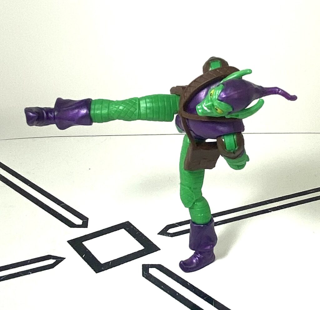
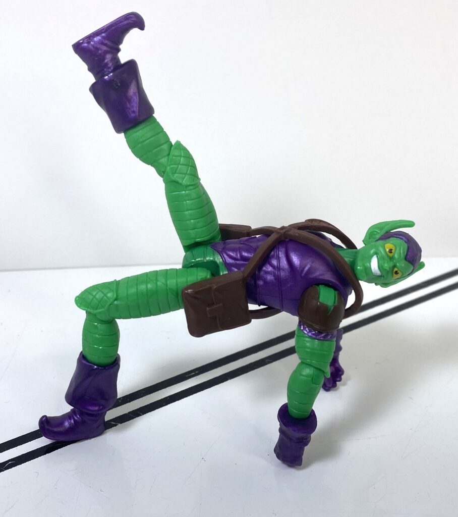
He’s got the same 9-joint articulation as Spidey, meanwhile, but it’s hampered by the fact that his weird, pointy-toed shoes have a very small footprint, making it a challenge to stand him up.
Any excuse to get off his feet.
The poses in these pictures took a lot of really careful balancing.
He’s only having a dance-off so he doesn’t need to stay on his feet.
Luckily, his accessory negates this problem.
Even if it looks kind of nondescript.
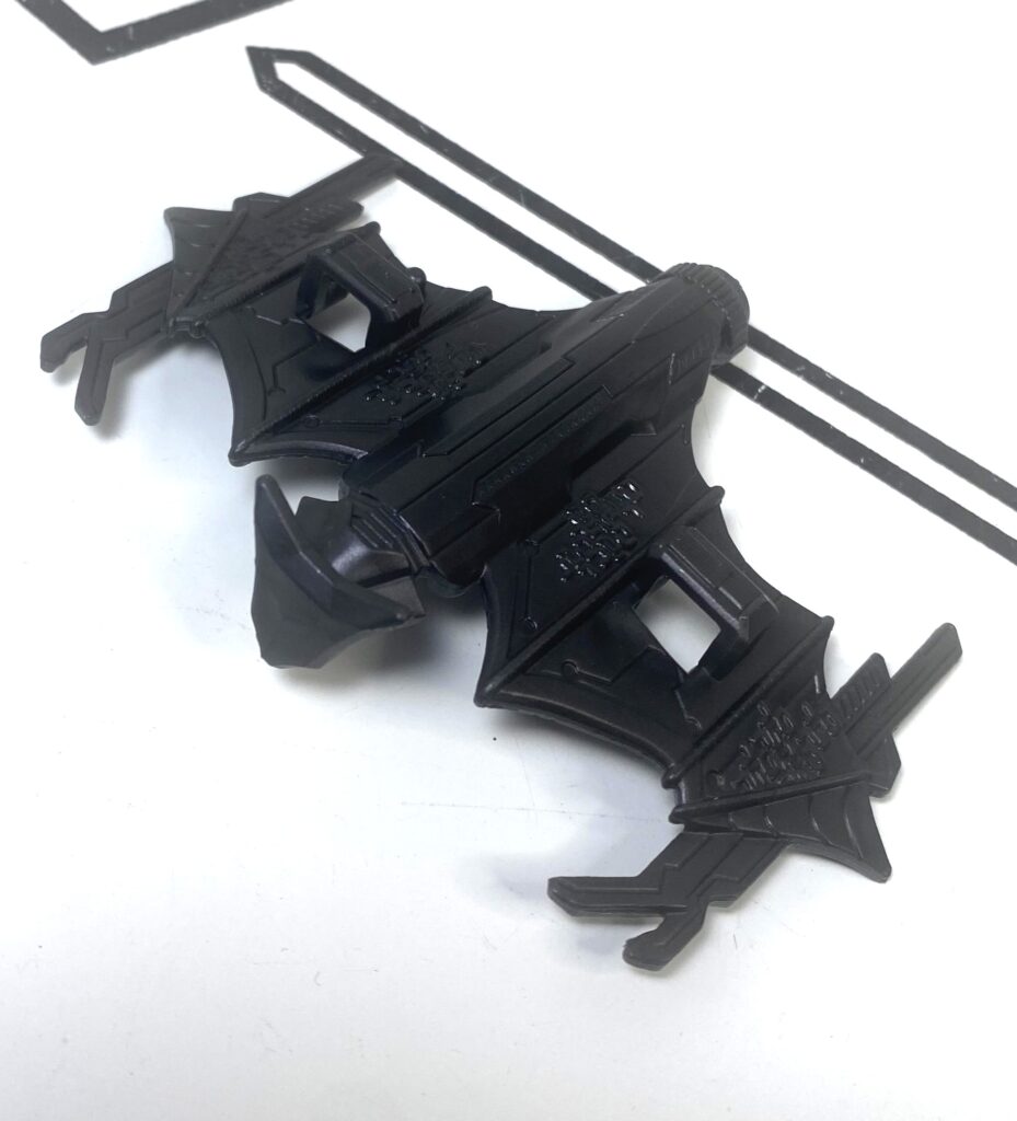
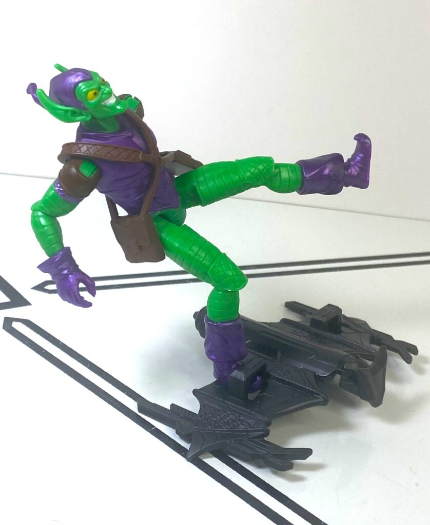
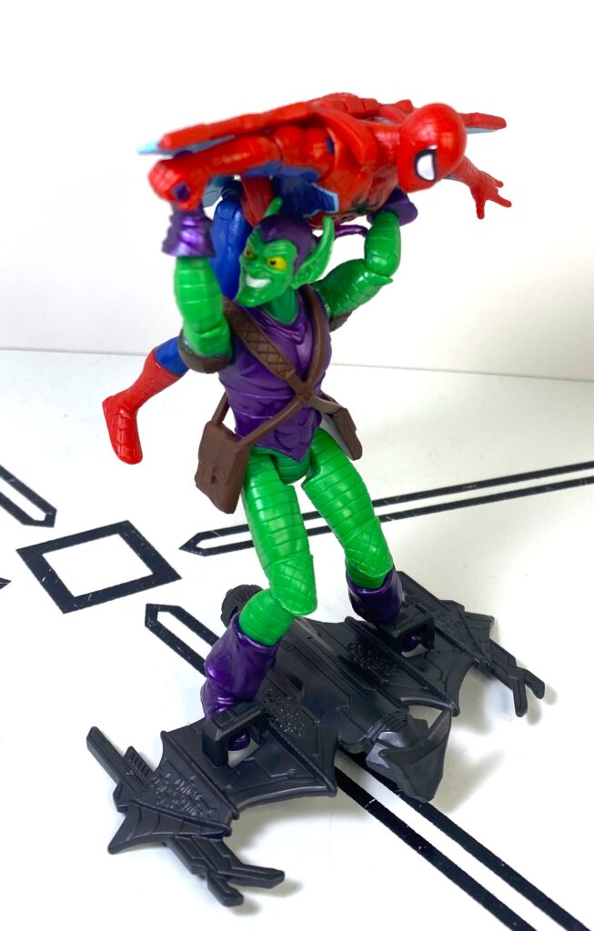
He’s got his traditional goblin-glider, cast in dark gray. Like him, it mostly looks like its classic comics appearance, but revised a little bit to include scribbled-on techie details. There’s two braces you can slide his feet into, with the right brace having a little peg for a hole on his foot.
For all your action-figue-standing needs.
On one hand, it’s actually hard to keep that foot pegged in when you install him onto the glider, as getting both feet in there will often move it out of place. On the other hand, it’s not really needed, as the braces are tight enough to secure him to it.
This is just as stable!
Once he’s on his glider, he’s got great pick-up-and-whoosh-him energy, while also being able to use the glider as a stand to keep him secure to the ground, if you like.
This is as much as I could get him to bend.
Overall, if you can find it, this set’s definitely still worth getting, if only for the Green Goblin, who feels like he’s a cut above the rest of the line in terms of effort, and this was already a really good line in general.
He literally clobbers Spider-Man.
I’m less of a fan of the Spider-Man, since he’s got a made-up deco and a made-up accessory, and those aren’t things I’m usually here for, but he’s still a good-quality figure on his own merits. The Goblin needs someone to fight with, and do Raimi-verse memes with.
You know the GIF.
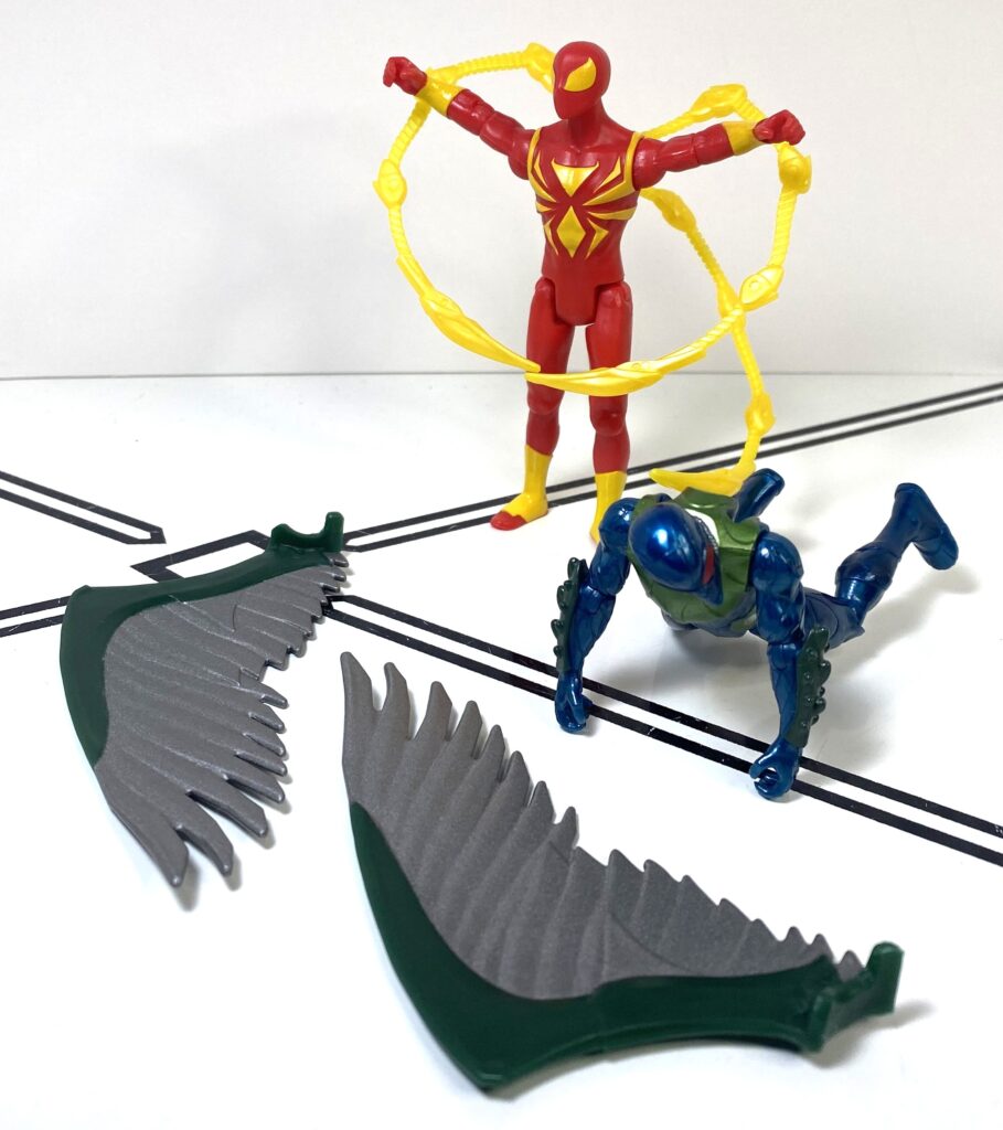
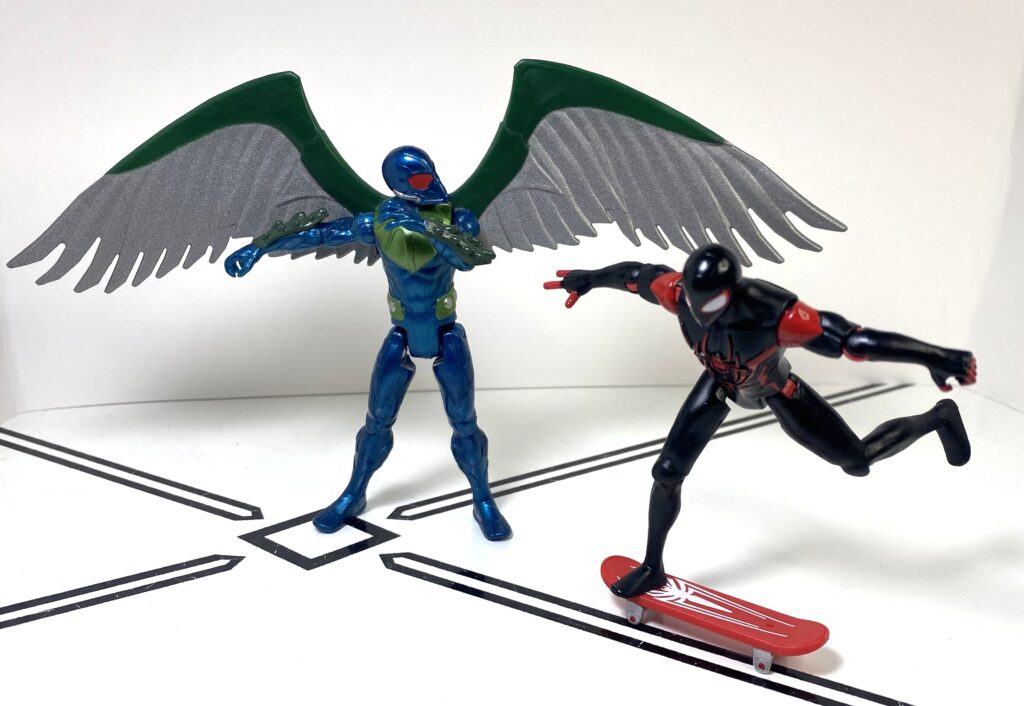
Miles Morales versus the Vulture
This time, only one of them can take to the skies.
The second of these two-packs is an unusual pairing. I’m not super-up on Miles’s comics, but I don’t think these two ever squared off in anything prominent? Better Miles than another Pete, though.
Spider-Man Beyond.
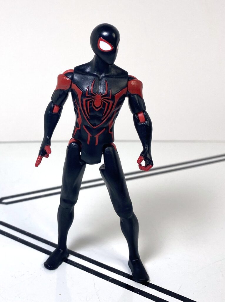
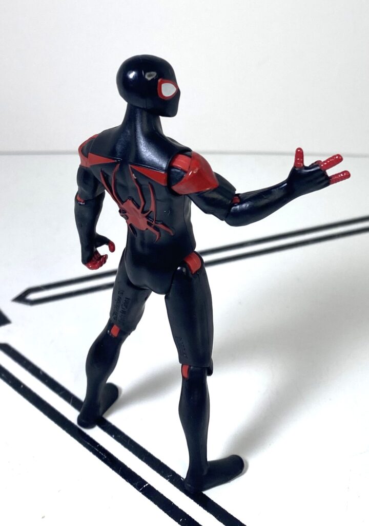
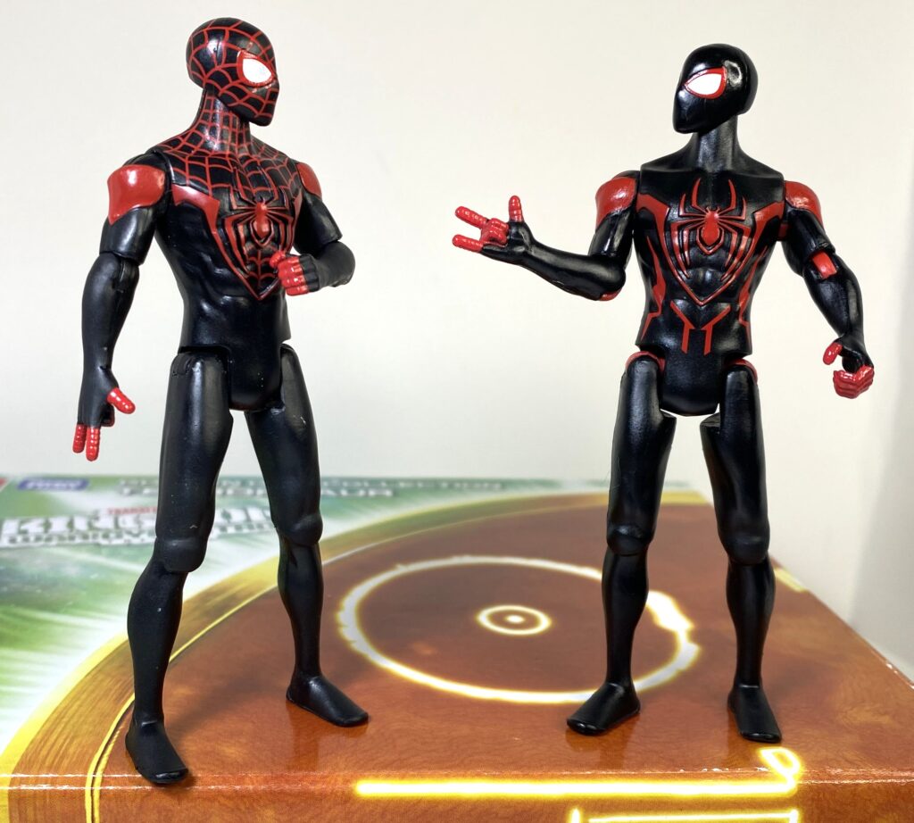
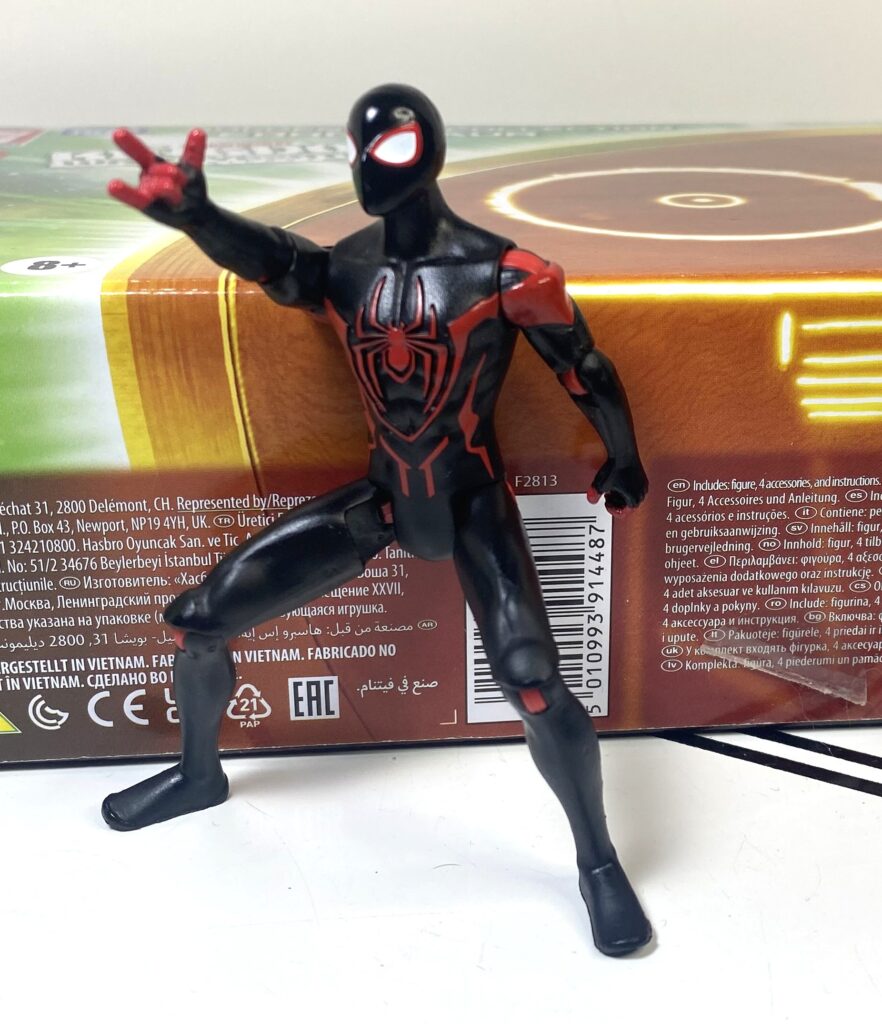
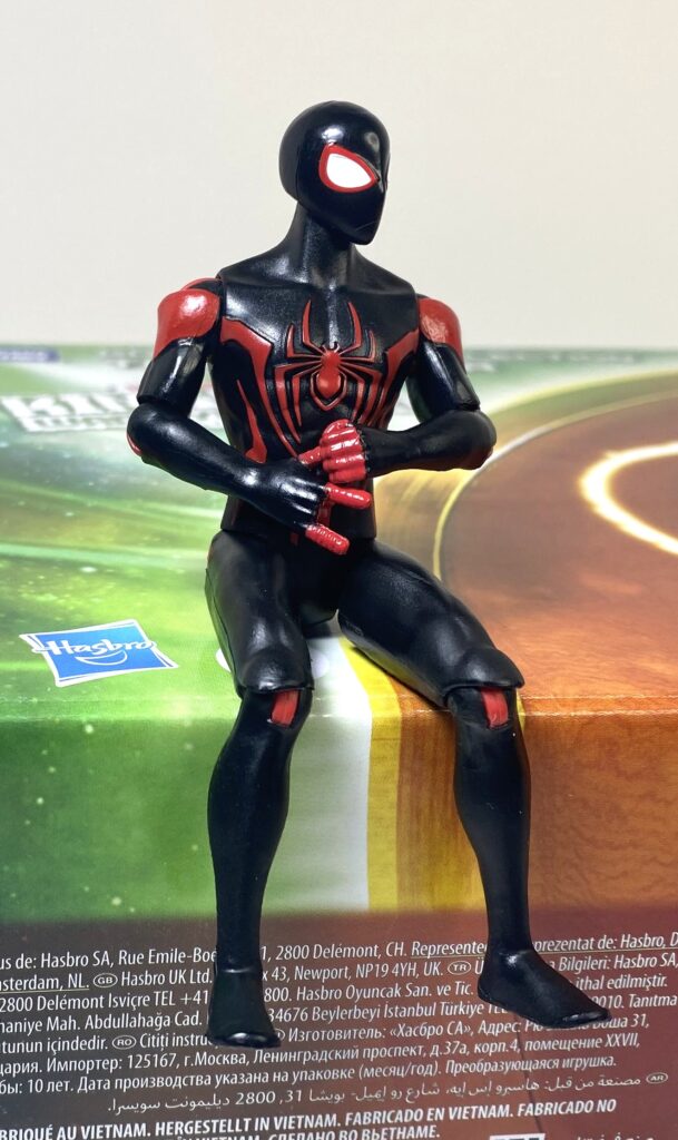
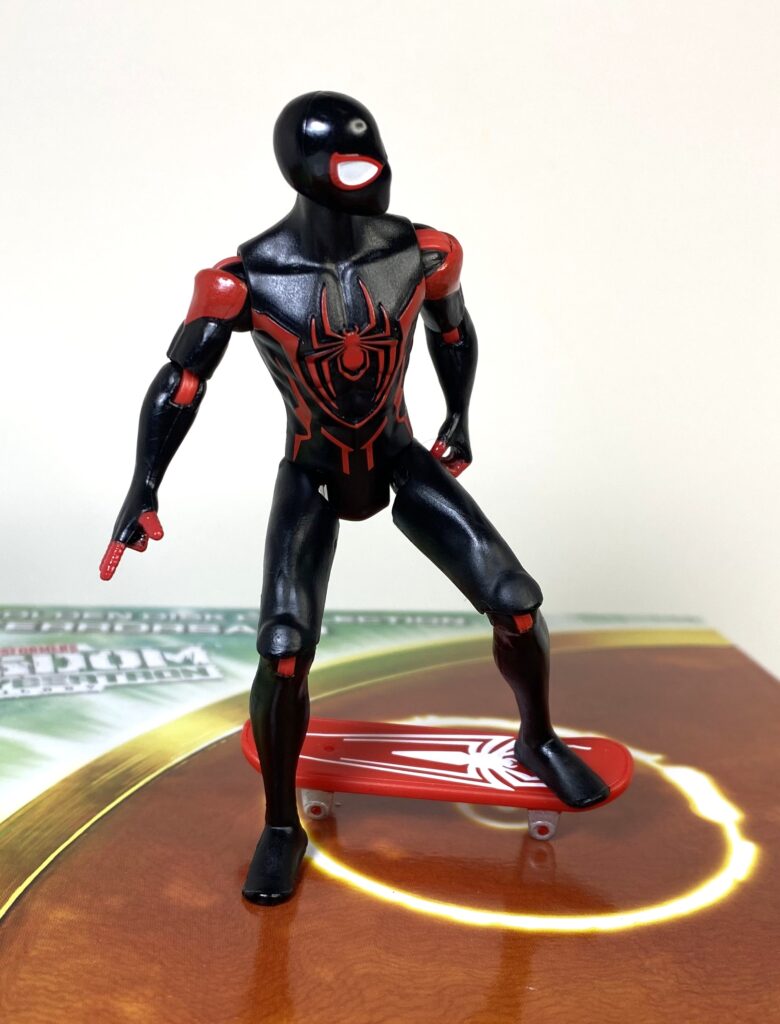
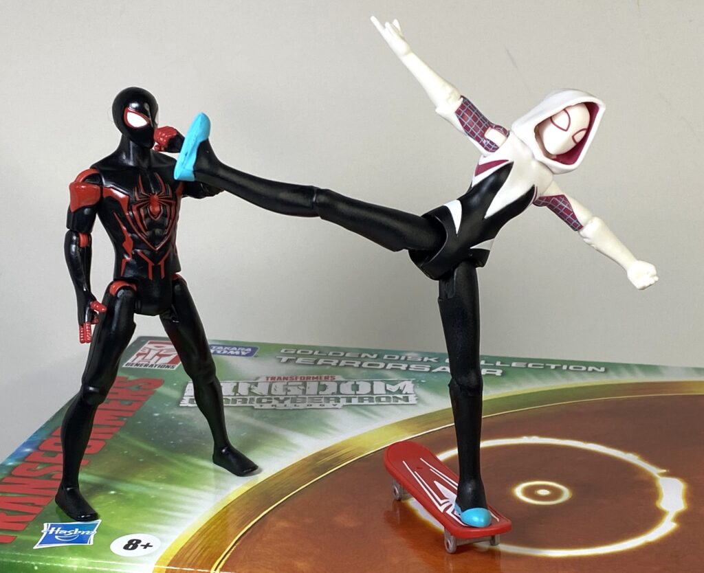
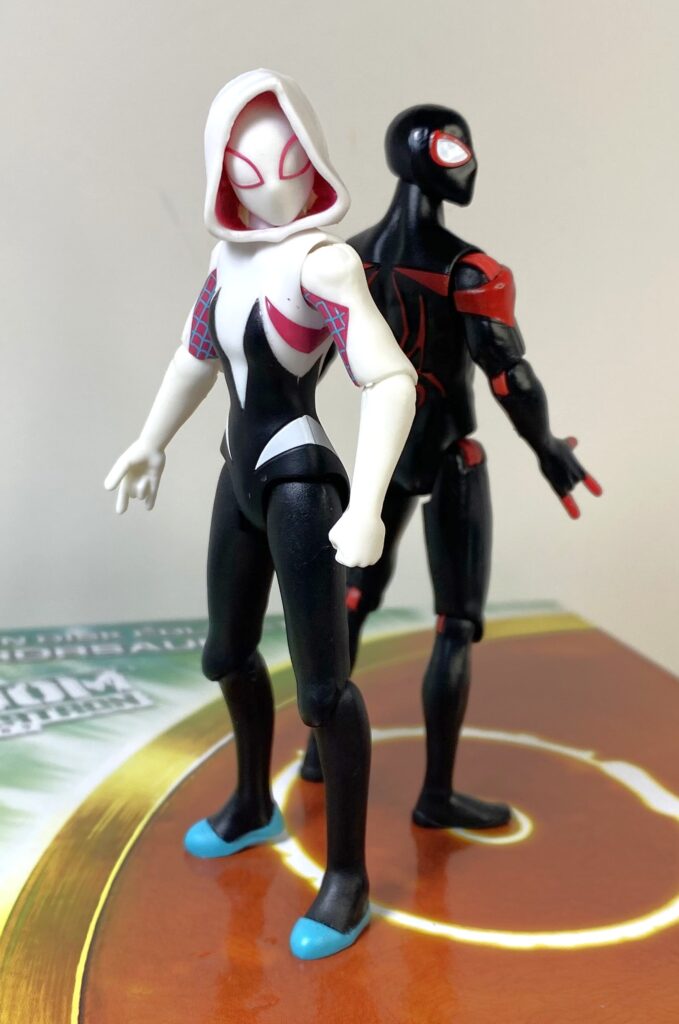
Speaking of Miles, this is, again, a straight repaint of his single-packed figure I previously reviewed. Sculptwise, he’s the same size as Peter, even though he feels like he ought to be shorter.
Pete needed some assistance hitting the Kamen Rider No. 1 Pose.
Surprisingly, he’s a mostly bespoke mold, only sharing his thigh pieces with the first Spider-Man, with even his web-shooting and accessory-holding hands flipped. He’s also got the exact same good-except-for-the-tight-ratchets universal articulation, so no complaints there.
He cuts a dynamic silhouette.
For deco, it’s a little inaccurate to call this version a repaint, as it’s more of a de-paint.
“I’m telling you, man, you want to simplify your look.”
Basically, he’s still solid black, with red accents, and white in his eyes, but a bunch of the red deco has been removed from him, specifically the web grid on his head and collar. He does have a couple extra little red highlights over his abs, but he’s still plainer than his standard release.
Plainer doesn’t equal bad, though!
It doesn’t look bad, though, the black and red is a slick look, and on this version, kind of gives me Batman Beyond vibes. They did make the same mistake as on Pete, though, where his joints aren’t color-matched, so his elbows, knees, and shoulders now all have red plastic visible.
Contemplating why his knees are red.
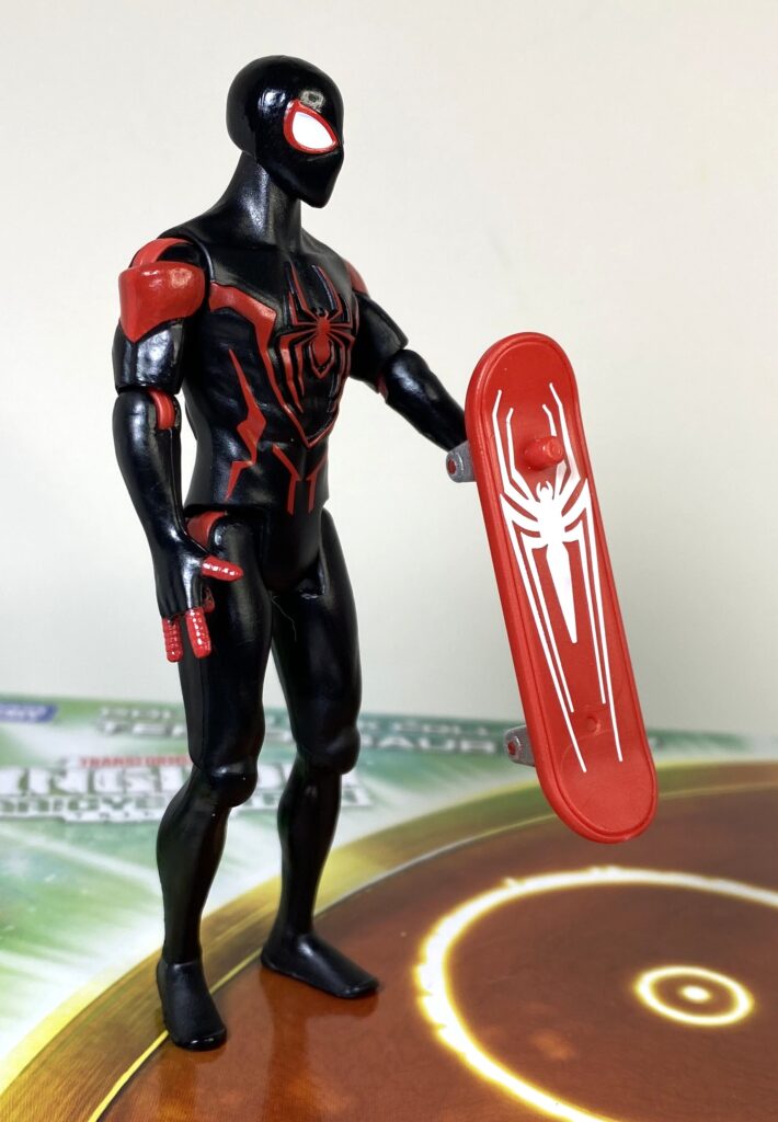
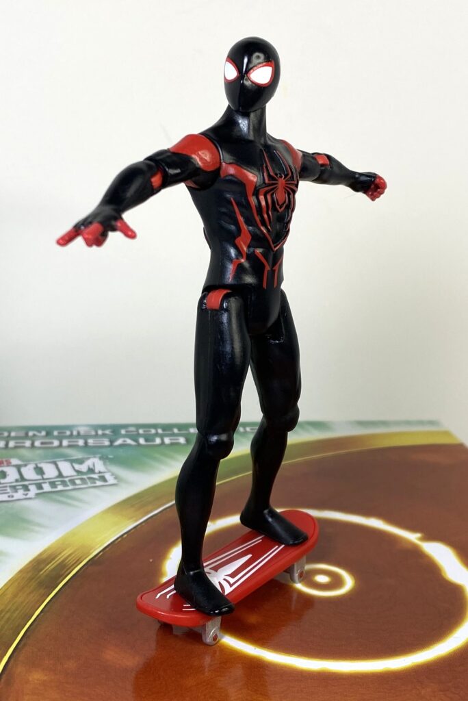
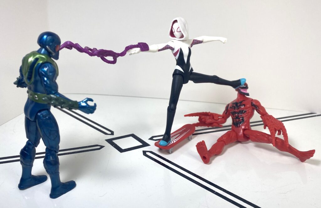
It’s his new accessory that’s really novel: A skateboard.
“Do…do they think this is a thing I do?”
Again, I don’t recall Miles being a skateboarder, but I’m not going to complain about something so interesting.
“OMG WHEEEE!!”
It’s cast in red, with silver on the wheels, and a big white spider-logo on top of the board (with a sculpted version on the bottom). On one hand, it doesn’t roll, since the wheels are also just sculpted in.
It makes the dismount nice and easy.
On the other hand, it’s got a peg on the top of it that fits into a peghole on his feet, so, like the Green Goblin, He’s got a nice, stable connection that facilitates some nice posing.
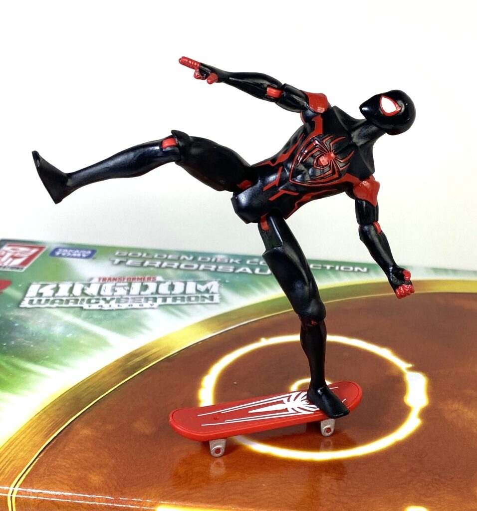
Imagine he did a slick trick.
And it’s compatible with pretty much any figure in the line!
A sample of the movie Goblin going “Misery, misery, misery” plays before the punk music kicks in.
That said, I discovered an embarrassingly small amount of 4-inch action figure outside of the Spiders could fit with it.
She was a skatermorph, she said “see you later, ‘morph.” / She wasn’t good enough for him… / She had a second face / They can’t hear you scream in space / He needed to come back down to Earth… (Lyrics by Firespitter).
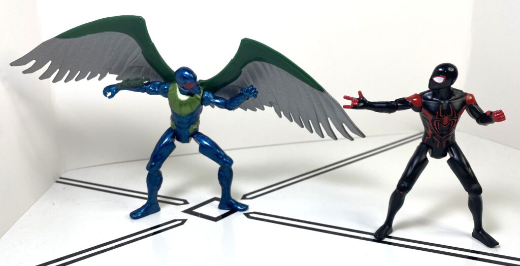
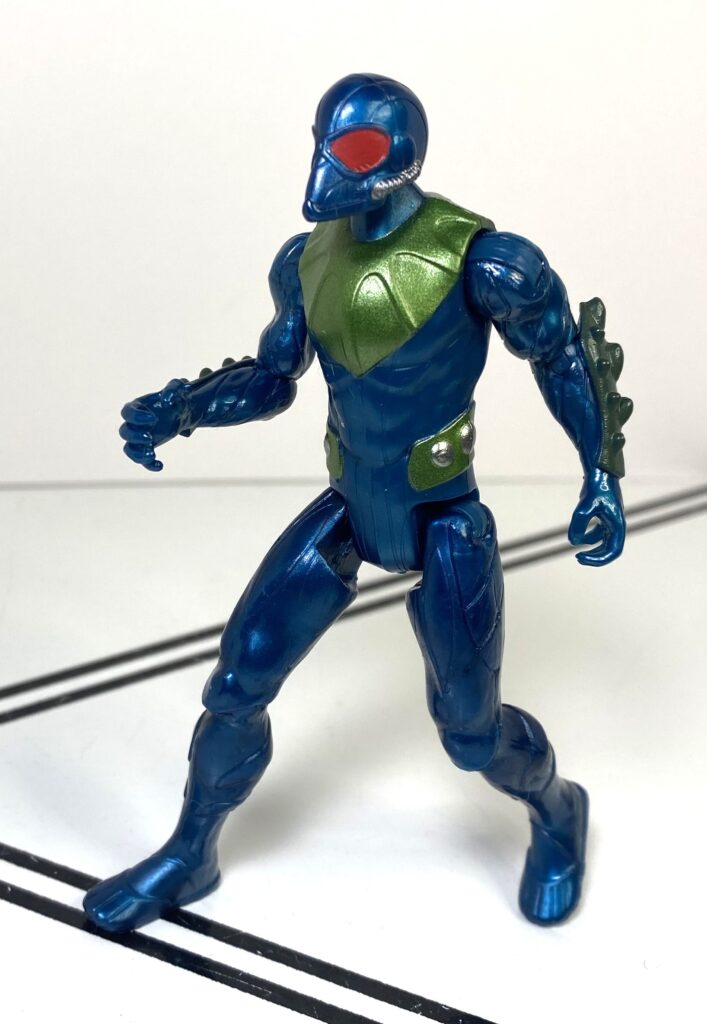
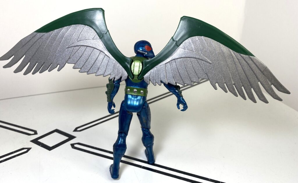
For his opponent, we have The Vulture, a.k.a the most boring villain of the original Steve Ditko era (fight me).
Nobody cared who I was until I put on the wings. Or after, really.
This was one case where the MCU re-inventing him as an ambiguously moral scavenger and weapons dealer was a definite upgrade. The original comics version really had nothing going on in terms of character or motivation, he was a random old guy in a lab who invented a flight suit so he could do crimes, and that’s it.
Okay, the wings didn’t help. It was the Michael Keaton that did.
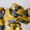
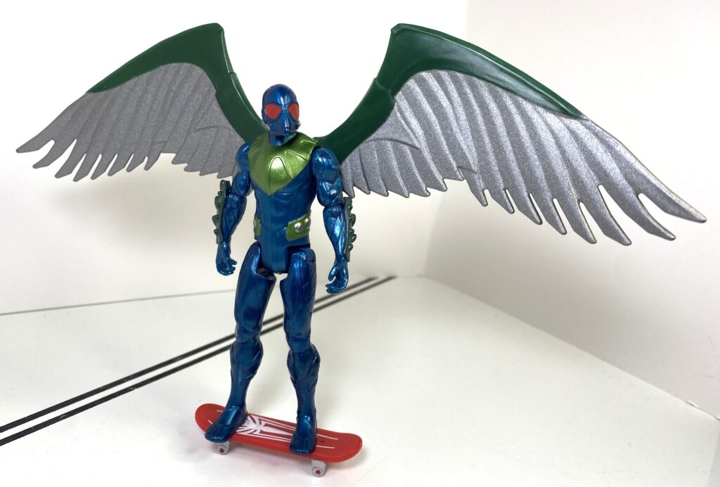
And I guess the toymakers agreed, because this is a brand-new design for the Vulture that definitely seems to be specifically inspired by the flying power armor of Spider-Man: Homecoming, with most of the bird traits relegated to plumage-like details on his forearms and collar, and a gasmask-like helmet (complete with tubes) that’s got a pointed end, kind of like a bird’s beak.
To be fair, it’s a really cool re-emagined headsculpt.
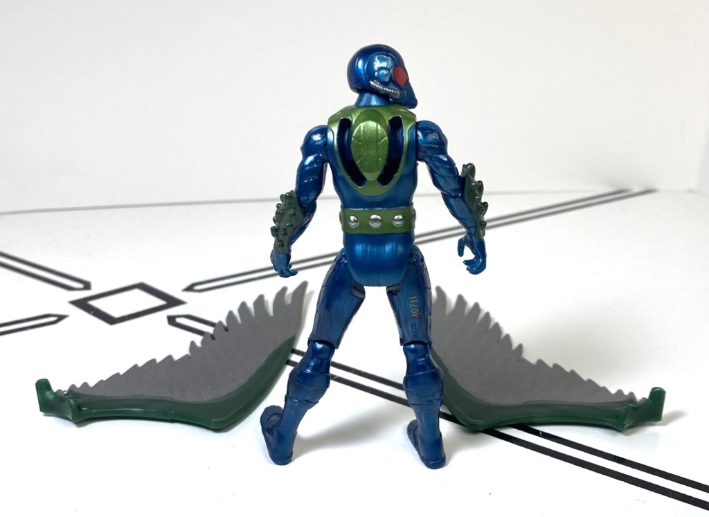
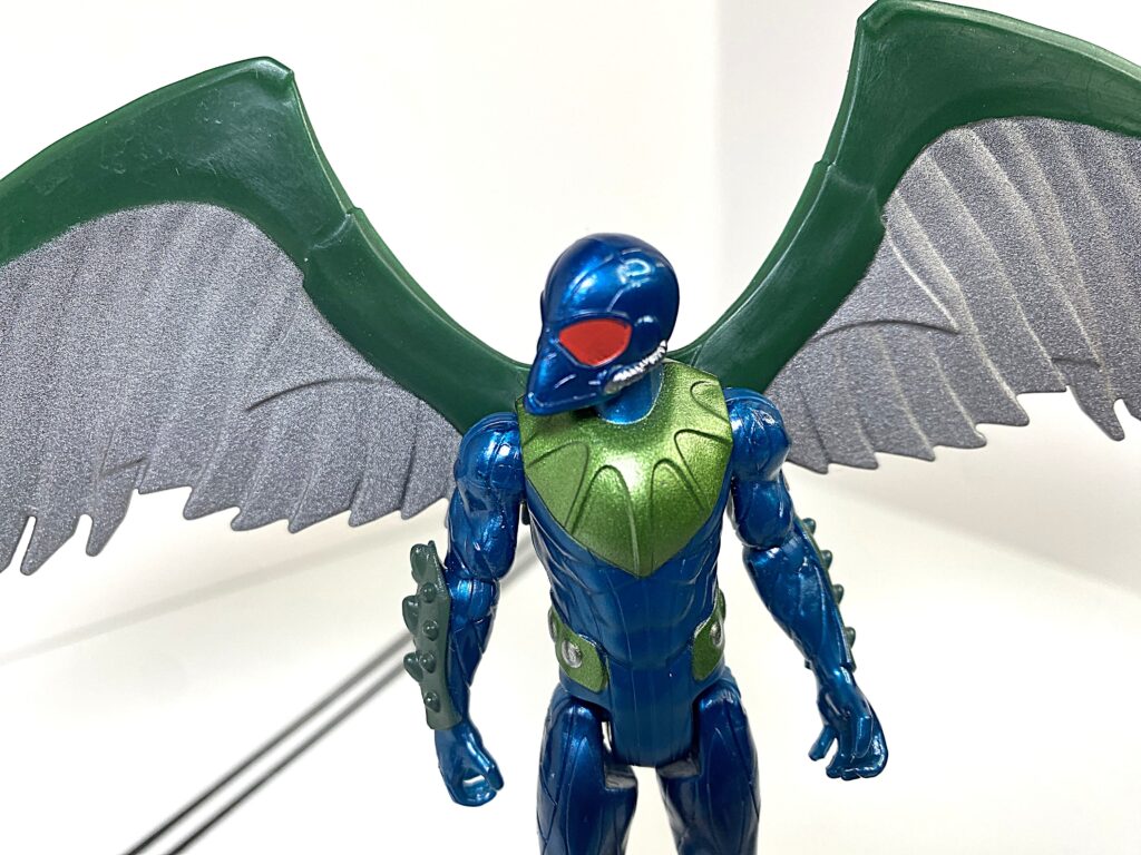
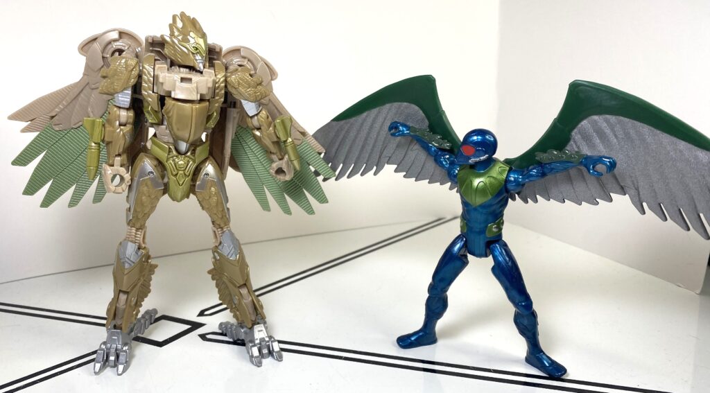
I’ll need to skip ahead to the accessories here, though, because they kind of define the figure. He’s got a pair of absolutely gigantic wings, each about as tall as the actual figure, which plug into brackets on his back, to complete his look, and make him dwarf most of the other figures in the line. They’re sculpted simply enough that it’s unclear if they’re high-tech, or biological, and I kind of wish they had the film’s turbines instead.
He’s a villain because he fumbled a bad Michelle Yeoh-sounding bird.
For colors, his main body’s mostly metallic blue, with a few green accents, and a mask that’s got silver tubes, and big red eyes, adding to the creepiness of him. His wings, meanwhile, are mostly dark silver, with some metallic green uptop.
It’s all about the plumage.
For articulation, he’s got the same suite of joints as the rest of the line, with a balljointed neck that’s particularly effective at looking creepy, given the sculpt of the head. It’s what he doesn’t have that bothers me. His wings have no articulation to speak of, even where they meet his body. And on top of that, they’re big and heavy enough that his stability is a running concern.
He actually needs the skateboard to stay up.
He can stand well in a neutral pose, but I’m disinclined to pose him in anything else, since it becomes a fight to keep him standing.
That’s how MCU Spidey really beat him.
Overall, this is the weaker of the two-packs, and it’s an easy skip unless a) you really want a Vulture, or b) you really want a skateboard accessory.
Vulture does add a badly-needed villain to the roster.
Miles is still a good figure, just not very different from his solo release, and Vulture’s got an impressive wingspan and cool design, but he’s just a bit too awkward to be fun. In fact, I’d call him the first outright miss of this line so far. But that board’s really cool.
Stuntin’ on them birds.
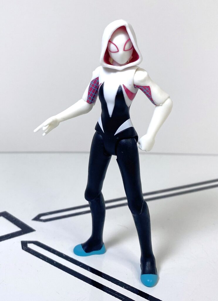
Ghost-Spider
So, let’s move forward in time, to stuff that’s come out this year.
Like her!
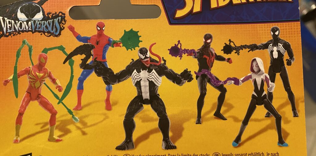
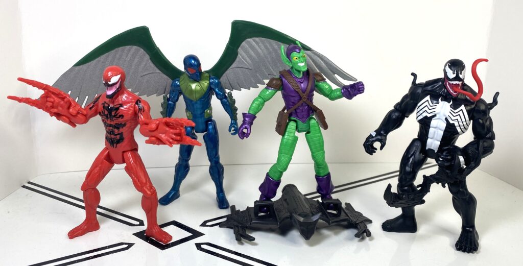
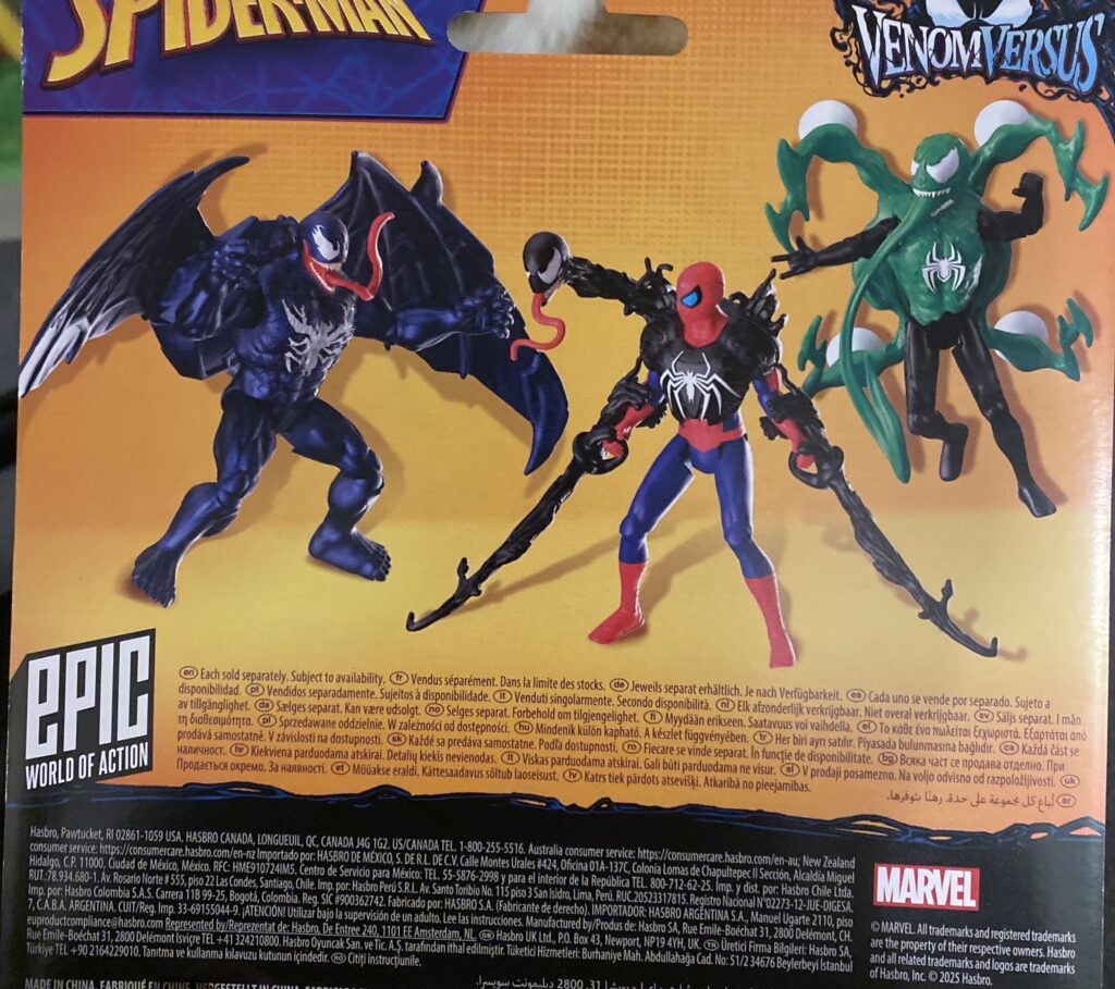
Epic Hero Collection had a name change to Epic World of Action, but otherwise kept going, and that included the Spider-Man toyline, which also now carries the “VenomVersus” branding, which, as far as I can tell, is a cross-toyline thing focusing on Symbiotes like Venom and Carnage, with an emphasis on depicting them as bonding with the heroes. When it comes to single-packed figures, though, the line’s mostly just re-releases of the first two waves of the toyline, albeit with the odd change that their accessories have mostly been repainted into funky colors.
“Why are you crying? Wait, the Green Goblin did WHAT in this universe?”
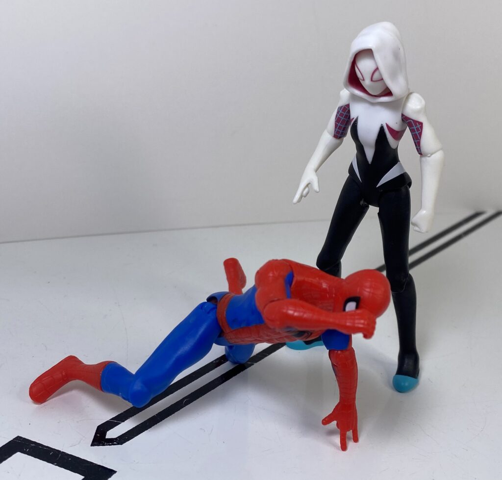
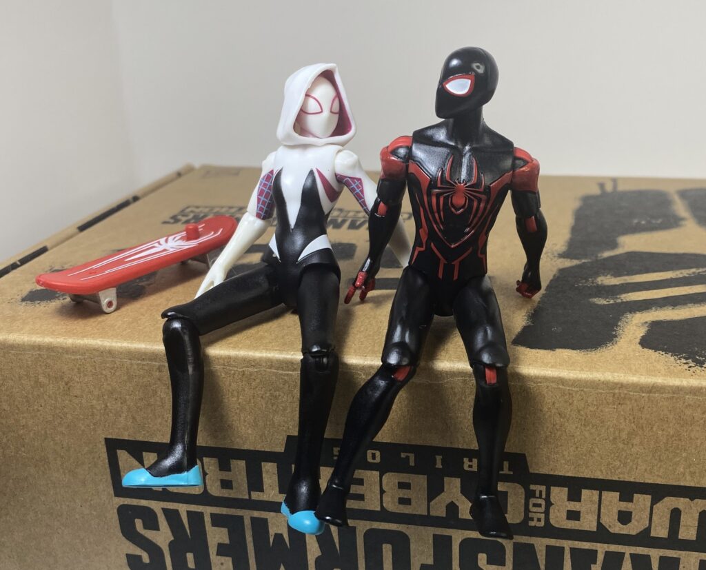
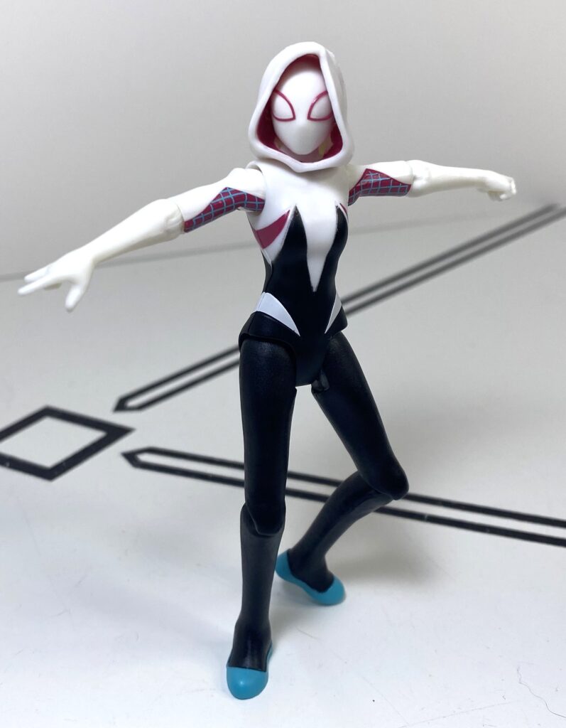
But there was one brand-new figure in the line, which I snapped up the moment I became aware it was a thing: Spider-Gwen, aka Spider-Woman, aka Ghost-Spider, if you believe the name on the packaging. I loved the Spider-Verse films as much as the next viewer with taste, and her original run of comics was pretty good, too, plus this was just a cool design.
I don’t know why, but I found myself relating to the sequel’s character beat of Miles’s feeling super cut off and out of the loop, while his love interest had seen and done incredible things he had no conception of.
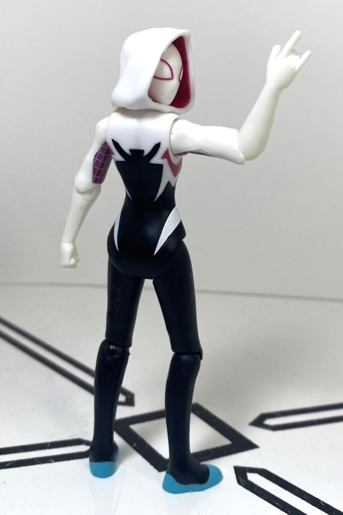
As the first woman in this entire line (I know, disappointing), Gwen’s a brand new tooling, the same height as everyone else, but a lot slimmer.
It’s the ballet that does it.
Maybe it’s recency bias, but I feel like I can tell this figure was designed and engineered much later than everything else in this line. She seems more elaborate, and her sculpt seems cleaner.
She’s gona put some dirt in the Goblin’s eye, though.
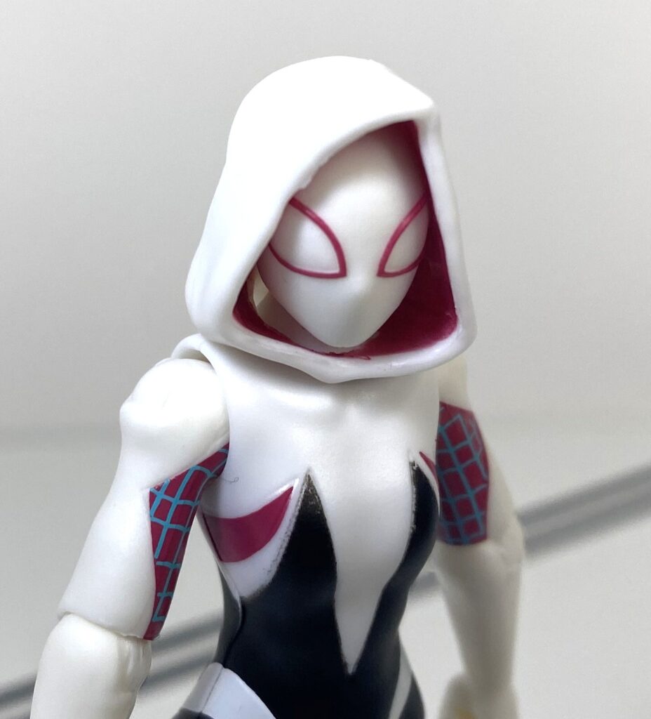
Speaking of that sculpt, this is more or less the same design from the Spider-Verse films, maybe with a couple details tweaked, which means she’s wearing ballet shoes, and has a hood over her head, which is made of soft, flexible plastic.
She’s anything but soft, though.
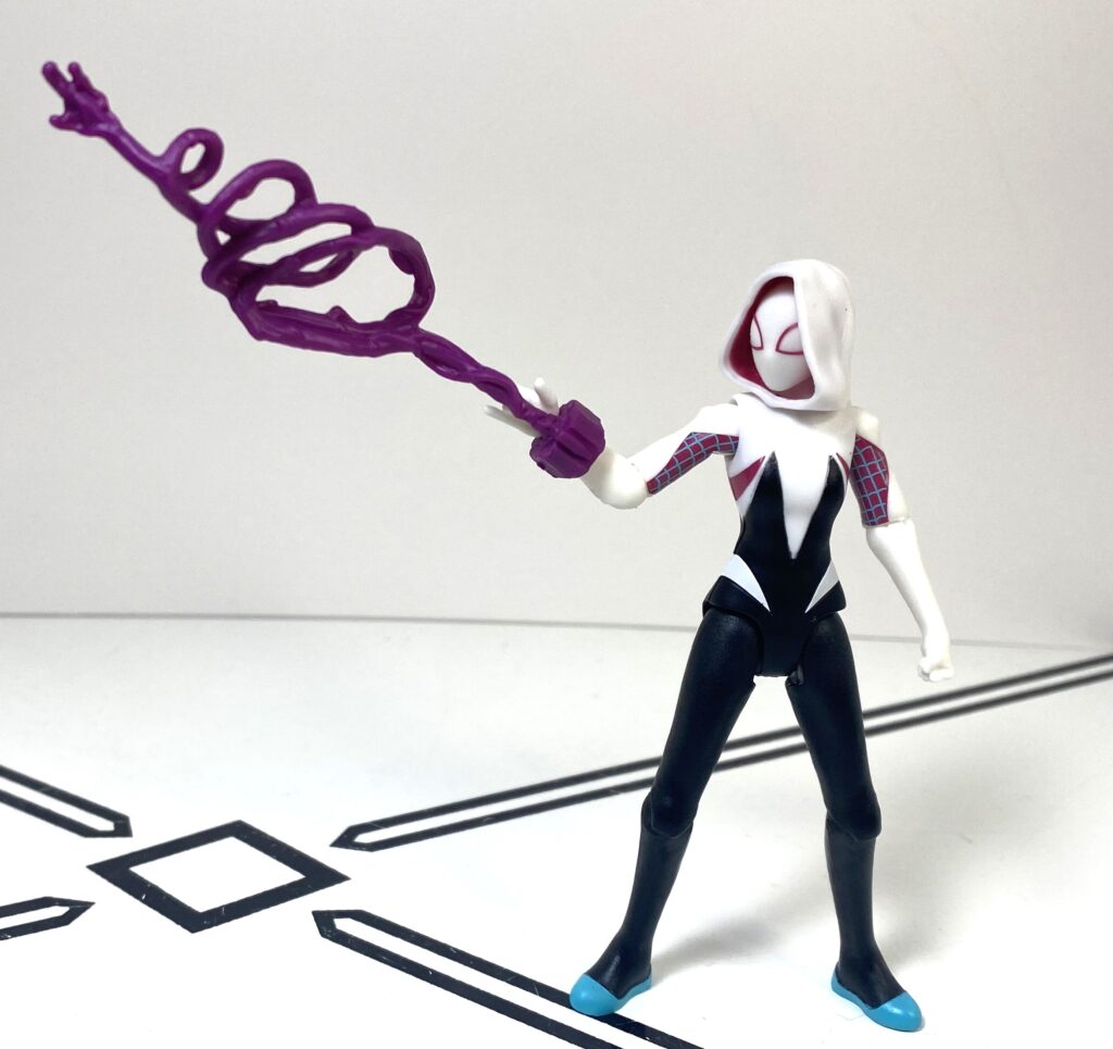
Her colors are also far more elaborate than most figures in this line. She’s white and black, with an intricate pattern over her torso, and has blue painted shoes, purple circles around her eyes, and purple inside her hood (which feels widely lush), plus a tampographed purple and blue pattern on her upper arms, as well as some purple lines on the sides of her torso. I don’t know where they found the budget for all of this, in a line that can’t be bothered to color in Peter Parker’s web patterns, but I appreciate it.
This macro zoom isn’t doing her any favors, though.
Aside from the soft plastic on her hood, the rest of her also feels very very slightly softer than the materials this line’s typically made out of, more like mainline Marvel Legends, but not to the point of affecting her stability, which is still top-tier. Her articulation, meanwhile, is the same 9POA as everyone else.
Showing Miles how it’s done.
What’s most impressive about it is that they sculpted the hood as a part of her head specifically so she still had neck articulation, including a little bit of up and down motion.
She’s as baffled as I am.
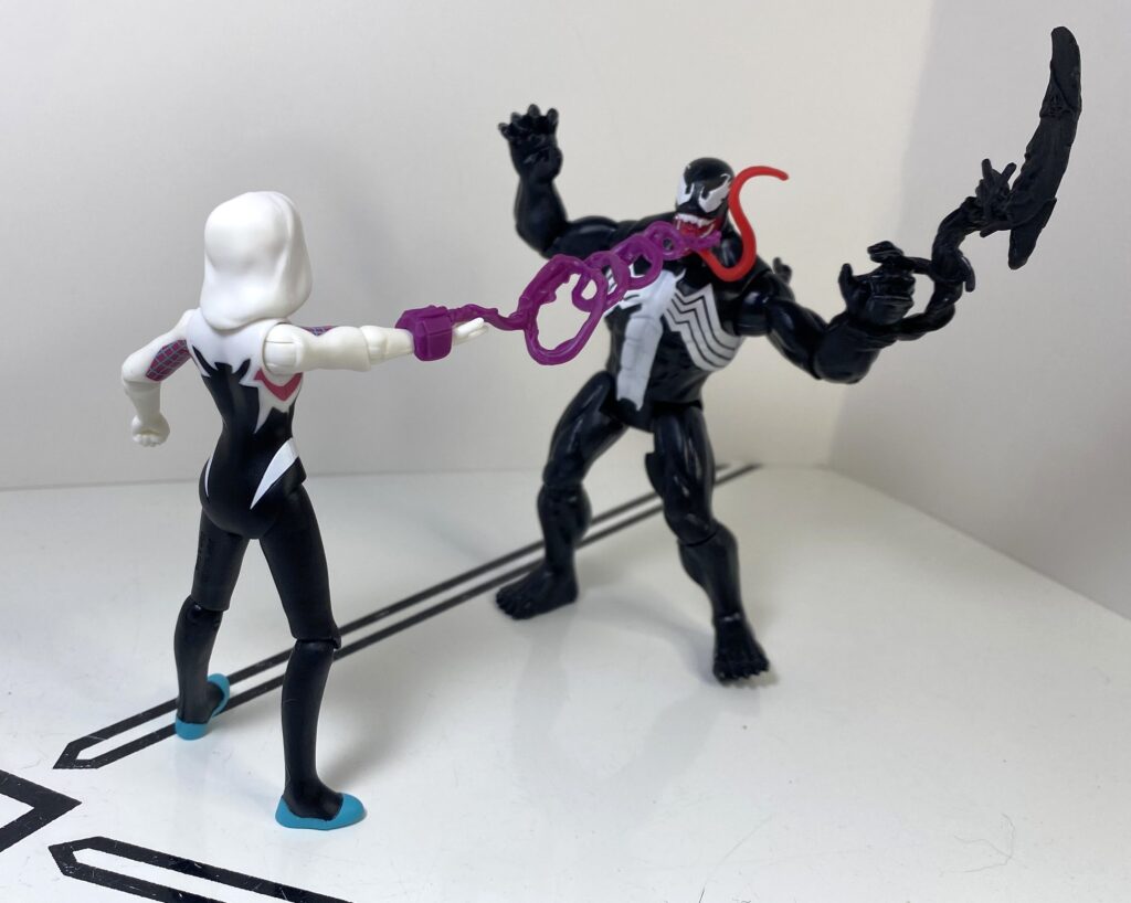
So, her lone accessory’s an odd one, because of that aforementioned thing from the VenomVersus line, where every accessory is an odd color: It’s a shot of purple goo, in a spiral pattern. Granted, it’s probably just supposed to be webbing that got repainted, but I can’t help but look at it and see something grape-flavored.
“DELICIOUS!” -Venom.
Still, the purple pops nicely against her colorscheme, so I can’t complain. It cuffs onto the wrist of her right web-shot-posed hand, and if it bugged me too much, I could always give her one of the more normal-colored web shots included with some of my older figures.
Not that she needs it to handle the baddies.
Overall, though, this is a really, really solid little 4-inch figure. Spider-Gwen’s a great design, and it feels like more effort and money went into getting this 9-dollar figure of her just right than the rest of the line. If you see her, and you like the character even a little bit, just get one, it’s as simple as that.
“I’m LEAVING. With. SOMETHING.”
I’d go so far as to say if you only get one single-packed figure, get her.
Maybe we’ll get to see the conclusion of their story some time this century.
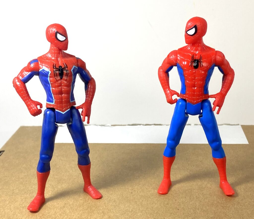
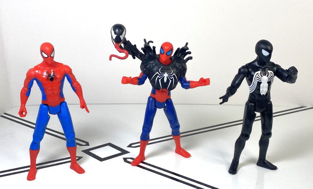
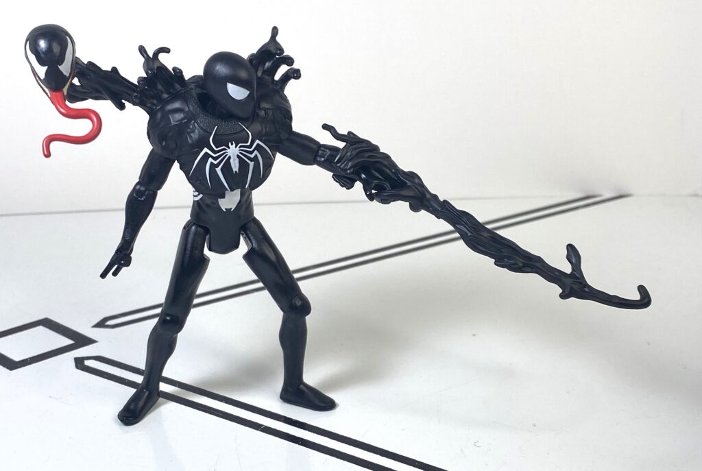
VenomVersus Spider-Man
Gonna be real, I’m not even sure what to call this guy, it just says Spider-Man on the package.
Spider-Man: Nights.
This is another pricier figure, costing the same amount as those two-packs above, but isn’t an exclusive this time around. Pete’s one of three premium figures in VenomVersus, where the gimmick is that they’re a normal 4-incher with extra Symbiote-related accessories. I’ll be real, though, it was the core figure here that made me decide to give this one a shot.
A little more dark, a little more serious.
So, Pete’s yet another repaint of the original, default Spider-Guy design, with the only tooling difference being that both of his hands are now accessory-holding sculpts, for the sake of his gimmick. Same good sculpt, same good articulation, but it’s the colors that got me.
Subtle, but improved.
Basically, he’s got almost the same layout as the original release (the spider logo on his chest is a bit bigger, and has different legs) but the whole thing’s been palette-swapped into something a bit darker. The blues are more navy, the red is less vibrant, and most interestingly, the lenses in his eyes are light blue, instead of white.
He’s looking into the sunset.
I don’t know why, but something about this color scheme makes me think of the 90’s animated series. Maybe it’s just that the deco looks like we’re seeing Spidey at night, or at sunset, and there was a lot of both settings on that show.
Or maybe I’m just seeing things.
Either way, I just think he looks neat in these colors.
Poses well, too.
So, same articulation, same build quality, what’s different? His accessories, which are a bunch of rubbery black goo, sculpted to look like Venom.
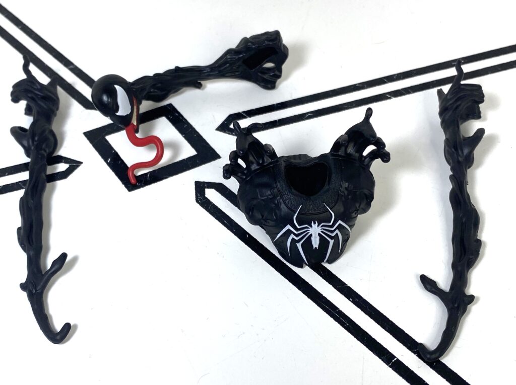
Get Venom’d!
They’re all soft plastic, and fit over him like armor. First of all, you’ve got a breastplate and shoulder pads, with a bunch of gooey spikes coming up from his shoulders, and a white spider-logo sculpted and painted onto his chest. It reminds me of a football jersey, or something a high-concept metal band would wear during a concert.
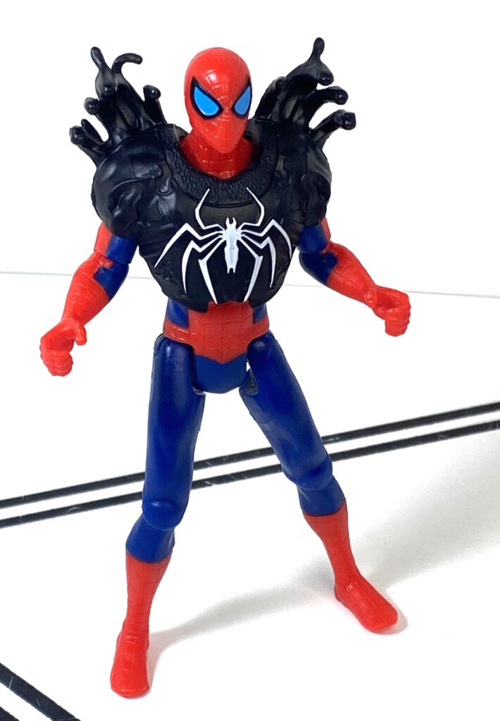
“Put me in, coach!”
It also inhibits his shoulder articulation, though, which is bothersome. Next up, there’s a Venom head, complete with obnoxiously long tongue, on a long, wiry stalk that attaches to the back of his armor, reminding me of how Venom would manifest in the modern Sony films whenever he wanted to speak to Eddie Brock.
Venom’s about to give him the worst advice knooooown to man.
It’s a very well-sculpted face, with a gleeful expression, though I do wish it had some articulation, or was at least the kind of bendable soft plastic that could stay bent, instead of snapping back to neutral, since it means he can’t turn and look at Spider-Man. Finally, he’s got these two long, gooey spikes, each about the length of one of Vulture’s wings, that clamp onto his forearms, and get held in his hands, hence why those hands were retooled.
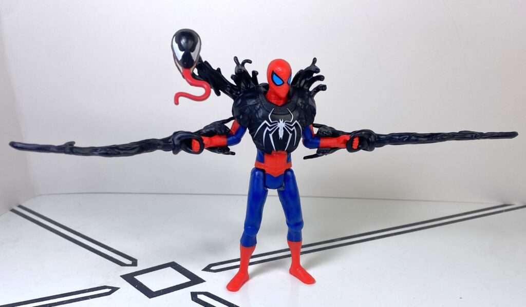
“Ey! I’m Venoming here!”
His shoulders being restricted when he’s armored up do, admittedly, limit the extent to which he can flail these around.
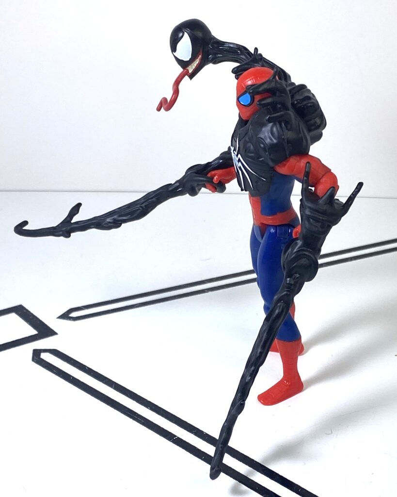
Anyone within a meter of him is in serious trouble.
Now, I’m not the biggest spider-lore-knower, but if there was ever a story where Spider-Man and Venom teamed up to fight while half-transformed, I’m not terribly aware of it, though it does, again, remind me of some of the tricks Venom would pull in his solo movies, so I guess there’s a bit of lore precedence here. This also sort of reads to me as Spidey caught mid-transformation into his black suit, too.
START > CHANGE > FINISH
Speaking of that, there’s nothing stopping you from giving these accessories to any of the other Spider-Men in this toyline, though they have to be shaped like this guy for the stuff to really fit. I’ve found these Venom Parts look really good on Miles, and on Black Suit Spider-Man.
When Black Suited-Pete loses control.
That’s still an unfortunately-colored accessory on Miles.
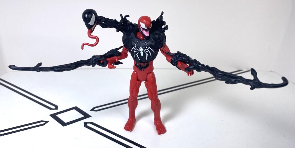
Well, double Symbiote on you!
Overall, while this isn’t a bad figure at all (really, Vulture’s the only not-so-great guy in this line so far), the fancy armor doesn’t really do much for me. I wanted this release for the palette-swapped core figure, and I’m happy with how that looks, for sure, but it’s not as good of a value proposition as the two-packs, or just buying one of the single-packed guys. I think it’s also a problem of the idea here not conceptually appealing to me, too. In terms of the other two releases, I don’t think I’ll grab the Miles with Green Symbiote, but maybe the Winged Venom could get me.
Hmmm, boss monster, or snot creature?
The Whole Shebang Overall
Here’s the deal: These single-packed, sub-10-dollar, Joe-scaled Spider-guys are still good old-fashioned fun, and I think you owe it to yourself to pick up one, or two, or three (and if you see Ghost-Spider, make it her). VenomVersus has reissued most of the earlier characters, so you’ve still got an easy on-ramp for entry.
Class of 2024/2025
I think the lesson learned from this batch is that the line stumbles a bit when it ventures outside of the sub-ten-dollar zone, and I suddenly feel like I have to hold them to a higher standard. Even then, the Goblin versus Pete set’s great, and my only criticisms are Miles and the Vulture are kind of ehhhhh, and the armor-up VenomVersus guys don’t really feel like they’re better than the cheaper single-packed ones. But, again, if you see any of these, I strongly encourage you to give one or two of them a whirl, especially since it won’t break the bank!
Cappi was curious about the photo shoot.
Once again, she had to be the subject.
Gwen’s in heaven (no, not like that).
For over 200 Bot, Non-Bot, and Retro Bot Reviews, click here to view my archive.