
Okay, last Spider-Man thing for awhile, honest. So, I mentioned back when I started what’s now a trilogy of themed reviews that my first exposure to the character (and Marvel in general, really) was his 90’s animated series, with its awesome opening theme (look, I’ll roll it one more time, it’s that good):
I recently re-watched the first few episodes, and, while I’ve heard it kind of falls off later on, the bit I saw actually holds up pretty well, and is fairly ambitious for a 90’s toon in terms of its serialization. Along with the series came an extensive, long-running line of action figures from Toybiz, which I’ve since heard were pretty well-regarded.
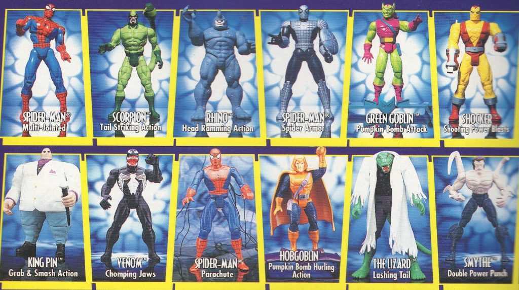
One of the later cardbacks, after the line had filled out a bit. There were a few Spider-Men before these three.
As a kid, I was way into them, and the action-features that each one came with. There were a bunch of different Spider-Mans (Spider-Men?) in the line, each with a different gimmick, and the one I had back in the day came with a cloth goods web-parachute, which was the lamest gimmick out of all of them, but meant that it just had a normal, poseable Spider-Man action figure at its core, rather than something compromised for the action feature (not that I thought this way back then, I wasn’t *that* lame of a kid).
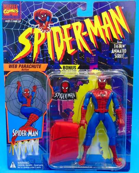
That’s the one I had! C. JillyBean on Flickr
Anyway, over the last few years, Marvel Legends has been releasing Spider-Man-related figures on jumbo-sized cards meant to imitate the old Toybiz line (Toybiz actually originally did Marvel Legends, so there’s some lineage there), and those cards really hit me in the nostalgia, until I noticed that the actual figures on the cards frequently had nothing to do with the Animated series, and it seemed like Hasbro was just sticking whatever Spider-people were in the pipeline on those cards (Sandman wasn’t even on the show! Neither was Gwen Stacey, except for an alternate-universe cameo! Jameson never wore that outfit on the show!).
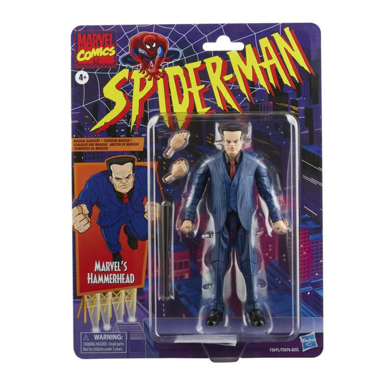
And this guy, whoever he is, why is he here? He’s currently shelfwarming every place Marvel Legends are sold.
There were a few exceptions here and there, like a cool-looking toon-style Venom, but yeah, it was generally pretty random. Most importantly, the line’s obligatory Normal Spider-Man was a bit underwhelming, being more of a generic design.
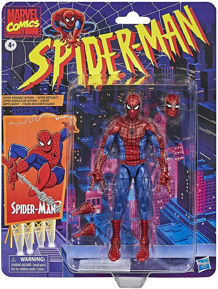
Not bad, but not great. And really lacking in the accessories department.
But, they finally got me, through the power of a solid do-over.
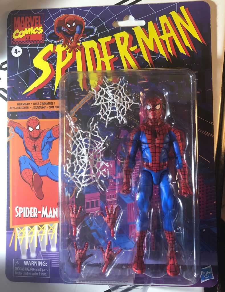
Same retro packaging, much more appropriate figure.
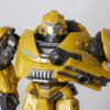
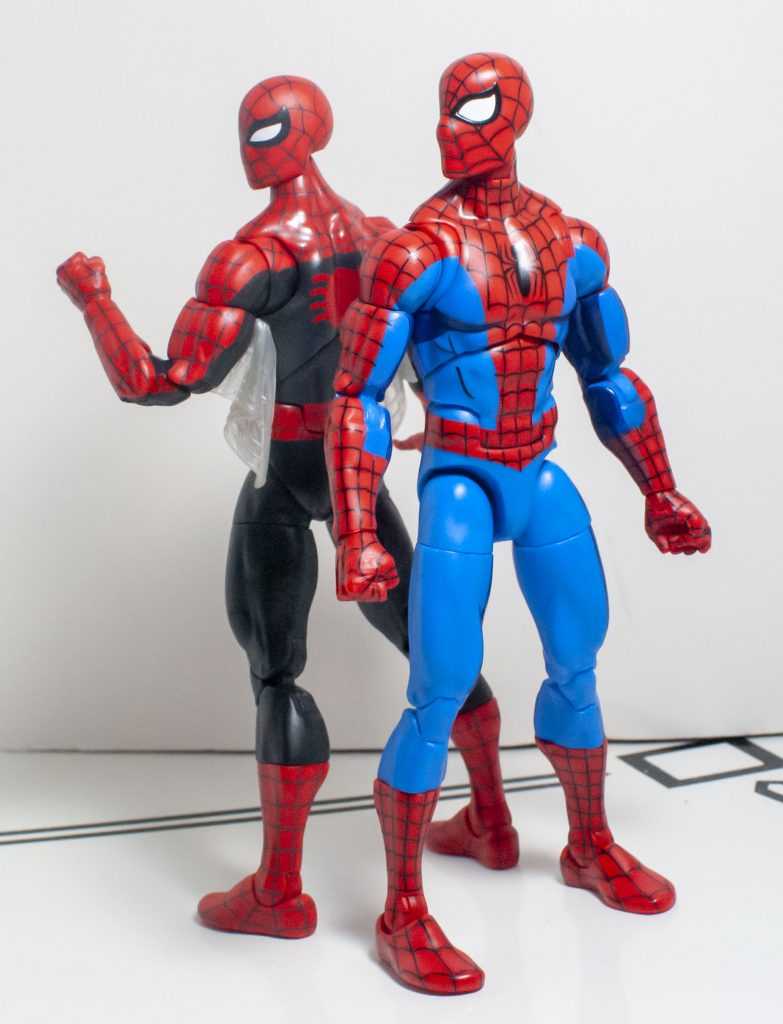
So, this second version of Spider-Man’s based specifically on his 90’s toon design, and is a repaint and retooling of last month’s Amazing Fantasy version. Character I like, show I like, tooling I like, sounds like a good formula, eh? Too bad this guy’s trapped in the same limited Wal-Mart Exclusive Wiggler as Retro Hot Rod. I managed to pre-order him online, but I’m not sure if he’s ever going to show up on store shelves, and might be hard to track down, compared to the mass-release Amazing Fantasy version (and him seemingly not having a specific name you can look up makes it harder, the title of this review is just the most agreed-upon combination of words). So, let’s see if he’s worth it.
The Sculpt
Trying to look buffer.
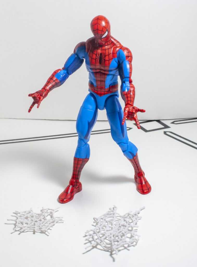
I’d said when I reviewed the Amazing Fantasy version of this figure that I kind of wished he wasn’t as muscular-looking, since Steve Ditko really just drew him like a normal, non-buff person. I also said they probably made him toned and athletic so they could repaint him, and that’s come true here, but funny enough, I feel the opposite sentiment: He should be bulkier, because 90’s Spider-Man was a bit on the beefy side. Still, this figure’s build feels far more appropriate for the Animated series, and looks right at a glance.
Feels wrong to have him standing there and not doing an Action Pose ™.
And as before, it’s a very solid sculpt, without the unsightly circular pins that could be found around the joints of older Hasbro 6-inchers. Granted, he’s again, absolutely covered in other kinds of joint cuts, but that comes with the territory. The only ones that really bug me are beneath his shoulders, as they break up the red/blue color blocking, thanks to the plastics used.
Like a funhouse mirror.
One thing that really impresses me here is the level of retooling. Firstly, he’s got a totally new headsculpt, which specifically evokes the 90’s toon version, through giving him wider eyes (but not as wide as the comics sometimes draw them, the toon didn’t get that nuts), and a more pronounced nose underneath his mask. Meanwhile, his upper arms are new pieces, due to not needing pegholes on them for accessories, and, to my surprise, his shoulders are each a different, slightly smaller piece, which, as I’ll talk more about later, actually helps with his articulation.
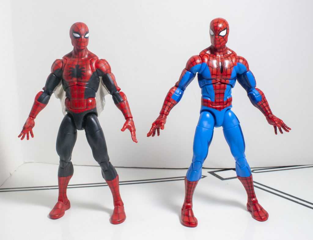
You ever think about how the Spider-Verse concept conditioned us to be fine with owning multiple variants of the same guy?
Overall, though, he’s just a good-looking Spider-Man, with an unexpectedly dedicated amount of retooling.
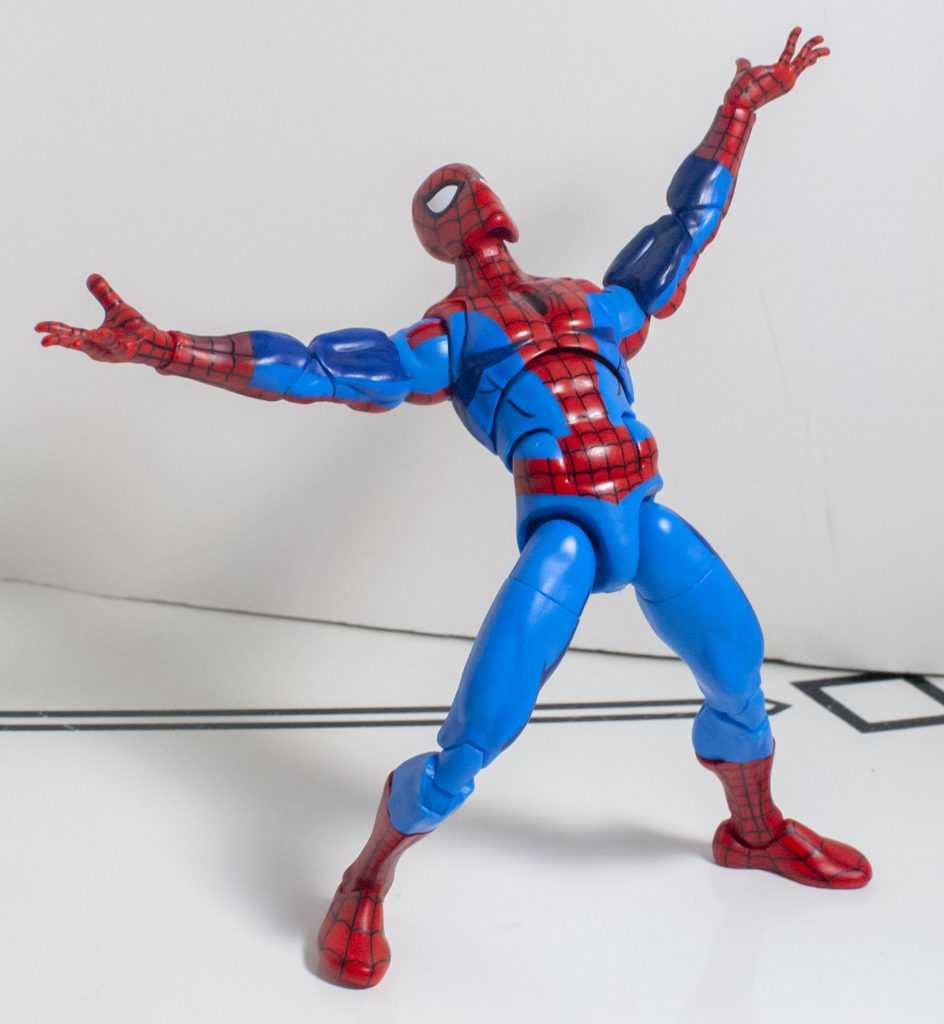
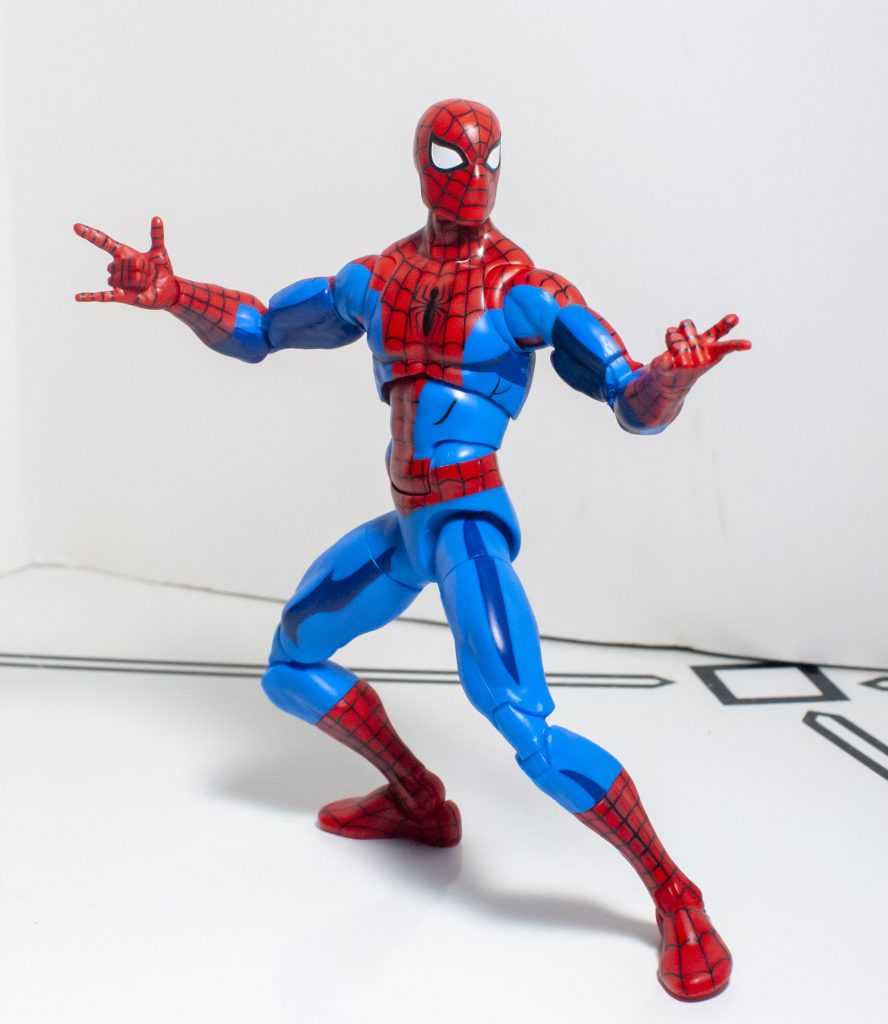
The Colors
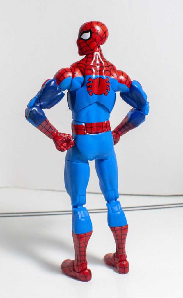
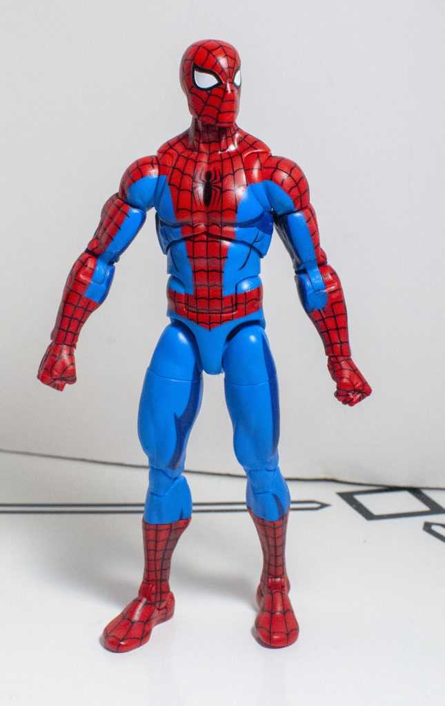
Check out his logo. Yes, logo.
This is where this particular Spider-Man really shines. See, I’m not usually a fan of cartoonish cel-shading on figures, like when Siege Optimus Prime and Megatron got “Classic Animation” repaints.
Really doesn’t do it for me. C. TFW2005
But in this case, they somehow managed to produce a version of that style of paint job that I actually like, probably because it’s more subdued than it usually is.
Still sticks out like a sore thumb when sneaking, though.
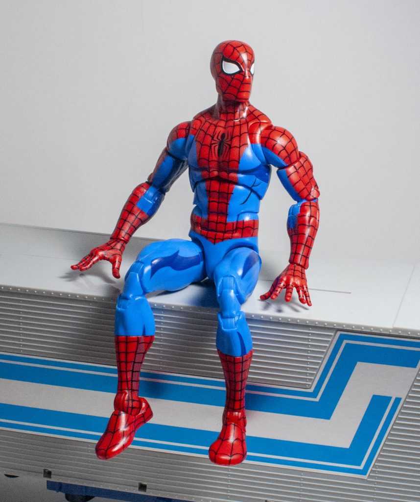
Abstractly, he’s a typical Spider-Man, red and blue (also, it’s the same shade of red as the Amazing Fantasy one, turns out I can’t understand color contrast making things look different.) His red bits have lavishly-painted webbing, a show-accurate spider-logo on his chest, and a red logo on his back. The blue’s where the shading comes in. He’s mostly light blue, but his arms and legs have dark patches on them, to imitate shadows, some of which trace additional musculature on his body. Small amounts of that shading also bleed onto the red. It’s subtle, and it’s effective at adding layers to his colors.
How he actually needs to hide.
Impressively, he shares no paint layouts with the Amazing Fantasy version, the webbing is different, the exact locations of the blue and red are different, it’s totally different. It’s hard to tell what’s deco and what’s plastic, but he’s seemingly slathered in paint, and it really gives him a premium-looking appearance.
It’s got good vibes.
Oh, and he’s got the expected whites in his eyes.
Build Quality
Do you think the 90’s cartoon would’ve referenced the Karate Kid?
You know, it may just be recency bias, but I think the build quality on this guy’s marginally better than his Amazing Fantasy release. It’s not such a large difference that you can’t level the same criticisms though, which is to say that he’s got just enough soft-feeling plastic on him to not pass for a Figuart, or Figma, but feels like a definite upgrade over the old, rubbery-feeling Marvel Legends I collected around 2014.
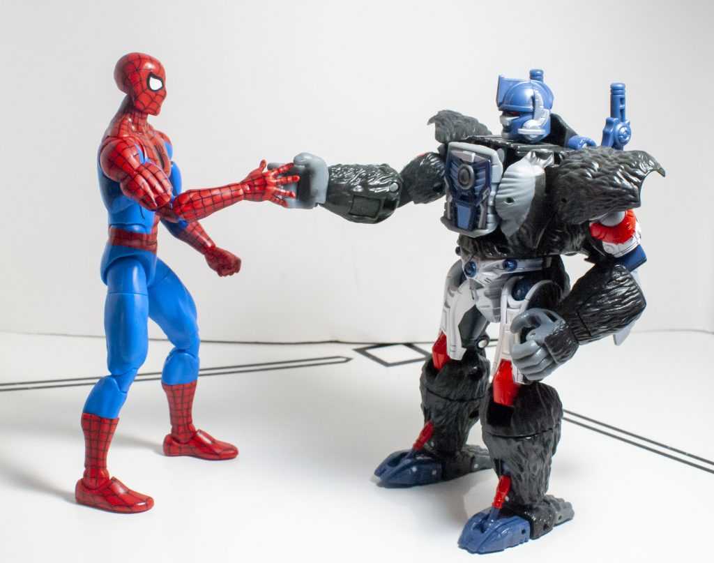
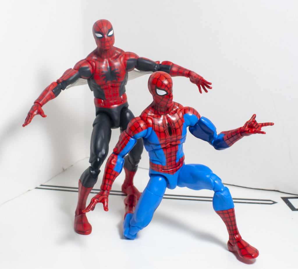
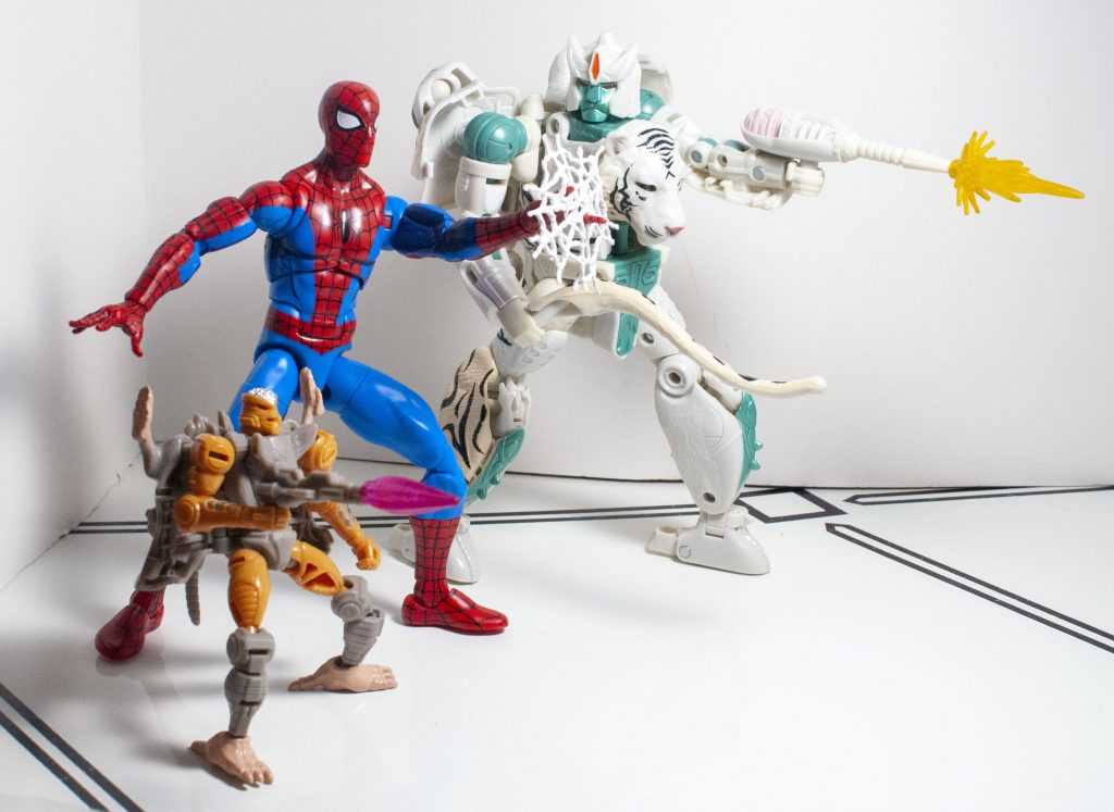
A teamup that feels era-appropriate.
“High Ho, Silver!” “Spare me further indignation!”
What’s improved a little bit on this one is that his extensive paint job makes him feel a little more rigid, and his joints came out marginally tighter. Maybe a little too tight, in fact, I had to move them all out of the package, until they naturally loosened, which makes me think it had something to do with the paint. But we’re not dealing with, like, NECA-style “boil the joints and try not to break it” tightness, just “I had to flex everything a couple times.”
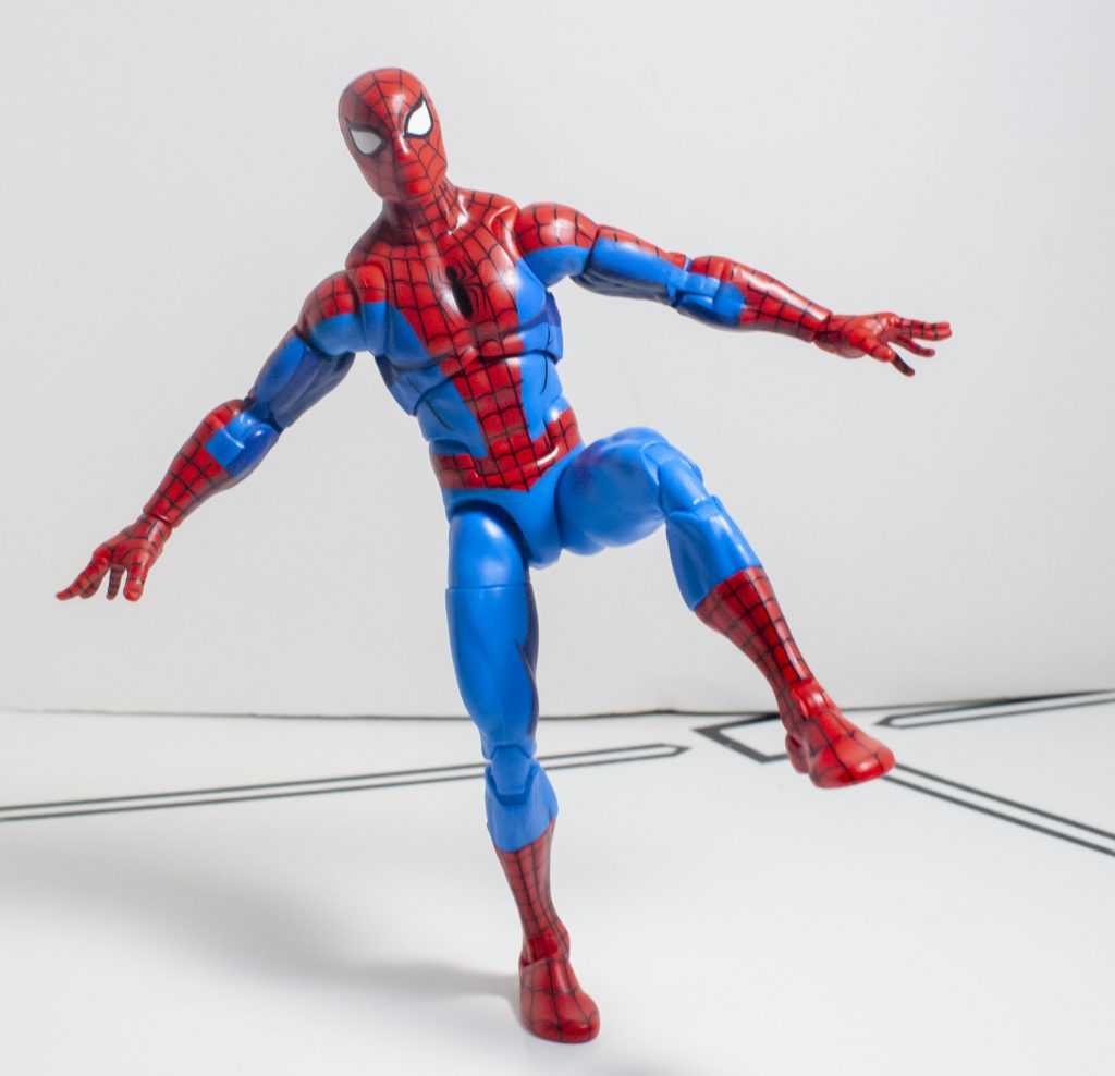
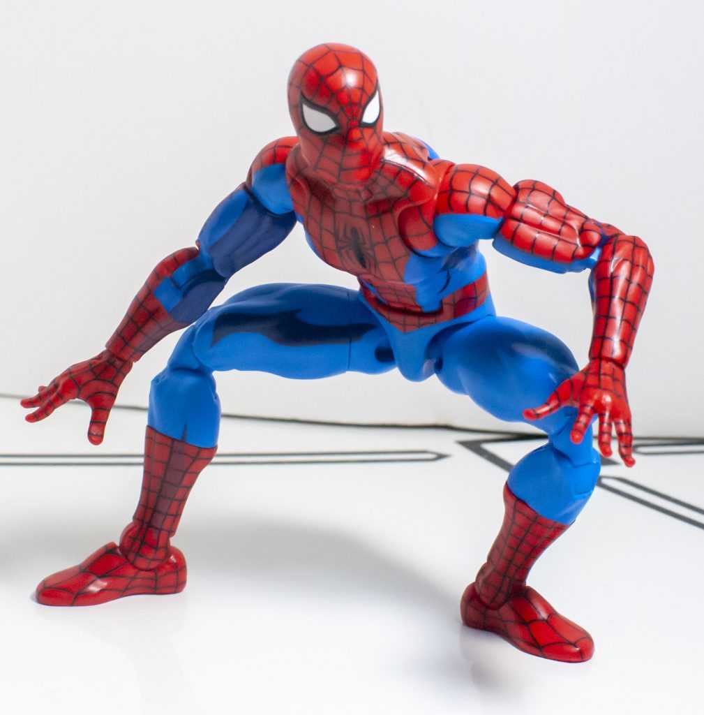
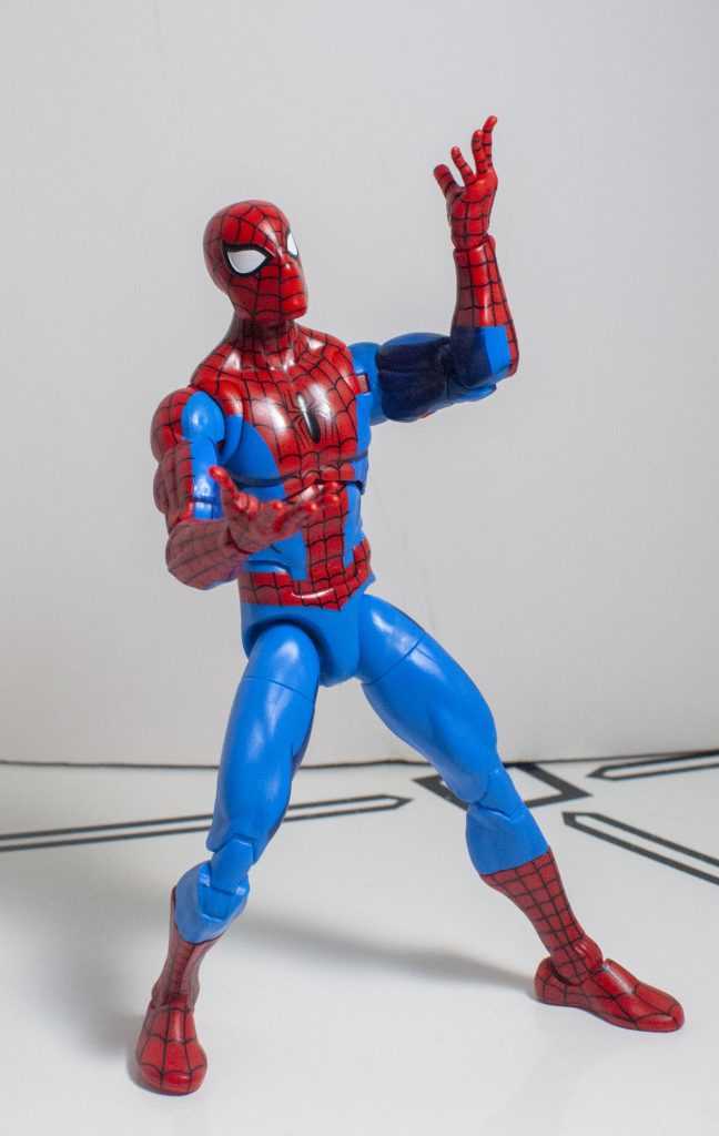
Articulation
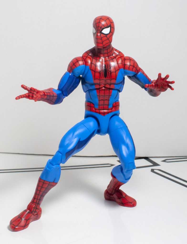
Bend it like…Beter?
Speaking of that jointage, the articulation is still incredible, and jockeys with the paint job as being the star of the show. It’s definitely the big gimmick here, and it’s appropriate for Spider-Man, since he’s known for twisting himself into all kinds of strange shapes. And hey, the Toybiz ones from back in the day even had a super-poseble Spidey, so this guy’s inheriting the throne.
He’s playing the guitar riff from his theme song.
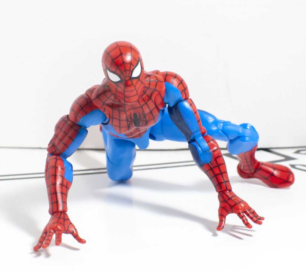
I’m gonna act like this is a high school essay and creatively rephrase my writeup about the Amazing Fantasy one’s bendiness: He’s got a ridiculous amount of joints on him, and they all come with an unusually large range of motion. My favorite bonuses are omni-directional ankles, double elbows and knees, multiple swivels on each limb, a gigantic two-way ab crunch, and two joints on his neck.
Pretty sure he spends the majority of his screentime crouching.
Not only that, but that articulation’s been enhanced a bit by his smaller shoulders, which have an improved range of motion compared to the oddly limited Amazing Fantasy ones.
E. MO. TION.
Of course, the lines of his suit get broken up just as easily when you bend him, but that’s the logistical price to pay for such a bendy boy. That, and his slightly-cheaper-than-Figma materials make me less afraid to handle him, and his personality is still conveyed very well through his bendiness.
Accessories
According to standards and practices, these fists are for shaking, not punching.
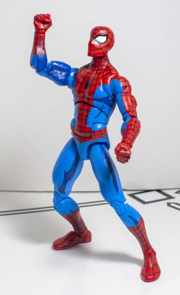
Here’s where he’s gone through a slight downgrade compared to the Amazing Fantasy version. This Spider-Man’s got six different hands, including fists, splayed fingers, and web-shooting hands, all identical to the previous version.
The wall-crawling hands…
..or the Shakespeare in the Park hands, depending.
The good old devil horns.
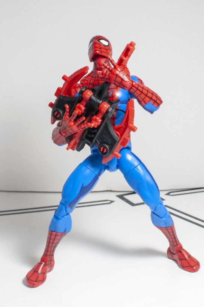
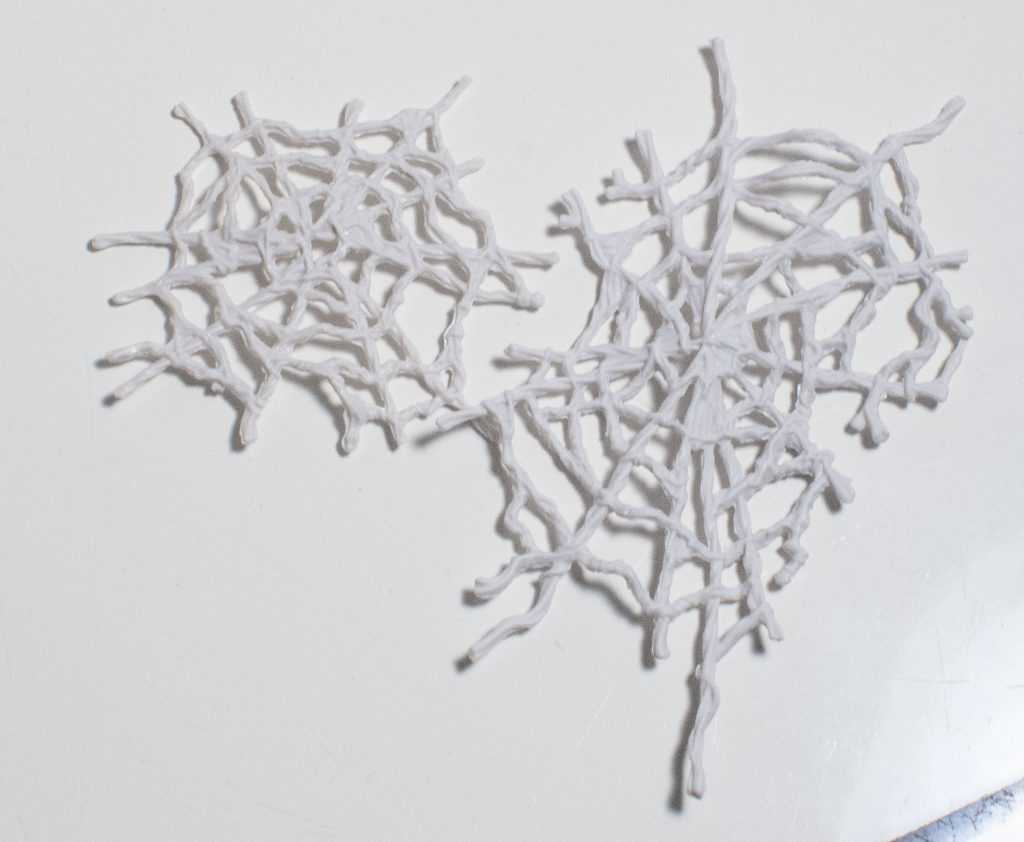
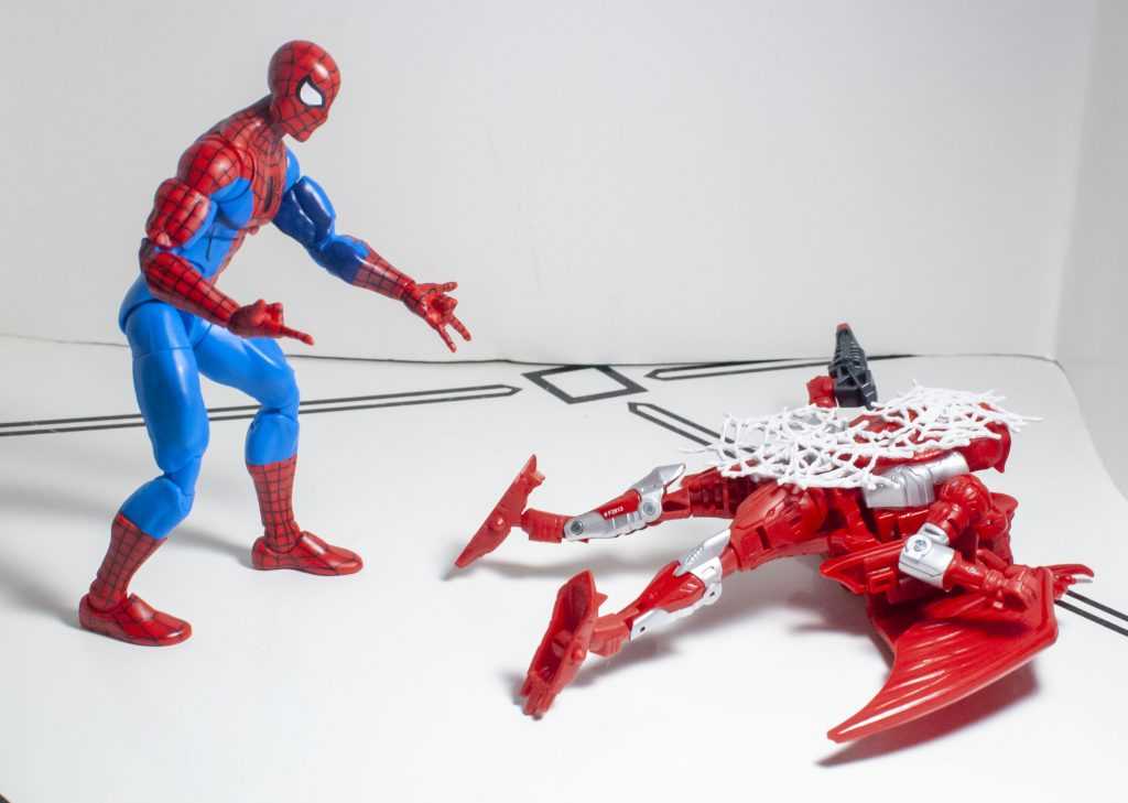
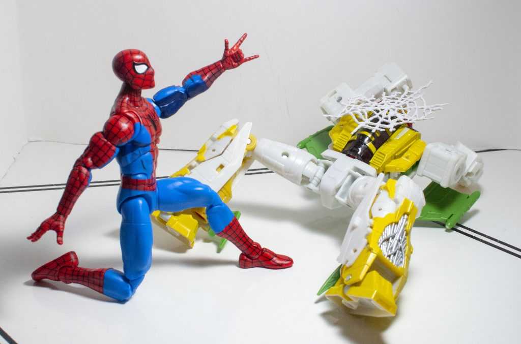
However, he omits the accessory-holding hands of that previous release. Which, fair, he’s got nothing to hold this time around, but it would have been nice to have the feature there, so he could hold stuff from other figures. But, since he uses the same shade of red as the Amazing Fantasy version, I was at least able to swap the hands in from that figure (they still fit perfectly, loose enough to easily swap, and tight enough to stay in). Obviously, he’s also missing the troublesome underarm-webs, since this version of the character didn’t have them, but he also lost his cool holdable webline. Instead, he comes with something the packaging calls out as a “web splat.”
*Stock wet splatting sound*
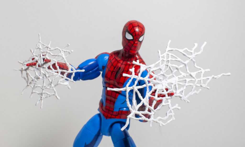
These Web Splats are a pair of spiderweb accessories, each with a different sculpt, composed of soft, bendy plastic that holds its shape. They’re a bit odd, and a bit limited in what he can do with them.
Okay, while I was taking the photos, I did figure out I could kind of dangle them off his fingers.
He can’t interact with them in very many meaningful ways, and the fact that they’re ironing-board-flat in shape, and hold that shape, means that they can’t really be used with other figures, unless they’re knocked over already.
Too early to make a Matrix reference….
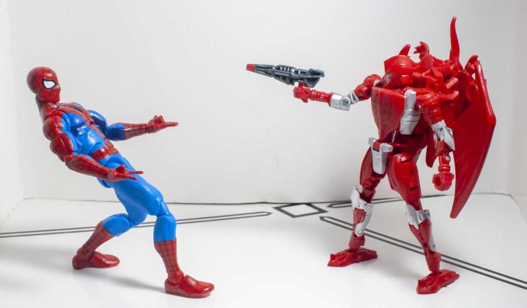
….but just on time to web his enemies up.
Maybe if they were properly flexible, you could wrap them around figures, but as it stands, all you can do is awkwardly place them over a knocked-over figure, or put them on the ground as a bit of display ambiance.
Or as a trap.
Like so.
At least they’re a nicely-sculpted, detailed pair of accessories, and unlike the previous releases underarm-webs, they aren’t essential to the character, and don’t compromise the core figure.
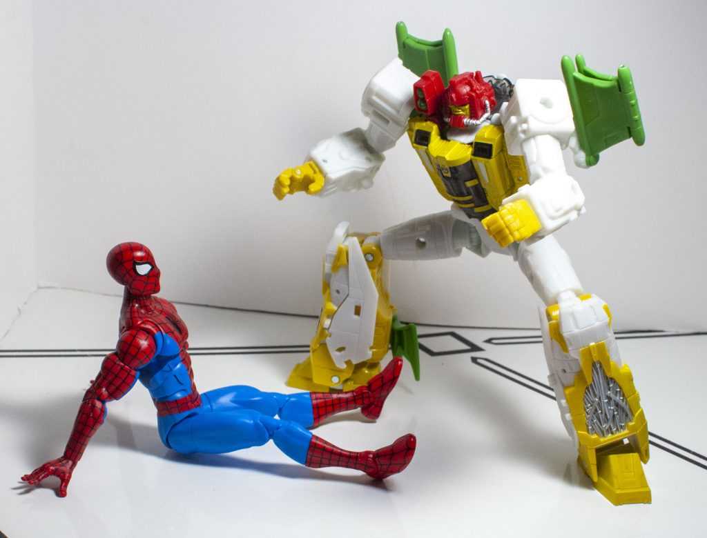
His allies are just as baffled as his enemies.
Overall
Specter of the Past/Vision of the Future.
This Animated Series version of Spider-Man comes with all of the positives of the Amazing Fantasy figure he’s retooled from, meaning he’s impressive-looking, well-built, and full of a ridiculous amount of articulation that just makes him good, clean fun to handle and pose. And he comes with a new, incredible paint job that manages to take a thing I don’t usually like (cell-shading) and actually do it well. His accessories are arguably fewer and weaker than the previous release, but on the other hand, don’t compromise the core figure like they did on that previous version. Plus, it has to be said, this one really does specifically hit me in the nostalgia. I’m not immune to Guy From Thing I Watched.
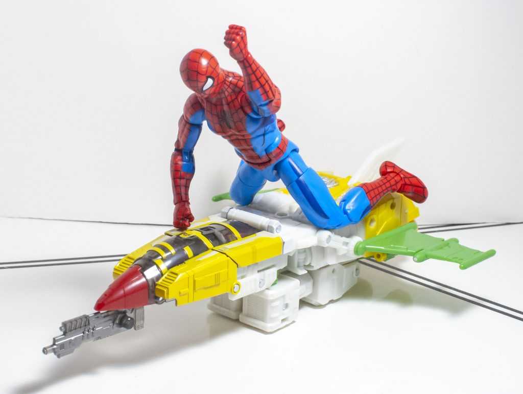
To enter the late 90’s, he must defeat the early 90’s.
“I’m never flying this airline again!”
Bullseye!
In some ways, if you’re in the market for a one-off Spider-Man figure in this scale, I’d actually recommend this guy over the Amazing Fantasy one, putting that nostalgia aside, simply because he registers more as a “default” Spidey than a “variant” Spidey, due to how subtle the cell-shading is. On the other hand, like I said uptop, he’s a hard-to-come-by Wal–Mart exclusive, whereas the Amazing Fantasy one is, as far as I know, general release (I haven’t seen it on shelves, but physical retail hasn’t caught up to that wave around here as of this writing). So, I’ll say, if it’s a case where you have a shot at both of them for roughly the same price and effort, I’d recommend this Animated Series one, but if this one’s way harder to get, or pricier, get the Amazing Fantasy one. They’re both great figures, you can’t lose either way. Just don’t confuse this guy with the older, generic one that’s also on an Animated Series card.
For over 100 Bot, Non-Bot, and Retro Bot Reviews, click here to view my archive.