Originally written January 2019. This is one of my earliest reviews, it’s interesting to look back on this in light of how far the War for Cybertron trilogy has come. This was my first exposure to Siege, and the new feel for the Trilogy in general. Some photos in this post were taken by Venomously Addicted Photography, who you can follow on both Facebook and Instagram for more pics.
Since around 2007, there’s been, more or less, three major, ongoing Transformers toylines: One for the current Movie, one for the current TV show, and then the Nostalgia Line (be it called Classics, Universe, or Generations), dedicated to creating modern updates of the classic cast. The full title of the current iteration of the line, which just began at the end of 2018, is the somewhat awkward Transformers Generations: War for Cybertron Trilogy: Siege, but everyone just calls it Siege. The idea is that it represents “the last day on Cybertron” before the Transformers traveled to Earth, with many familiar G1 Transformers character represented with Cybertronian alternate modes, and covered in a layer of damage and grime from battle. When the Siege line was first unveiled to the fandom, there was some deep skepticism on multiple levels. Generally, the criticism boiled down to four issues: The fact that the line seemed to primarily be concerned with remaking the classic Transformers cast of 1984-86 for the umpteenth time, a dislike of the spackled damage-and-grime paint apps, the Cybertronian altmodes being “Earth modes with bits stuck on,” as well as the line’s aesthetic of excessive molded detail, nicknamed “greebling.”
However, those opinions began to change once we saw in-hand samples, and once these figures finally made it to market. It’s clear that Hasbro and Takara stepped up their game with this line, and aimed it directly at the collector’s market, creating figures that are meant to almost be pseudo-Masterpiece versions of the robots we know and love. We’re looking at a total reboot of the Generations line, and what feels like an attempt to make “definitive” versions of these classic characters, and there’s none more definitive than Optimus Prime, released in the first series of the line at the Voyager pricepoint, which has gone up recently, retailing for about $40 Canadian. In this era of $500 Masterpiece versions, though, he represents a wonderful version of the character at a price people can actually afford. Here’s what he’s like in-hand, and why he’s a prime example of Siege’s potential.
Robot Mode
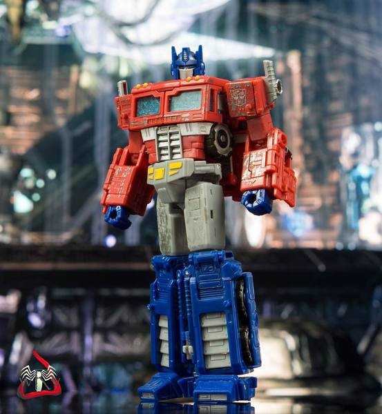
There’s been many different versions of Optimus Prime at the Voyager scale in the extended Classics-and-onward line, but aesthetically, they shared one common point: Each tried to put a new spin on the character, and reinvent his appearance, some more drastically than others. This version does the opposite, and instead aims to directly base itself on the classic Optimus Prime character model that we saw in the original cartoon and Marvel comics, and which the Masterpiece editions of the character attempt to faithfully replicate.
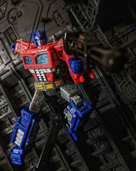
This is a familiar design, complete with chest windows, and ab grill, smokestack shoulders, the works. If you know even a little bit about Transformers, you know this look, and it’s surprisingly faithfully replicated here, down to the smaller, usually-altered details like the specific yellow markings on his pelvis, and the vents on his shins. Like several other Siege figures, though his alternate form is now a sci-fi space truck, several robot details, like the yellow lights at his collar and the aforementioned stomache grill, still suggest his eventual Earth mode. Special attention needs to also be paid to his headsculpt, which really looks like they took the CAD files for his Masterpiece figure and shrunk them down. This is a really clean, kibble-free robot, too, something previous Voyager Primes have struggled with. He’s got a bit of a backpack, but a contained one, as well as a few extra panels on his arms, but he’s generally a svelte robot.
Despite that sveltness, there’s some mass to him. A common complaint about recent Generations figures has been a sense of hollowness to the designs, as budgets and designer ambitions collide, but that’s not present here. Instead, in hand, he feels solid, and a bit weighty. He has mass and density.
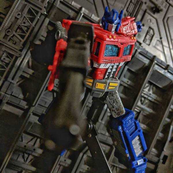
Let’s talk a moment about the colors and paint job, because that’s something that Siege has gone all out on. He’s in his traditional red, blue and grey colors, augmented with bits of silver and yellow in plenty of spots, along with transparent blue windows. It’s here that we talk about one of those controversial Siege elements: The damage and grime. In Prime’s case, it manifests as a series of silvery-grey speckles and splotches across his shoulders, forearms, chest and thighs. I have to say, in person, it looks better than the initial promo art suggests. Like many G1 character models, Prime’s design was always a bit plain, and these paint apps seem to have been strategically deployed to add visual interest and break up the sea of primary colors. Point is, in person, they enhance his look, instead of detract.
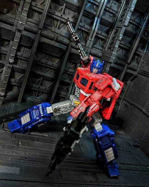
In terms of his articulation, boy, are we spoiled on this bendable guy. In fact, heavy articulation seems to be a general goal of Siege. On top of the usual suspects, he’s got stuff you don’t usually see on mainline Transformers, like tilting ankles (so you can spread his feet wide apart and keep him standing), and swivelling wrists (so he can twirl and pose his accessories). Honestly, comparing him to the Masterpiece figures on my shelf, the only bits of “prestige” articulation he’s lacking are individual fingers and an ab crunch. And thanks to those ankles and some big feet, he’s very stable, supporting all kinds of crazy, akimbo battle poses. It’s really hard to overstate how nice you can make this guy look.
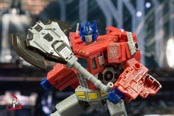
Speaking of battle poses, here’s what he’s armed with. First of all, he comes with his traditional Ion Blaster rifle, cast in black. It’s a very familiar weapon, and hasn’t really changed from his classic character model. What has changed, though, is the axe he comes with. The classic iteration of Optimus had a yellow energy axe that descended from his wrist, but Siege Optimus reinvents it as a physical weapon, a long poleaxe cast in black and silver with an Autobot symbol, with a grey handle, perfect for twirling around using his wrist swivels. On top of that, it also transforms, compressing and folding into a shield that you can mount on his arm.
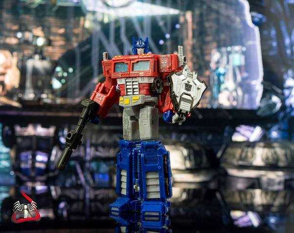
If there’s any weak links to this guy, though, it can be found in this weapon. Thanks to the transformation, it really only looks good from one side in axe mode, and when transformed and mounted as a shield, the compressed handle makes it stick out a bit oddly far from his arm. Still, these are pretty minor complaints, and this brings me to the mounting points on his body.
One of the gimmicks throughout the Siege line is swappable, mountable weapons. The smaller Battle Master and Micromaster figures in the line are mini-bots that transform into weapons for the larger figures to wield, and there’s even a few Deluxe-sized figures, called Weaponizers, that break apart into different weapons for others to wield. In the case of Optimus, he has holes on his forearms, shoulders, thighs and back that you can plug his gun and shield into (the back ones are mostly for the sake of storage). On his own, it’s a nice little bonus, and the holes manage to be not too intrusive. Also, while it’s not an intentional gimmick, his chest flaps can open, though he’s got an empty space in there instead of a Matrix. If you have a Matrix Core from one of the larger Power of the Primes figures, or a Prime or Titan Master from either of the previous two lines, you can loosely fit one in there, though it rattles around a bit.
Transformation
Turning him into his truck mode is more complex than you’d expect, mainly due to the classic “bend the legs, fold the arms in, tuck the head in” Optimus transformation not really being enough to change the fairly slim character model into a believably square, blocky truck once you translate it into real life. Essentially, his backpack and arms contain a shell that wraps a new, square truck form around his compressed body, and so there’s a lot of making sure panels are lined up carefully, and clicking things into place. Still, unlike many shell-formers, everything actually fits and pegs together without much of a struggle. It’s also a relief to find that his chest windows actually do become his truck mode’s front windows, a feature that’s surprisingly rare on Voyager-sized primes, who often fake it.
A note when transforming him back to robot mode: It’s difficult to pry his robot head out of its resting place, but if you look in the spaces where you’d move his front truck wheels up into his torso, there’s alternate holes that lead into where his head is stored, and you can poke at it with something small (like the figure’s axe handle) to safely get his head dislodged.
Vehicle Mode
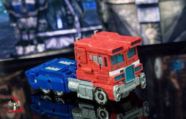
Now we reach another one of those early Siege controversies: His Space Truck mode, or as it was deemed when it was unveiled, “an Earth truck wearing a hat.” All I can say is that it really looks nicer in-hand than the photos suggest. It’s an odd, spacey truck that reads more like a futuristic concept vehicle than something alien. It appearance, to me, lets it work as multiple things. Maybe it really is Optimus’s pre-Earth form. Or maybe it’s Optimus’s post-Earth form after departing the planet in the IDW comics. Or maybe he does looks this way on Earth, and he landed on our planet sometime in the future. There’s a line this design seems to be riding on purpose, and I think it rides it well. The other controversy in this mode is the excessive tech detailing, or “greebling.” Once again, in-hand, it’s much less prominent than on CGI renders and resin prototypes, and really is just a techy version of things like the molded-in rivets and panel lines on the original Prime toy’s truck form.
While he’s got the same colors as in his robot mode, there’s a lot more transparent blue plastic visible on the front of the truck in this mode, which makes him pop more visually in person than I was expecting. There’s surprisingly little damage visible in this mode, just on his sides where his shoulders end up, and around the truck windows. A tiny luxury of the increased paint budget with him is that the hubcaps on his wheels have silver paint.
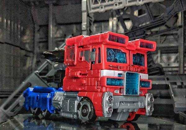
In terms of gimmickry, he’s pretty straightforward. You can stash his shield and gun at the back of the truck, with the gun mounting on top of the shield. You can also mount either of them on the top or sides of the truck. Also, it’s not called out in the instructions, but promotional materials called out an intermediate “hover truck” mode, created by simply folding the wheels down.
Overall
In case I didn’t make it clear earlier, this is a really, really good figure. He’s great-looking, solidly-built, extremely poseable, and a lot of the quirks of the Siege line turned out to be plusses in-hand. I’d go so far as to say, when it comes to this one particular figure, even if you’re a casual collector who isn’t planning to get much or any Siege stuff, you should pick this guy up as a one-off, he’s that good. If you want a good Prime for non-Masterpiece prices, he’s your guy, and while he is pricier than previous Voyagers, you can really see where the money went. If this is a sign of how good the Siege line is (and I’ve heard some great things about the other releases in it), then it looks like it’s going to be a favorite of mine.
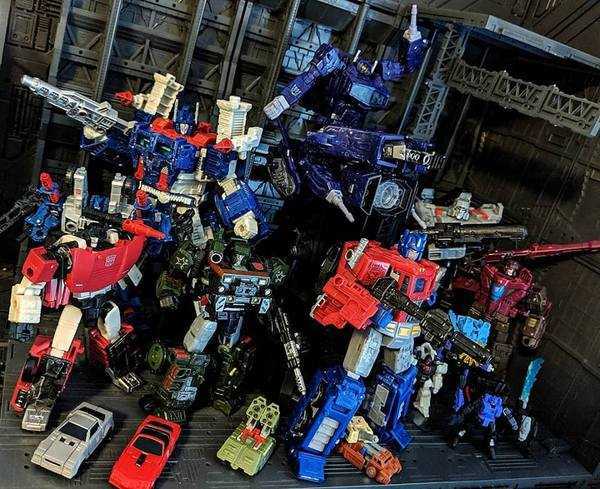
(2021 thoughts: Honestly, this guy still holds up. A year and change later, we may have gotten an Earth-mode version, but, honestly, I still kind of like this version better than the Earthrise leader. He’s got nicer robot mode proportions, nicer weapons, and just feels a bit better in hand. Between this guy’s Classic Animation repaint, and the newer Nemesis Prime release that just came out, there’s plenty of opportunities to own a version of the tooling still, and it’s one I still highly recommend.)
For over 100 Bot, Non-Bot, and Retro Bot Reviews, click here to view my archive.


